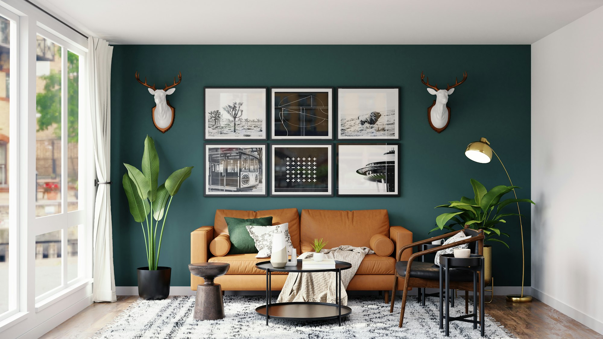
Unexpected Color Trends Worth Trying bold interiors begin with daring palettes. Designers are rebelling against predictability, embracing chromatic juxtapositions that surprise and delight. If you crave vibrancy tempered by nuance, it’s time to try unexpected color mixes. From smoky neons to vintage-inspired pastels, these trends will transform ordinary spaces into spectacular showpieces.

The New Rules of Chromatic Play
Color no longer adheres to safety guidelines. The freshest trends defy conventional pairings, pairing opposites to forge harmony. Unexpected mixes challenge the eye and nurture creativity. When thoughtfully applied, these palettes refresh and rejuvenate without plunging into chaos.
1. Smoky Neon Accents
Neon glows, but muted neons mesmerize. Think neon chartreuse dusted with gray, or electric pink tonally softened.
- Applications: Accent edges of shelving, niche panel interiors, geometric murals.
- Effect: A subtle neon flicker that intrigues rather than overwhelms.
2. Vintage Pastel and Charcoal
Pair powder pink or mint green with deep charcoal for a sui generis mélange.
- Applications: Wainscoting in pastel over charcoal walls; pastel cabinetry with charcoal countertops.
- Effect: Romantic nostalgia meets modern grit.
3. Burnt Sienna and Sky Blue
Earthy terracotta inflected by airy sky blue evokes sunrise vistas.
- Applications: Kitchen islands in sienna, tongue-and-groove ceilings in sky blue.
- Effect: Down-to-earth warmth uplifted by open-air freshness.
4. Mustard Yellow and Smoky Teal
A retro-modern alliance: mustard vibrancy with teal’s oceanic coolness.
- Applications: Upholstered chairs in teal, mustard-piped cushions.
- Effect: Energetic yet grounded ambience.
5. Coral and Forest Green
Juxtapose rosy coral with deep foliage green for unexpected botanical drama.
- Applications: Coral accent walls against green carpets; green tiling with coral grout.
- Effect: Tropical vitality meets woodland calm.
6. Indigo and Marigold
Royal indigo scaled down by marigold’s golden cheer.
- Applications: Indigo-painted front doors paired with marigold planters.
- Effect: Majestic entrance with playful warmth.
7. Lavender and Saddle Brown
Dusty lavender and rich leather-brown channel vintage glamour.
- Applications: Leather sofas with lavender throw blankets.
- Effect: Luxurious softness contrasted with rugged texture.
8. Cool Gray and Ruby Red
An icy neutrality punctuated by jewel-like red.
- Applications: Gray bedroom walls with ruby-red headboards.
- Effect: Quiet sophistication sparked by passionate accent.
9. Oceanic Aqua and Burnt Orange
Coastal blues enlivened by desert-inspired orange.
- Applications: Aqua bathroom vanities with orange towels.
- Effect: Refreshing duality reminiscent of shoreline sunsets.
10. Pale Peach and Charcoal Blue
Gentle peach shaded by stormy midnight blue.
- Applications: Pale peach drapes in rooms with charcoal-blue walls.
- Effect: Soft romance anchored by brooding depth.
11. Moss Green and Blush Pink
Symbiosis of verdant calm and blush’s tender warmth.
- Applications: Moss-green cabinetry with blush hardware; blush walls with green accents.
- Effect: Garden-fresh serenity with a dash of romance.
12. Golden Ochre and Dusty Plum
High-contrast elegance forging unexpected affinity.
- Applications: Ochre kitchen tiles paired with plum cabinetry.
- Effect: Rich vibrancy with understated sophistication.
13. Neon Lime and Matte Navy
Electric lime set against a velvety deep blue.
- Applications: Neon lime furnishings on navy-carpeted floors.
- Effect: Modern pop-art energy balanced by classic depth.
14. Charcoal Teal and Mustard Accent
Subdued teal walls punctuated by mustard details.
- Applications: Teal walls with mustard ceiling fixtures.
- Effect: Moody canvas enlivened by sunny punctuation.
15. Warm Taupe and Vibrant Fuchsia
Neutral taupe warmed by fuchsia’s audacity.
- Applications: Taupe upholstery with fuchsia piping; fuchsia throw pillows on taupe sofas.
- Effect: Understated backdrop with dynamic highlights.
Implementation Strategies
- Swatch Pairing Panels: Paint large poster boards side by side to visualize try unexpected color mixes.
- Feature Corners: Apply bold mixes only on one wall or niche to test impact.
- Textile First: Experiment with cushions, rugs, or curtains before painting surfaces.
- Trim Contrast: Paint baseboards or moldings in an unexpected complement hue.
Layering for Cohesion
- Neutral Core: Start with a calm base—soft whites or light grays.
- Primary Accent Pair: Choose two contrasting hues for main elements.
- Secondary Hints: Introduce a subtle third color in small doses.
- Textural Balance: Offset glossy paints with matte finishes and varied textiles.
Room-by-Room Application
Living Room
Combine smoky neon edge details on shelves with charcoal walls. Add vintage pastel armchairs for contrast.
Kitchen
Paint lower cabinets in burnt sienna and upper cabinets in sky blue. Use neutral countertops.
Bedroom
Accent a headboard wall in lavender and saddle brown. Layer peach linens and ruby-red throws.
Bathroom
Tile in oceanic aqua with burnt-orange grout. Accessorize with moss-green towels and blush soap dispensers.
Home Office
Cover one wall in neon lime trim on matte navy. Introduce charcoaled teal desk and mustard stationery.
The Future of Unexpected Palettes
As color science advances, expect glow-in-the-dark neutrals, thermochromic paints that shift hue with temperature, and AI-curated palettes based on personal biometrics. These innovations will expand how we try unexpected color mixes, offering bespoke combinations that respond to our moods and environments.
Fearless color pairings can redefine interiors. By daring to try unexpected color mixes, you breathe fresh life into every surface, creating spaces that resonate with personality and contemporary flair. Let these trends guide you toward bold, beautiful harmony beyond the predictable palette.

:strip_icc()/20190521_meredith_015_preview-4cafea707ac344e18df0f94b6fff3356.jpg "Furniture Ideas for the Minimal Home")