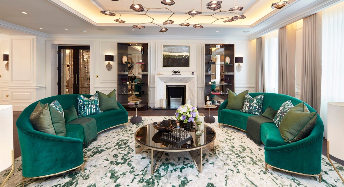
Timeless Color Trends You’ll Love in a world where design trends come and go faster than a seasonal sale, color remains the most enduring and emotionally resonant element of interior aesthetics. While bold fads may tempt us momentarily, there’s something undeniably magnetic about timeless hues. These are the colors that feel right—today, tomorrow, and ten years from now. They offer comfort, elegance, and a certain visual rhythm that never falls out of favor. Across eras, continents, and styles, these are the timeless color schemes loved by those who value longevity and sophistication in design.
From warm neutrals to heritage blues and grounded greens, this guide celebrates enduring palettes that hold their charm through changing seasons and shifting moods.

Why Color Timelessness Matters
When color becomes timeless, it transcends trends. It’s not just a matter of fashion or aesthetics—it’s about emotional resonance. Timeless colors are those that make you feel at home instantly. They’re the shades that nurture, ground, or energize us gently. Unlike trend-driven palettes that lose appeal within months, timeless colors become a part of our lifestyle.
They allow flexibility in layering, evolving, and mixing, offering a stable foundation to pivot as your taste or space changes.
What defines timeless color schemes loved universally?
- Balance between warm and cool tones
- Versatility across materials, finishes, and lighting
- Rootedness in nature, history, or culture
- Soft saturation, never too bright, never too dull
Let’s dive into the most iconic combinations that continue to inspire spaces across generations.
1. Ivory and Greige: The Quiet Champions
A marriage of gray and beige, “greige” is a contemporary classic. When paired with soft ivory, it creates a palette that feels airlight, sophisticated, and adaptable to almost any design style.
Where it excels: Scandinavian, Japandi, modern classic
Best paired with: Warm woods, black iron details, dried botanicals
This duo plays well with both minimalism and comfort-forward spaces. It provides an unspoken warmth while maintaining a clean and refined look—definitely one of the most enduring timeless color schemes loved in interiors and even fashion.
2. Navy Blue and Crisp White: The Nautical Staple
Few pairings are as visually crisp and universally beloved as navy and white. Navy introduces depth and calm, while white provides contrast and freshness. Whether on bedding, wall paint, or cabinetry, the combination is as versatile as it is elegant.
Where it excels: Coastal, preppy, transitional homes
Best paired with: Brass hardware, woven baskets, sea glass accessories
This classic combination brings with it a sense of maritime charm, but it also works beautifully in formal spaces with modern or traditional flair.
3. Olive and Tan: Earth-Inspired Sophistication
The natural elegance of olive green offers a muted richness. When paired with tan or caramel tones, the result is earthy and grounded. This color scheme creates warmth without excess.
Where it excels: Mid-century modern, organic modern, rustic chic
Best paired with: Terracotta pottery, raw wood finishes, soft leathers
Deeply tied to nature, this combination evokes the forest floor, dry grasslands, and Mediterranean hillside groves. No wonder it’s among the timeless color schemes loved in both interior and fashion circles.
4. Slate Gray and Soft Rose: Balanced and Elevated
Soft rose tones bring a gentle warmth and a hint of romanticism, while slate gray anchors them with composure. This pairing feels modern yet nostalgic, perfect for creating an inviting and balanced atmosphere.
Where it excels: Feminine-modern bedrooms, contemporary offices, boutique hospitality
Best paired with: Velvet fabrics, stone countertops, brass fixtures
Used in moderation, rose softens the otherwise steely demeanor of gray, making this duo sophisticated without feeling austere.
5. Charcoal and Linen: Monochrome with Warmth
When dark gray flirts with light beige, a beautifully subdued contrast emerges. This duo feels timeless, layered, and grounded.
Where it excels: Loft apartments, minimalist living rooms, masculine-meets-cozy homes
Best paired with: Concrete floors, black-framed artwork, linen drapery
This scheme relies heavily on texture to avoid feeling flat. It’s one of the timeless color schemes loved by designers who appreciate the drama of monochrome with the ease of natural light.
6. Terracotta and Cream: Warming the Soul
Terracotta has been used for centuries in art, pottery, and architecture. When balanced with creamy off-white, it becomes undeniably chic.
Where it excels: Southwestern, bohemian, Mediterranean interiors
Best paired with: Woven textures, clay tiles, brushed gold accents
The richness of terracotta provides heat, while cream tones soothe the palette. It’s timeless in regions where sun, sand, and natural material dictate the color story.
7. Forest Green and Antique Gold: Majestic and Timeless
Forest green is deeply tied to nature, while antique gold adds historical gravitas. Together, they bring regal character to interiors—especially in formal dining rooms, libraries, and grand entryways.
Where it excels: Traditional, moody maximalist, historical homes
Best paired with: Panel molding, heavy drapery, marble surfaces
The juxtaposition of earthy and opulent makes this a favorite in many of the timeless color schemes loved by classic decorators.
8. Soft Black and White: Eternal Contrast
You can’t go wrong with the high-contrast, yet never jarring combo of black and white—especially when the black is a “soft” or chalky shade that takes the edge off.
Where it excels: Monochrome kitchens, gallery walls, classic bathrooms
Best paired with: Chrome fixtures, geometric patterns, pops of greenery
This combo is architectural in nature. It sharpens silhouettes and defines space while keeping the overall look crisp and uncluttered.
9. Camel and Dusty Blue: Understated Elegance
Camel adds warmth, while dusty blue brings softness. Their harmony lies in their muted quality, which allows them to blend seamlessly across decades and styles.
Where it excels: Boutique hotel rooms, serene bedrooms, transitional offices
Best paired with: Light oak floors, boucle textiles, soft brass lighting
This scheme balances cool and warm effortlessly—earning it a solid place among the timeless color schemes loved by those who crave subtle sophistication.
10. Taupe and Rich Brown: Classic Depth
Taupe’s neutrality makes it the perfect canvas for rich browns, from espresso to walnut. Together, they evoke coziness and tradition.
Where it excels: Libraries, cozy living rooms, leather-heavy interiors
Best paired with: Natural stone, handwoven rugs, brass or copper accents
Brown is back in a big way, and this classic pairing shows exactly why. It’s familiar yet refined.
The Role of Natural Light in Color Timelessness
Even the most timeless colors can feel wrong under bad lighting. Understanding how natural light impacts a room is essential in applying these palettes correctly.
North-facing rooms tend to feel cooler, enhancing blues and grays
South-facing rooms are warmer, ideal for earthy and golden tones
East-facing rooms offer soft morning light—perfect for blushes and pastels
West-facing rooms are golden in the evening, deepening reds and yellows
Always test your chosen palette under various lighting conditions to ensure that the timeless hue you love in theory performs beautifully in reality.
Timeless Colors in Unexpected Pairings
Sometimes, timeless color shines even more when combined with a surprise element:
Navy and Blush – Adds femininity to a strong base
Ivory and Forest Green – Nature meets serenity
Charcoal and Mustard – A modern classic twist
Slate Blue and Burgundy – Heritage richness with a bold soul
These combinations work because they respect the foundation of timeless color schemes loved universally, while introducing a whisper of edge.
From Interiors to Fashion: Cross-Platform Appeal
Timeless color schemes aren’t confined to interiors. You’ll often see the same combinations appear in high-end fashion, luxury branding, and even car interiors.
Camel coats over gray suits
Terracotta handbags with cream silk blouses
Navy pinstripe with crisp white shirting
The overlap is no accident. Colors that are rooted in classic elegance tend to work across mediums, styles, and purposes. That’s the magic of timelessness—it transcends categories.
How to Introduce Timeless Color in a Modern Home
You don’t need to do a full renovation to enjoy these palettes. Here are simple ways to bring them into your space:
Accent walls in dusty blues, olive, or taupe
Furniture in warm camel leathers or forest velvets
Textiles like drapery or rugs in cream and slate
Artwork and ceramics in charcoal, ivory, or soft pinks
Lighting with matte brass, antique bronze, or blackened steel
Because timeless color schemes loved across decades are so adaptable, small updates often have a big impact.
Final Thoughts
There’s something deeply reassuring about color that endures.
The palettes explored here aren’t fleeting. They’re grounded in nature, culture, and the rhythms of daily life. Whether you lean minimalist, maximalist, or somewhere in between, there’s a timeless color story waiting to bring harmony and beauty to your space.
These are the timeless color schemes loved not just for how they look—but for how they make us feel: calm, grounded, and always at home.