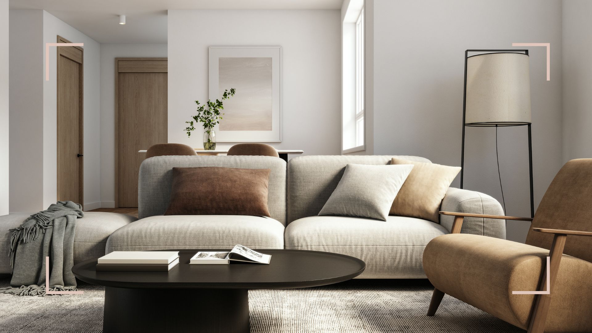
Color Trends That Spark Creativity color is more than decoration. It’s the catalyst that ignites imagination, fuels artistic expression, and transforms everyday spaces into incubators of innovation. As the boundaries between work, play, and rest blur, individuals crave environments that stimulate fresh ideas and encourage bold thinking. Enter the world of creative interior color trends, where every hue serves a purpose beyond mere aesthetics. This comprehensive guide explores the latest color movements designed to inspire, energize, and unlock your creative potential.

1. Energetic Neon and Fluorescent Accents
Neon isn’t just for nightlife. In interiors, strategic pops of electric pink, chartreuse green, and ultraviolet purple jolt the senses awake. These creative interior color trends leverage high-saturation pigments to draw attention, define zones, and spark imaginative leaps.
Use in:
- Accent walls behind workspaces
- Geometric pattern murals
- Statement furniture pieces (e.g., a neon orange side table)
Pro Tip: Pair with matte black or pure white backdrops to let neon truly glow.
2. Gradient and Ombré Walls
Walls are canvases in motion. Gradient transitions—soft peach to coral, sky blue to indigo, or lime to mint—create immersive atmospheres. As colors meld seamlessly, they stimulate visual curiosity and encourage daydreams.
Use in:
- Creative studios
- Children’s play rooms
- Café and co-working spaces
Pro Tip: Apply subtle metallic sheen over gradients for a shimmering effect as light shifts.
3. Bioluminescent Blues and Greens
Inspired by oceanic bioluminescence, these ethereal hues—teal glow, phosphorescent seafoam, and lagoon radiance—imbue spaces with otherworldly luminosity. They foster a sense of wonder, perfect for brainstorming zones.
Use in:
- Feature niches
- Under-cabinet lighting panels
- Flowing LED-anchored color strips along moldings
Pro Tip: Combine with natural wood to anchor the futuristic glow.
4. Jewel Tone Saturation
Deep emerald, sapphire blue, and amethyst purple aren’t new, but in 2025 they’re etched in richer, velvety textures. These luxurious pigments stimulate focus and creativity by evoking regal and mysterious atmospheres.
Use in:
- Upholstery (velvet sofas, chaise lounges)
- Statement rugs and tapestries
- Accent cabinetry or bookcases
Pro Tip: Balance jewel tones with lighter neutrals such as pearl gray or sand.
5. Playful Pastel Palettes
Pastels aren’t all saccharine. Sophisticated, muted options like dusty lavender, subdued mint, and powdery peach lend a softness that calms yet inspires. They lower creative barriers by creating inviting, non-intimidating environments.
Use in:
- Home offices for balanced mental states
- Art therapy rooms
- Collaborative meeting pods
Pro Tip: Layer multiple pastels in juxtaposition for complex, layered moods.
6. Monochromatic Boldness
One-color schemes, when executed boldly, become powerful statements. Monochromatic murals in citrus yellow, midnight blue, or terracotta red envelop individuals in a singular emotional field, deepening focus and enhancing creative flow.
Use in:
- Feature rooms like writing dens
- Meditation or reflection corners
- Retail pop-up installations
Pro Tip: Introduce texture variety—matte, satin, gloss—to differentiate surfaces.
7. Earthy Terracotta and Rust
Grounded terracotta, burnt sienna, and rust tones bring warmth and stability. They connect occupants to the natural world, offering a secure base from which imagination can branch out.
Use in:
- Studio floors or low walls
- Terracotta planters in greenery clusters
- Accent cushions and textiles
Pro Tip: Combine with terry cloth, boucle, or raw linen to boost tactile inspiration.
8. Chalkboard and Writable Finishes
Walls become living labs with chalkboard or whiteboard paints in unconventional hues—charcoal lavender, mossy black, or slate green. Encouraging sketching, note-taking, and ideation, these surfaces blur the line between environment and tool.
Use in:
- Home offices
- Entryway idea boards
- Café community tables
Pro Tip: Border writable sections with vibrant color frames to highlight creativity zones.
9. Metallic Infusions
Beyond gold and silver, metallic finishes in copper blush, rose brass, and oil-slick iridescence introduce luxurious shimmer. Light dances across surfaces, creating changing reflections that stimulate the eye and mind.
Use in:
- Shelving backdrops
- Decorative panels in boardrooms
- Lighting fixtures and lamp bases
Pro Tip: Mix matte paint with metallic trim for subtle elegance.
10. High-Contrast Pairings
Contrast drives attention. Pair navy and mustard, charcoal and electric blue, or plum and chartreuse to create dynamic interplay. These stark juxtapositions challenge the mind and energize collaborative environments.
Use in:
- Striped wallpapers
- Two-tone cabinetry
- Upholstery with piping in contrasting colors
Pro Tip: Maintain balance by anchoring one hue to the majority of space and using the contrasting shade sparingly.
11. Translucent Layering
Sheer color washes—like tinted glass or resin panels—allow overlapping hues to interact. Light filtering through these surfaces creates kaleidoscopic patterns that shift throughout the day.
Use in:
- Partition walls in open-plan offices
- Color-blocked window treatments
- Pendant lights with layered glass shades
Pro Tip: Orient panels where they receive natural light to maximize chromatic interplay.
12. Organic Green Escapes
Infusion of natural greens ranging from deep forest to pale celadon supports biophilic design. These creative interior color trends tap into evolutionary preferences for foliage, increasing cognitive function and idea generation.
Use in:
- Living walls and moss art
- Painted ceilings in lounge areas
- Accents around indoor gardens
Pro Tip: Combine with natural wood grains and stone textures.
13. Muted Minimalism
Soft minimal hues—fog white, greige, and sand shadows—provide blank-slate environments optimized for projection of creative output. They reduce visual noise while offering enough warmth to prevent sterility.
Use in:
- Gallery walls for artwork
- Quiet reading nooks
- Yoga and meditation rooms
Pro Tip: Introduce small-scale color accents to prevent monotony.
14. Retro Revival Colors
Nostalgia fuels the imagination. Revival of avocado green, mustard yellow, and burnt orange conjures mid-century charm while inspiring playful experimentation.
Use in:
- Upholstered vintage chairs
- Geometric patterned tiles
- Statement lighting fixtures
Pro Tip: Balance retro colors with contemporary furnishings for fresh contrast.
15. Celestial and Cosmic Hues
Drawing from nebulae imagery and ultraviolet spectrums, cosmic purples, starburst whites, and meteorite grays encourage out-of-this-world thinking. These expansive shades broaden mental horizons.
Use in:
- Ceiling murals above creative zones
- Illuminated wall art
- Projector screen backdrops
Pro Tip: Integrate fiber-optic or LED starfields for immersive experiences.
Implementation Strategies
- Zoning Through Color: Divide multipurpose spaces by palette—energizing hues for creation, calming tones for reflection.
- Sample Testing: Paint peel-and-stick swatches across walls at eye level to observe interactions.
- Balance and Anchor: Always anchor bold colors with neutral ground to maintain harmony.
- Texture Integration: Layer different materials—velvet, matte paint, gloss—to enrich perceptions.
- Lighting Considerations: Test swatches under ambient, task, and accent lighting to ensure consistency.
Color isn’t an afterthought. It’s a fundamental ingredient in the recipe of creativity. By embracing these 15 creative interior color trends, you can cultivate spaces that not only look stunning but actively nurture inspiration, focus, and out-of-the-box thinking. Whether you’re a designer, entrepreneur, artist, or homeowner, let your walls and accents be the spark that transforms ideas into reality.
:max_bytes(150000):strip_icc()/12.20.23BrownstoneBoys_SecondSt_Social-8-da4b4369d0f24d8094529a9adc4943cc.jpg "Top Color Trends for Relaxing Interiors")