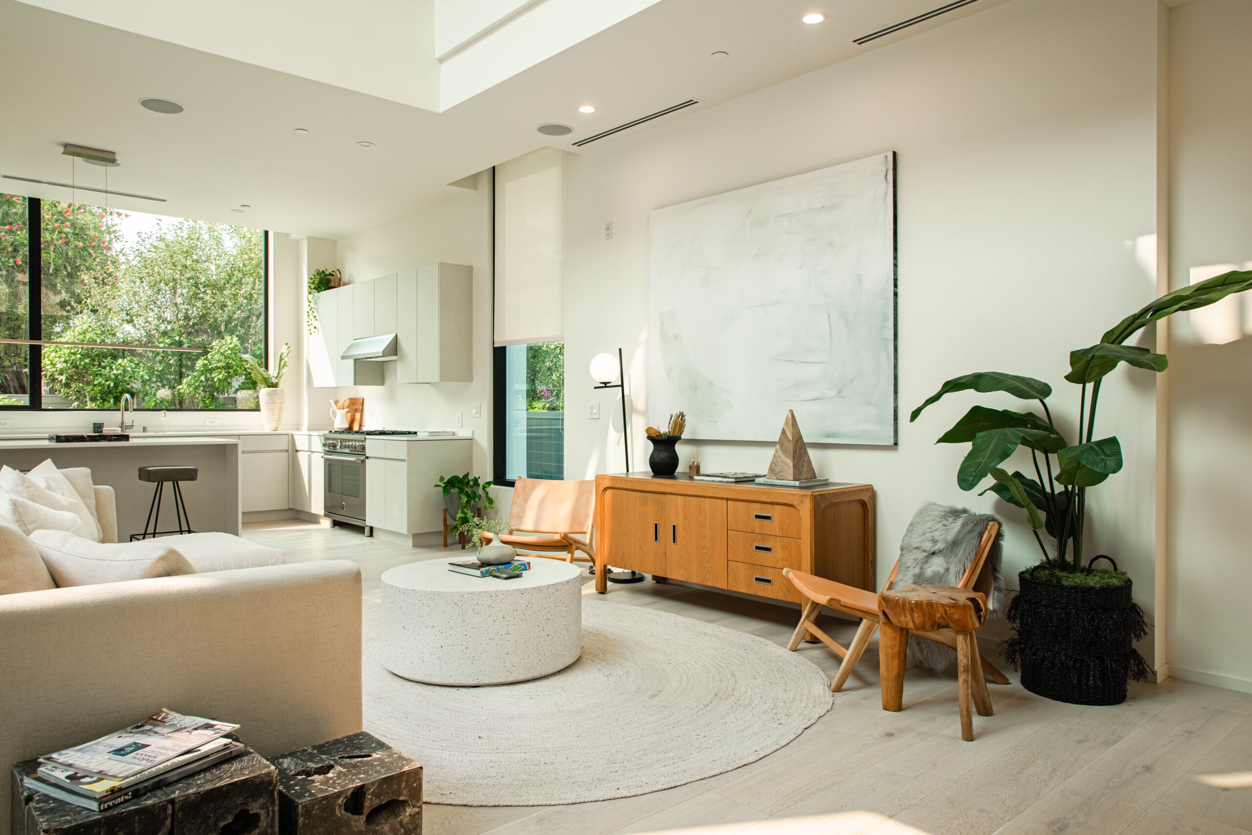
Chic Color Trends for Modern Living color is the silent architect of ambiance. In contemporary homes, palettes define mood, communicate style, and embody individuality. This year’s modern chic color ideas combine avant-garde vibrancy with timeless elegance, crafting interiors that feel both forward-thinking and effortlessly sophisticated. From serene sylvan greens to effulgent metallic accents, these trends will guide you toward a refined yet dynamic aesthetic in every room.

The Art and Science of Chic Color
Incorporating the right hues demands both aesthetic intuition and chromatic science. Colors can expand or contract a space, alter perceived temperature, and even influence well-being. Modern chic revolves around balance—pairing saturated statements with ethereal neutrals, unexpected duos with harmonious triptychs, and soft luminance with strategic shadow. Understanding these dynamics empowers you to implement modern chic color ideas that resonate on both visual and emotional levels.
1. Sylvan Sage and Moss Duo
Sage green and deep moss unite the tranquility of shaded forests with contemporary polish. This verdant duo cultivates a biophilic sanctuary within urban dwellings.
- Application: Accent walls in living areas, kitchen cabinetry, or study nooks.
- Result: A serene embrace that fosters mental clarity.
- Pairing: Light oak furnishing and matte black hardware.
2. Effulgent Copper and Rose Gold
Metallics aren’t limited to cold silver. Warm copper and rose gold impart a luminous glow, reflecting light in a sophisticated whisper rather than a shout.
- Application: Light fixtures, mirror frames, and hardware.
- Result: Instant glamour without ostentation.
- Pairing: Charcoal walls or deep navy upholstery.
3. Muted Lilac and Dusty Mauve
A nod to romanticism, dusty mauve and muted lilac balance softness with depth. These hues evoke dusk skies and lavender fields at twilight.
- Application: Upholstery, drapery, and area rugs.
- Result: Subtle femininity with modern restraint.
- Pairing: Polished chrome accents and pale gray walls.
4. Onyx Black with Ivory Contrast
Nothing feels more contemporary than the stark collision of deep onyx and creamy ivory. This binary scheme is both timeless and decidedly modern.
- Application: Two-tone walls, furniture insets, or tile patterns.
- Result: High-contrast chic that’s visually arresting.
- Pairing: Natural walnut floors to soften austere edges.
5. Oceanic Teal and Cerulean
Teal’s revival continues, now accompanied by cerulean’s sky-like calm. These complementary blues breathe aquatic sophistication into interiors.
- Application: Kitchen islands, bathroom vanities, living room accent pieces.
- Result: Depth and freshness reminiscent of coastal retreats.
- Pairing: Crisp white trim and woven rattan details.
6. Solar Inferno: Tangerine and Saffron
Infuse kinetic energy with warm, zesty hues. Tangerine and saffron bring an audacious warmth without sacrificing refinement.
- Application: Statement chairs, art pieces, and wallpaper motifs.
- Result: Vibrant focal points that spark conversation.
- Pairing: Tame them with sandy neutrals and brushed brass.
7. Porcelain Blue and Chalk White
This porcelain-inspired duo channels fine china palettes for a soft, pristine look. Chalk white enhances the purity of porcelain blue’s gentle undertone.
- Application: Bathroom tiles, kitchen backsplashes, and ceiling treatments.
- Result: Crisp, clean spaces that still feel inviting.
- Pairing: Matte black fixtures for sculptural drama.
8. Graphite Gray and Soft Blush
Graphite’s graphite grit contrasts beautifully with blush’s demure delicacy, striking a harmonious balance between edge and elegance.
- Application: Custom cabinetry, upholstered headboards, or accent pillows.
- Result: Polished neutrality with a wink of color.
- Pairing: Light marble surfaces and plexiglass accessories.
9. Terracotta Revival with Chalky Taupe
Warm terracotta finds new life paired with chalky taupe—a duo that marries rustic authenticity with modern minimalism.
- Application: Pottery collections, area rugs, or half-painted walls.
- Result: Earthy warmth anchored by serene neutrality.
- Pairing: Olive-green drapes and raw wood furniture.
10. Neon Accent Splashes
Tiny bursts of neon—fuchsia, lime, or electric blue—act as design punctuation. In moderation, they provide an avant-garde twist to more subdued palettes.
- Application: Throw cushions, accent lighting, or small art frames.
- Result: Unexpected vitality in curated doses.
- Pairing: Broad strokes of neutral walls and refined textural plays.
11. Gradient Oceans and Skies
Gradient wall treatments mimic natural transitions—dawn pink to midday cerulean or deep marine to light aqua. These dynamic murals tell a story across surfaces.
- Application: Full-height installations in entry halls or bedrooms.
- Result: Breath-taking visual journeys that alter with light.
- Pairing: Minimalist furnishings to focus on the gradient’s narrative.
12. Violet-Infused Charcoals
Charcoal gains a purple twist, resulting in a hue that oscillates between moody and regal. This atypical neutral lends sophistication to modern interiors.
- Application: Painted ceilings, cabinetry, or dining chairs.
- Result: Depth with a secret chromatic undertone.
- Pairing: Soft linen textiles and gold-leaf accents.
13. Olive Oil and Mustard Seeds
Earthy olive and rich mustard conjure Mediterranean palettes. Together, they infuse homes with sun-soaked warmth and decadent ease.
- Application: Kitchen cabinetry, accent walls, or pillows.
- Result: A cosmopolitan nod to rustic tradition.
- Pairing: Terracotta floor tiles and woven jute accessories.
14. Quartz Pink and Slate Gray
Quartz pink, a soft rosy neutral, harmonizes beautifully with slate gray’s industrial chic.
- Application: Bathroom walls, hallway niches, or bed linens.
- Result: Delicate romance meets urban edge.
- Pairing: Brushed nickel and glass accents.
15. Champagne Hues and Misty Silver
Soft metallics in champagne and misted silver offer a chic shimmer that’s understated yet luxurious.
- Application: Ceiling accents, bar cart finishes, or pendant light interiors.
- Result: Subtle luminescence that elevates everyday moments.
- Pairing: Matte textures like plaster walls or velvet upholstery.
Implementing Your Palette
- Swatch Then Commit: Test paint samples at various times of day.
- Strategic Dosing: Apply bold hues in small areas first—accent walls, trims, or furniture.
- Textural Contrast: Pair glossy finishes with matte; polished metals with raw wood.
- Neutral Anchors: Even the liveliest palettes need breathing room—balance with ivory, greige, or stone.
Room-by-Room Palette Deployment
Living Room
Combine mossy sage walls with terracotta accent cushions. Add a porcelain-blue vase on a graphite gray sideboard.
Kitchen
Paint lower cabinets in sylvan sage and upper ones in chalk white. Install copper pendant lights above a marble island.
Bedroom
Use a gradient from dusty mauve to deep plum behind the headboard. Accessorize with neon accent pillows and rose-gold sconces.
Bathroom
Tile one wall in porcelain blue subway tiles. Paint trim in slate gray. Include misty silver fixtures and champagne-hued towels.
Home Office
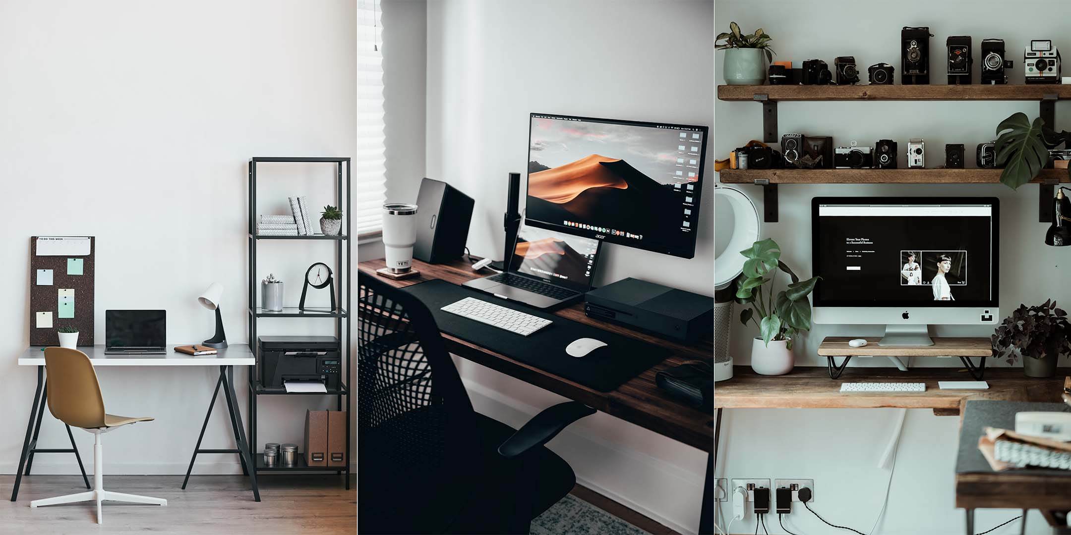
Frame a workspace with graphite-violet walls. Furnish with mustard-seed filing cabinets and quartz-pink desk accessories.
The Future of Chic Color
As technology and sustainability intersect, expect pigment innovations—biodegradable neon inks, color-shifting coatings, and AI-curated palettes. Modern chic color ideas will evolve, offering ever-richer, more personalized design opportunities.
Implementing modern chic color ideas is the quickest path to an interior that feels both current and timeless. Through expert balancing of hue, saturation, and texture, you can craft a home environment that reflects your unique style while maintaining sophisticated cohesion. Embrace these chic color trends and watch your modern living spaces come alive with unparalleled flair and whimsy.
:max_bytes(150000):strip_icc()/timesless-design-GettyImages-944634598-c6bf1951f25446689c34ec7638a1fe53.jpg "Timeless Furniture Ideas for Any Style")