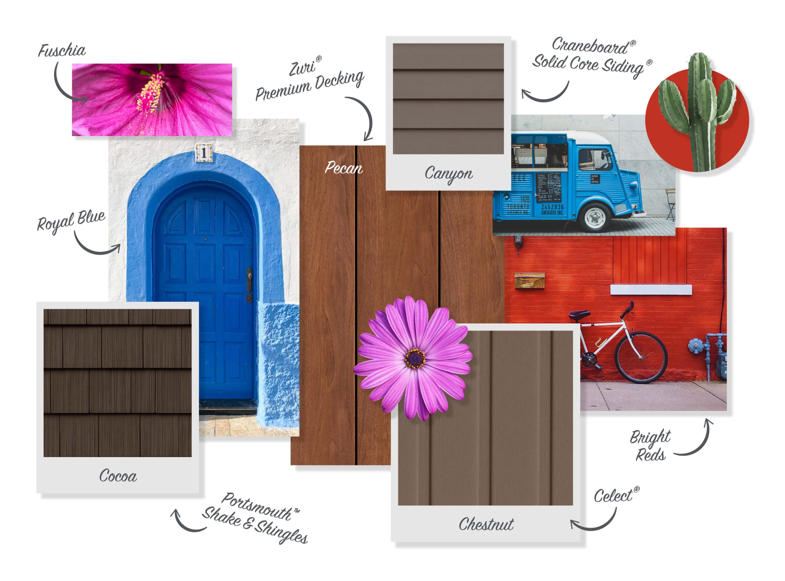
Color Trends to Brighten Small Rooms creating an inviting and spacious atmosphere in a small room is all about smart design choices, and one of the most impactful elements is color. The right shades can elevate a tiny space from feeling cramped to charming, and from dull to dazzling. With a thoughtful approach to hues, textures, and contrasts, you can easily breathe life into every corner of your home. Let’s explore the latest small room color updates that interior designers swear by to make compact living spaces feel expansive and energetic.

Why Color Matters in Small Rooms
Color isn’t just a matter of aesthetics—it plays a powerful psychological role. Soft pastels, airy neutrals, and luminous shades can reflect more light and give the illusion of openness. When used strategically, colors can elongate walls, highlight architectural features, and provide a cheerful ambiance even in limited square footage.
The goal is to strike a balance between style and spatial perception. Embrace colors that help bounce light around the room and keep it from feeling boxed in. And remember: you don’t have to sacrifice personality just because the room is small.
Light Neutrals That Open Up a Room
One of the most reliable small room color updates is the use of light neutrals. Think creamy whites, barely-there beiges, and soft grays. These tones create a seamless flow between walls, ceilings, and floors, reducing visual interruptions and making a room appear more expansive.
Best Picks:
- Chalk White – Clean and timeless.
- Pale Sand – Adds a touch of warmth.
- Foggy Gray – Cool and contemporary.
Pair these neutrals with natural materials like oak wood or jute rugs for an effortlessly airy and welcoming feel.
Pastels That Whisper Style
Don’t underestimate the quiet charm of pastel shades. Soft lilacs, mint greens, and powder blues can offer depth without overwhelming a small space. These gentle colors are perfect for bedrooms, bathrooms, or cozy reading nooks.
Pastel Winners:
- Dusty Rose – Romantic and soft.
- Sky Blue – Serene and expansive.
- Butter Yellow – Sunny and optimistic.
Pastels are perfect for layering. Add texture through textiles like velvet cushions or chunky knits to make your space feel multi-dimensional without adding clutter.
Bold Accents in the Right Places
While light colors are generally favored for small spaces, you can still inject boldness into your home. The secret lies in the placement. Use deep shades as accent walls, or incorporate them into furniture, rugs, or accessories.
Statement Shades:
- Emerald Green – Luxurious and energizing.
- Cobalt Blue – Deep and dramatic.
- Marigold – Vibrant and inviting.
Just one bold pop can give a small room a big personality. Keep the surrounding palette subdued so the focal color stands out beautifully.
The Magic of Monochrome
Monochrome palettes simplify the visual experience and make a small room look more organized and polished. You can use various shades of the same color to create depth and interest.
Try working with:
- Shades of Gray – Sophisticated and balanced.
- Blush Tones – Soft and layered.
- Warm Taupes – Rich but not overpowering.
Use different finishes—matte, satin, and gloss—to give the monochrome effect more dimension and dynamism.
Reflective and Glossy Finishes
Reflective surfaces like satin or semi-gloss finishes bounce light around a small room, amplifying brightness. Pale hues in glossy finishes can act almost like a mirror, enhancing the perception of openness.
Pro Tip: Use gloss paint on ceilings to draw the eye upward and give the illusion of height.
Color Zoning to Define Space
When your small room serves multiple functions—like a studio apartment or a multipurpose guest room—use color zoning to define areas. Contrasting shades or accent trims can separate a sleep zone from a work zone without needing partitions.
Great combinations include:
- Cream & Sage Green
- Ivory & Slate Blue
- Soft Peach & Light Charcoal
These combinations work best when you maintain similar tones and intensity, ensuring the room still feels cohesive.
Embrace Earth Tones in Small Doses
Earthy hues like terracotta, ochre, and clay are trending right now for their grounding properties. While they can feel heavy in large doses, small rooms benefit from earthy accent walls or furniture pieces that provide visual warmth without closing in the space.
Ideal touches:
- A terracotta headboard
- Ochre throw pillows
- Clay-toned pottery
These touches pair beautifully with light wood tones and whitewashed walls.
Color and Light: The Dynamic Duo
Don’t forget that natural and artificial lighting dramatically affects how color appears. A color that looks fresh and energizing in the morning might seem muted at night.
Tips:
- North-facing rooms benefit from warm tones like buttery yellows or soft coral.
- South-facing rooms can handle cooler shades like dusty blue or pale green.
- Use dimmable lighting to shift the mood depending on the time of day.
Understanding the interplay of color and light ensures your small room color updates are effective and visually pleasing.
Ceilings and Floors: The Forgotten Canvases
To make a small room feel more open, consider the ceilings and floors. Painting the ceiling the same color as the walls creates a seamless cocoon that avoids visual cuts. Alternatively, painting the ceiling a slightly lighter shade can make the room feel taller.
For flooring, light-colored wood, pale tiles, or even painted floorboards in soft gray or white can amplify a sense of space.
Smart Pairings: Colors That Expand Visual Boundaries
To trick the eye into seeing more space, combine:
- White walls + pale blue trim
- Beige walls + ivory ceiling
- Soft green walls + taupe furniture
These combinations blur hard lines, giving the room a tranquil, open effect.
Modern Neutrals with a Twist
Move beyond basic beige. Today’s modern neutrals include:
- Greige – A sophisticated blend of gray and beige.
- Mushroom – A warm, muted brown.
- Bone – A yellow-based white that exudes calm.
These tones serve as ideal backdrops for pops of color, metallic finishes, or organic textures.
Vertical Stripes and Ombre Walls
Vertical stripes elongate walls and draw the eye upward. Try tone-on-tone stripes in neutral hues for subtle sophistication. Ombre walls, fading from dark to light, create a dreamy gradient that adds interest without overwhelming a small space.
DIY tip: Use painter’s tape and a sponge roller to achieve clean lines and gradients.
The Scandinavian Effect
Scandinavian design is known for making small spaces feel cozy yet minimal. The palette revolves around white, gray, muted blues, and pale wood tones. Add soft textures, plants, and clean lines to complete the look.
Try this trio:
- White walls
- Pale gray sofa
- Blush-toned throw blanket
It’s calming, stylish, and universally flattering.
The Psychology of Color in Compact Spaces
Understanding color psychology is a must for smart small room color updates. Here’s what different colors communicate:
- Blue: Calm, serene, expansive
- Green: Balanced, natural, refreshing
- Yellow: Happy, bright, energizing
- Gray: Neutral, sophisticated, grounded
Use these emotional cues to guide your palette depending on the room’s function—soothing blues for a bedroom, sunny yellows for a workspace, or grounded neutrals for a lounge.
Final Thoughts
Designing small spaces doesn’t mean limiting your creativity. In fact, it opens up the opportunity to innovate and make bold yet thoughtful choices. By selecting colors that reflect your personal style and enhance spatial flow, you can transform any petite room into a charming sanctuary.
These small room color updates are not just about aesthetics—they’re about creating harmony, comfort, and the illusion of more. With the right hues and application techniques, every inch of your home can shine with personality and style.