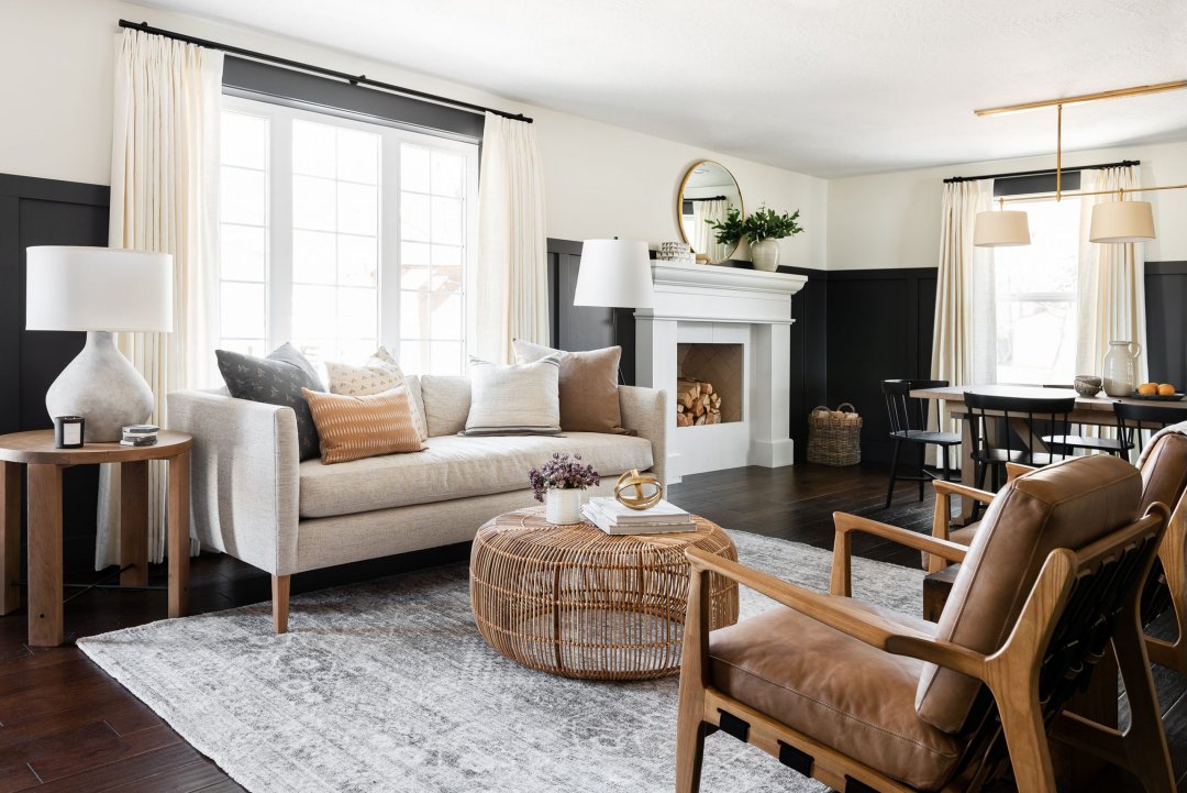
Color Trends Designers Swear By n the ever-evolving world of design, color remains one of the most powerful tools for shaping emotion, identity, and aesthetic harmony. Each year brings new palettes and pigment stories, but some shades transcend fleeting fashion. These are the hues seasoned professionals gravitate toward—those timeless, adaptable, and emotionally resonant choices that anchor spaces with poise and purpose.
Welcome to the vibrant universe of trusted designer color trends, a curated exploration of tones that continue to dominate mood boards, model homes, runways, and boutique interiors. This article walks through designer-approved shades, explains their psychological impact, reveals unexpected pairings, and provides pro styling insights for every type of space.

The Timeless Power of a Designer’s Palette
Why do designers trust certain colors over others? It’s not just about beauty. It’s about balance, versatility, cultural resonance, and emotional response. The right hue does more than look good—it tells a story.
Colors that make the cut as trusted designer color trends often share common characteristics:
- Timeless appeal across seasons and styles
- Emotional depth that creates mood
- Adaptability with materials and lighting
- Easy pairing with other design elements
Whether earthy neutrals or daring brights, these colors earn their status through longevity and impact.
1. Warm Taupe – The New Foundation
Move over beige—taupe is the new neutral of choice. Designers love its warm, mushroomy base that works equally well in modern, rustic, or eclectic interiors. Taupe brings softness without blandness and effortlessly elevates both small and expansive spaces.
Best Uses: Wall color for open-plan homes, upholstery for sofas and chairs, kitchen cabinetry with matte finishes
Pair With: Black and brass accents, blush pinks or olive greens, natural wood and raw textiles
Warm taupe is a subtle powerhouse in the realm of trusted designer color trends—quietly chic and always flexible.
2. Moody Navy – Sophistication Without Black
Navy blue remains a go-to for designers wanting depth without the severity of true black. It’s intellectual, rich, and plays well with a variety of textures, from glossy lacquer to matte linen. Designers love navy for its ability to feel classic and edgy all at once.
Best Uses: Statement walls, built-in bookcases, velvet upholstery
Pair With: Ochre or brass accents, white oak flooring, marbled countertops or textured ceramics
When seeking elegance with a contemporary twist, navy remains one of the most trusted designer color trends in the toolkit.
3. Sage Green – The Quiet Star of Wellness Design
Nothing speaks to the wellness movement quite like sage. This calming, slightly gray-toned green evokes eucalyptus leaves and mossy tranquility. Designers flock to sage for its ability to create serene, spa-like spaces that still feel modern.
Best Uses: Bathrooms and bedrooms, entryway walls, cabinetry in kitchens with natural light
Pair With: Light stone, raw wood, soft creams and dusty pinks, terracotta planters or brass hardware
Sage green anchors many of today’s most restorative environments—earning its place among trusted designer color trends for its soothing, evergreen charm.
4. Charcoal Gray – Edgy and Elegant
Forget flat grays—charcoal offers drama without darkness. This smoky tone is a favorite for designers who want depth and neutrality in one. Charcoal frames spaces beautifully and provides a sleek backdrop for art, color pops, or layered textures.
Best Uses: Feature walls, fireplace surrounds, modern kitchens or masculine bedrooms
Pair With: Burnished gold, cobalt blue or dusty rose, concrete and glass finishes
Charcoal’s quiet strength makes it a darling of minimalist and industrial styles alike. It’s not surprising it remains a staple among trusted designer color trends.
5. Clay and Terracotta – Earth’s Bold Whisper
Organic, grounded, and increasingly sought after, clay tones bring a hand-crafted warmth to interiors. From soft burnt sienna to dusky terra, these colors exude a rustic modernity that designers adore.
Best Uses: Accent walls, textured tile backsplashes, decor pieces like vases or woven rugs
Pair With: Bone white and sage green, rich browns and golds, natural fibers like jute or hemp
These hues feel ancient yet incredibly current—embodying the soulful spirit of trusted designer color trends in 2025.
6. Deep Plum – The New Royalty
Luxurious yet unconventional, deep plum offers richness without being garish. Designers choose this bold shade for intimate lounges, formal dining spaces, or eclectic rooms that need a strong focal hue.
Best Uses: Accent chairs or ottomans, moody bedroom walls, curated art backdrops
Pair With: Dusty rose and muted teal, gold or mirrored accents, dark walnut furniture
Plum is decadent, confident, and a refreshing twist in the palette of trusted designer color trends.
7. Crisp White – Still Undefeated
Though bold colors dominate trend lists, white is a perennial favorite for designers. The secret? Knowing which white to choose. From warm alabaster to cool arctic, there’s a nuanced white for every lighting condition and design style.
Best Uses: Gallery walls, Scandinavian-inspired spaces, layered neutral interiors
Pair With: Natural light and shadow play, textures over tones, organic shapes and minimal furniture
Crisp white isn’t boring—it’s a strategic canvas. It’s the baseline from which many trusted designer color trends shine.
8. Sun-Baked Yellow – Optimism, Bottled
Warm, muted yellows—think marigold, ochre, or straw—bring sunshine into any space. Designers often use this hue to spark joy or create warmth in colder climates.
Best Uses: Kitchen backsplashes, entry hallways, upholstery for accent chairs
Pair With: Charcoal gray or sage green, brass, wood, or rattan, hand-dyed textiles and earthy ceramics
Sun-baked yellow radiates gentle positivity—a standout choice among optimistic trusted designer color trends.
9. Ink Blue – Where Art Meets Architecture
Darker than navy, ink blue is moody, mysterious, and endlessly sophisticated. It adds intellectual weight to interiors and is often used in spaces where contemplation or conversation occurs.
Best Uses: Study or library walls, artistic feature walls, painted wood furniture
Pair With: Creamy whites and soft metallics, structured modern furniture, layered books, objects, and personal mementos
This shade is cerebral and grounding—firmly rooted in the world of trusted designer color trends for cultured interiors.
10. Blush Nude – Feminine, Not Fragile
Soft, rosy nudes have evolved from trendy pinks into sophisticated base tones. Designers love blush for its warmth, neutrality, and unexpected ability to pair with strong colors.
Best Uses: Bedrooms and boudoirs, bathroom tile or accessories, modern nursery palettes
Pair With: Olive or plum, white oak or dark walnut, linen, wool, and velvet textures
Blush nude is delicate but modern—a rising star in the list of trusted designer color trends that feels at once fresh and timeless.
Layering and Texture: Enhancing Color’s Impact
What separates a well-designed space from an ordinary one? It’s not just the color itself—but how it’s layered, textured, and contrasted. Designers understand that the true magic of a color comes to life when it’s applied with purpose and material synergy.
Matte finishes create softness and subtlety
High-gloss paints offer drama and light reflection
Natural textures like raw wood, linen, and stone enhance warm hues
Metallic sheens like bronze or brushed brass add luxe to cool tones
Layered fabrics build dimension and comfort
Understanding these elements helps the most successful trusted designer color trends move beyond flat swatches into immersive, tactile experiences.
Color in Context: Light, Scale, and Function
No color exists in a vacuum. Designers always consider:
Natural vs. artificial light – Warm bulbs intensify red/yellow tones, while cool LEDs amplify blues and grays
Room size and purpose – Lighter colors expand space, deeper tones add intimacy
Ceiling height and architectural details – Certain shades can highlight moldings, beams, or window trims
Emotional function – Bedrooms call for calm; dining rooms can handle vibrancy
By approaching each space holistically, designers ensure their chosen hues work with—not against—the room’s essence.
The Psychology Behind the Palette
Designers aren’t just artists—they’re emotional strategists. Colors evoke deep, often subconscious, responses. The best trusted designer color trends are carefully chosen for their ability to enhance well-being, productivity, or relaxation.
Cool tones like sage and ink blue lower blood pressure and heart rate
Warm tones like clay and ochre boost energy and appetite
Neutral tones like taupe and charcoal ground the mind and body
Bold accent colors like plum or marigold create drama and excitement
It’s not about trend-chasing—it’s about creating emotional resonance through color.
Forecasting the Future of Designer-Approved Colors
While many hues on this list have stood the test of time, the next wave of trusted designer color trends may include:
Digital-inspired neons with softened edges
Earth-mineral pigments sourced sustainably
Multi-tonal ombrés for walls and upholstery
Bio-reactive paints that respond to light or heat
Design is always evolving—but some colors remain timeless because of their emotional pull, versatility, and ability to tell a story across decades and disciplines.
Final Thoughts
Great design is color-aware. It respects the nuance of undertones, the complexity of light, and the richness of pairing. The best designers know which hues to return to again and again—the ones that create beauty, clarity, warmth, or mystery.
Whether you’re repainting a living room, reimagining a brand, or styling a photo shoot, these trusted designer color trends offer a roadmap to expressive, elevated, and emotionally intelligent spaces. Bold or subtle, bright or neutral, these shades have proven their worth in the hands of visionaries—and they’re ready to transform your world, one wall at a time.


