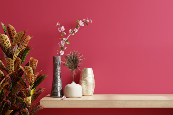
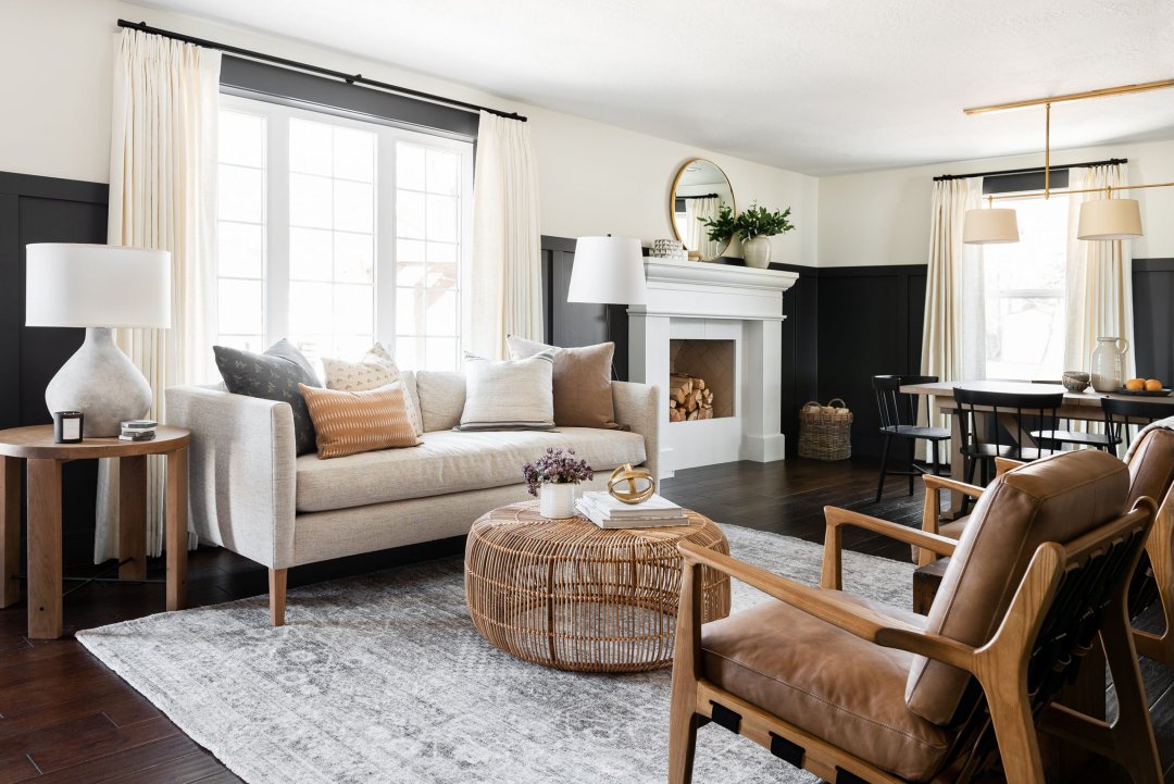
Go Bold with These Color Trends color is power. It has the unique ability to set a mood, define a space, and express personality with unapologetic flair. While neutral tones often take center stage in minimalistic interiors, there’s a growing shift toward maximalism—where bold is beautiful and vibrancy is celebrated. This shift has ushered in a powerful movement centered around bold vibrant color choices that exude confidence, warmth, and creativity.
Whether you’re transforming a room or looking to infuse your space with expressive energy, this guide explores daring color trends that are reshaping interiors across the globe. Get ready to go bold—and love every minute of it.

The Rise of Bold Color in Interior Design
Subtle hues had their time. Now, people are craving spaces that reflect character and emotional richness. Designers are increasingly leaning into color stories that captivate—diving into deep jewel tones, electric neons, and unexpected pairings that challenge convention.
These bold vibrant color choices are not just trends; they’re a statement. They tell the world that your space, much like your personality, refuses to be muted.
1. Fiery Red: The New Neutral?
Once considered too overpowering for interiors, fiery red is staging a major comeback. Think crimson velvet sofas, terracotta feature walls, and scarlet kitchen cabinets.
Why It Works:
- Red energizes and stimulates conversation.
- It adds immediate warmth to both modern and traditional settings.
- When used thoughtfully, red can balance luxury with livability.
How to Use:
Pair red with deep charcoal, dusty rose, or even a soft mint for a surprisingly elegant twist.
2. Royal Blue: Bold Meets Serene
Royal blue may seem classic, but its bold richness brings a refreshing punch when used as a dominant color. Its versatility makes it a go-to shade for living rooms, entryways, and even bathrooms.
Why It Works:
- It’s intense without being overwhelming.
- Royal blue projects confidence and stability.
- It works beautifully with metallics like gold or brass.
How to Use:
Use royal blue as a wall color, or introduce it via large furniture like a statement armchair or cabinetry. Pair it with textured neutrals like oatmeal or jute.
3. Citrus Explosion: Lemon, Tangerine, and Lime
Looking to inject pure joy into a space? Citrus hues are bursting onto the design scene, bringing sunshine to even the gloomiest corners.
Why It Works:
- These shades uplift mood and invite playfulness.
- They’re perfect for creative zones like studios and kids’ rooms.
- When layered, they create a high-energy, youthful vibe.
How to Use:
Accent pillows, bar stools, or painted door frames in citrus tones can be enough to make a room pop without going overboard.
These are truly bold vibrant color choices that wake up any space.
4. Deep Emerald: The Luxe Statement
Emerald green radiates opulence. This jewel tone has depth, character, and an evergreen sophistication that refuses to fade.
Why It Works:
- Emerald evokes nature and tranquility.
- It adds drama without feeling heavy.
- Paired with the right finishes, it’s timelessly chic.
How to Use:
Try emerald in velvet upholstery, tiled backsplashes, or an accent wall framed by clean white trim.
5. Neon Revival: Bold, Brash, and Brilliant
Neon colors aren’t just for nightclubs anymore. Designers are reclaiming them for home interiors—using them sparingly for big impact.
Why It Works:
- Neon infuses instant personality.
- It works as a fun contrast to more subdued tones.
- Great for contemporary or futuristic interiors.
How to Use:
Think neon pink light fixtures, electric green planters, or highlighter-yellow bar stools in an all-white kitchen.
6. Cobalt and Mustard: A Match Made in Color Heaven
Cobalt blue and mustard yellow may seem like an odd couple, but together, they bring balance and brilliance.
Why It Works:
- Cobalt feels modern and punchy.
- Mustard adds grounded warmth.
- Together, they create a palette that’s edgy yet inviting.
How to Use:
Try cobalt on walls or furniture and mustard in textiles like rugs or curtains. Add matte black accents to tie it all together.
These are among the most compelling bold vibrant color choices for eclectic and artistic spaces.
7. Ultra Violet: Mystical and Mysterious
Pantone’s Color of the Year not long ago, ultra violet continues to hold space as a forward-thinking, creative shade.
Why It Works:
- It evokes cosmic energy and innovation.
- Ideal for meditation rooms, libraries, or creative studios.
- It offers a sophisticated alternative to black.
How to Use:
Paint a ceiling ultra violet and add white walls for contrast. Use it with emerald or mustard for a regal look.
8. Hot Coral and Blush Pink
This duo walks the fine line between fiery and soft. Hot coral is more saturated than traditional pinks, and when paired with blush, it feels both bold and romantic.
Why It Works:
- These tones flatter skin and natural light.
- They bring vibrancy without being garish.
- Works especially well in dining rooms and bedrooms.
How to Use:
Layer textiles—throw blankets, cushions, and drapes—in both tones. Add white or rose gold fixtures to enhance the feminine energy.
9. Rich Maroon and Slate
Grounded yet dramatic, maroon brings in a sense of elegance that feels deep and moody. When paired with slate gray, it becomes a grown-up palette with creative energy.
Why It Works:
- Maroon feels mature and introspective.
- Slate acts as a neutralizer and contrast.
- Both shades are strong, yet highly livable.
How to Use:
Paint built-in bookshelves maroon and contrast them with a slate-colored couch or cabinetry.
10. Bold Earth: Ochre, Rust, and Terracotta
Earth tones are anything but boring when they’re turned up a notch. Rusty reds, golden ochres, and sun-baked terracottas are redefining what it means to decorate with nature.
Why It Works:
- These tones are grounding yet adventurous.
- They’re deeply connected to global and artisanal aesthetics.
- They play well with both cool and warm undertones.
How to Use:
Layer these in wall paint, ceramics, or textiles. They’re especially cozy in living and dining areas.
They make ideal bold vibrant color choices for bohemian, desert-modern, or Mediterranean-inspired interiors.
Styling Tips for Bold Colors
Embracing boldness doesn’t mean overloading your space with saturated hues. Here’s how to strike balance:
- Start with Accents: If you’re color-shy, try bold hues in small doses—like vases, artwork, or a throw blanket.
- Pick One Focal Color: Let one bold color be the star, and use neutrals or pastels to support it.
- Mix Finishes: A matte bold wall pairs beautifully with glossy, smooth furnishings.
- Embrace Patterns: Geometric or abstract patterns with bold colors can add an extra layer of visual interest.
- Don’t Neglect Lighting: Bold colors look best when they’re well-lit. Use natural light during the day and warm LED lighting at night to keep the space vibrant.
Color Psychology Behind Bold Choices
Every color tells a story. Here’s what these bold vibrant color choices say about your space:
- Red – Passion, excitement, energy
- Yellow – Optimism, creativity, youthfulness
- Blue – Intelligence, trust, calm
- Green – Balance, renewal, abundance
- Orange – Playfulness, enthusiasm, warmth
- Purple – Imagination, luxury, spirituality
- Pink – Compassion, fun, elegance
- Black – Sophistication, power, mystery
- White – Cleanliness, clarity, simplicity
By curating your color palette intentionally, you shape not only the look of your room but the feel it evokes.
Unexpected Pairings That Work
Take your bold game up a notch with pairings that feel fresh and avant-garde:
- Navy + Fuchsia: Classic meets contemporary
- Burnt Orange + Aqua: Desert heat meets ocean cool
- Turquoise + Chocolate Brown: Tropical and earthy
- Lavender + Lemon: Sweet and tangy contrast
- Forest Green + Bubblegum Pink: Nature with a wink
These pairings challenge design norms and invite you to play outside the lines.
Where to Use Bold Colors
While every room can benefit from boldness, some spaces shine brighter with more color love:
Kitchen
Use bold cabinetry or backsplash tiles to create a statement cooking space.
Bathroom
Experiment with deep tones like navy, emerald, or coral in a small powder room for a jewel-box effect.
Bedroom
Opt for bold bedding, accent walls, or even a painted ceiling to envelop the space in personality.
Entryway
First impressions matter. A vibrant door, bold wallpaper, or striking rug sets the tone.
Final Thoughts
The world of design is shifting away from beige-on-beige and into a world where self-expression reigns supreme. If you’re craving interiors that speak louder, last longer, and lift your spirit, it’s time to embrace bold vibrant color choices.
Color isn’t just a backdrop—it’s a main character. It can invigorate, comfort, empower, and inspire. So go bold. Let your home reflect your courage, creativity, and confidence. Because life’s too short for dull decor.
Kalau kamu butuh versi ini sebagai file dokumen siap pakai, tinggal bilang saja ya!


