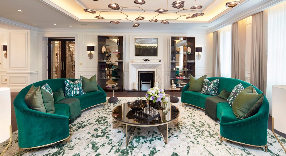
Pastel Color Trends for a Soft Look when it comes to creating interiors that whisper elegance and peace, nothing quite compares to the power of pastels. These gentle hues provide a soothing alternative to bold brights and moody darks, allowing homeowners to infuse their spaces with lightness, charm, and refinement. In 2025, soft pastel color ideas are taking center stage in the world of interior design.

Why Pastels Work So Well in Interiors
Pastels evoke a sense of calm and serenity, making them ideal for spaces meant for relaxation and personal rejuvenation. Think bedrooms, reading nooks, nurseries, or even home offices that aim to lower stress levels. The secret lies in their subtle saturation — colors that are lightened with white, reducing visual weight and intensity.
The Emotional Power of Pastel Palettes
One of the most compelling aspects of soft pastel color ideas is their psychological impact. Pale pinks foster feelings of nurturing and softness, baby blues evoke clarity and tranquility, while buttery yellows introduce gentle optimism. These colors are perfect for setting a mindful tone within any living space.
Trending Pastel Colors for 2025
1. Muted Lavender
Soft yet sophisticated, muted lavender is being used to create dreamy bedrooms and elegant living rooms. Paired with creams or deeper purples, it becomes a versatile color suitable for multiple design aesthetics.
2. Cloud Blue
This hue is reminiscent of clear spring skies. Designers are using cloud blue in bathrooms and kitchens to create clean and airy environments that feel both modern and timeless.
3. Sage Mint
A crossover between soft green and barely-there mint, sage mint is perfect for creating a natural yet stylish space. It complements wooden furniture and brass accents exceptionally well.
4. Powder Blush
A whisper of pink that works beautifully in both classic and contemporary settings. Powder blush offers a touch of romance without becoming overwhelming.
5. Peach Cream
Warmer than pink but gentler than orange, peach cream adds a sunny glow to any room. It’s especially popular in nursery designs and wellness-focused spaces.
Rooms That Benefit Most from Pastels
Bedrooms
The gentle tones of pastels make bedrooms feel like sanctuaries. Pair pastel walls with crisp white bedding and natural textures for a look that’s both refreshing and timeless.
Living Rooms
Pastels can help balance the energetic vibe often found in living areas. Think blush sofas, mint accent walls, or sky-blue throws that harmonize with neutral surroundings.
Kitchens
Kitchens are seeing a resurgence of color, with soft pastel color ideas leading the charge. Pale pink cabinets or mint backsplashes make a delightful contrast to metallic hardware and white countertops.
Bathrooms
Transform your bathroom into a spa with pastel tiles or paint. Colors like soft aqua or lavender lend an ethereal feel, perfect for self-care rituals.
How to Use Pastels Without Overdoing It
Layer with Neutrals
Balance is key when using pastels. Layer them with shades of white, taupe, or gray to avoid an overly saccharine look.
Mix Textures
Different textures can give pastels more dimension. Think of a velvet pastel sofa, matte pastel paint, or glossy tiles in light hues.
Try Pastel Accents
Not ready to commit to a full pastel room? Try incorporating pastel touches through art, pillows, lamps, or rugs.
Combine with Bolder Shades
For those who love contrast, pair pastels with deep navy, charcoal, or even mustard to ground the softness and create a dynamic palette.
Pairing Pastels with Design Styles
Scandinavian
Scandinavian design’s focus on light and minimalism pairs beautifully with pastels. Think soft pink walls, pale wooden furniture, and plush textures.
Coastal
In a coastal interior, pastel blues, seafoam greens, and sandy pinks echo the beach while maintaining a light and breezy feel.
Boho
Layering pastels with ethnic prints, macramé, and wooden accents gives a global, eclectic flair to any room.
Mid-Century Modern
Use pastels on statement furniture pieces — like a robin’s egg blue sofa or blush pink dining chairs — to add a playful yet chic vibe.
The Return of Two-Tone Pastel Walls
A big trend on the horizon involves painting two-tone walls using pastels. For example, the bottom half of a wall might be painted a soft coral, while the top is finished in a pale cream. This technique adds subtle visual interest while keeping things serene.
Pastels in Decor and Accessories
Rugs
Pastel rugs can anchor a space without overwhelming it. Think pale geometric patterns or watercolor designs in soft hues.
Curtains
Choose sheer pastel curtains to let light filter through and enhance the color’s delicate presence.
Wall Art
Watercolor artwork, abstract pastels, or photographic prints with soft tones can reinforce your pastel palette while adding personality.
Lighting
Opt for pastel lampshades or glass pendants to bring a touch of hue to overhead and table lighting.
Tips from Top Designers
- “Use pastels like neutrals,” suggests interior designer Marla Grey. “They’re quiet but expressive.”
- Color consultant Joshua Fields recommends mixing pastels with organic textures for depth.
- Architect Delaney Rios says, “Incorporating soft pastel color ideas into unexpected places — like ceilings or cabinetry interiors — surprises and delights.”
Whether you’re revamping a whole home or adding subtle updates, soft pastel color ideas offer a versatile, calming, and undeniably stylish way to do it. From muted lavenders to buttery creams, these hues can transform everyday rooms into havens of peace and personality.
For those seeking timeless appeal with a whisper of modernity, pastels are the design language of 2025. Use them with intention, blend them with balance, and watch your home take on a fresh, airy new spirit — one subtle stroke at a time.