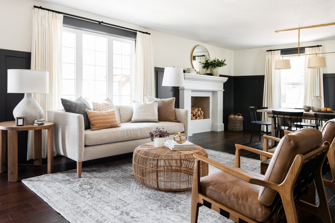
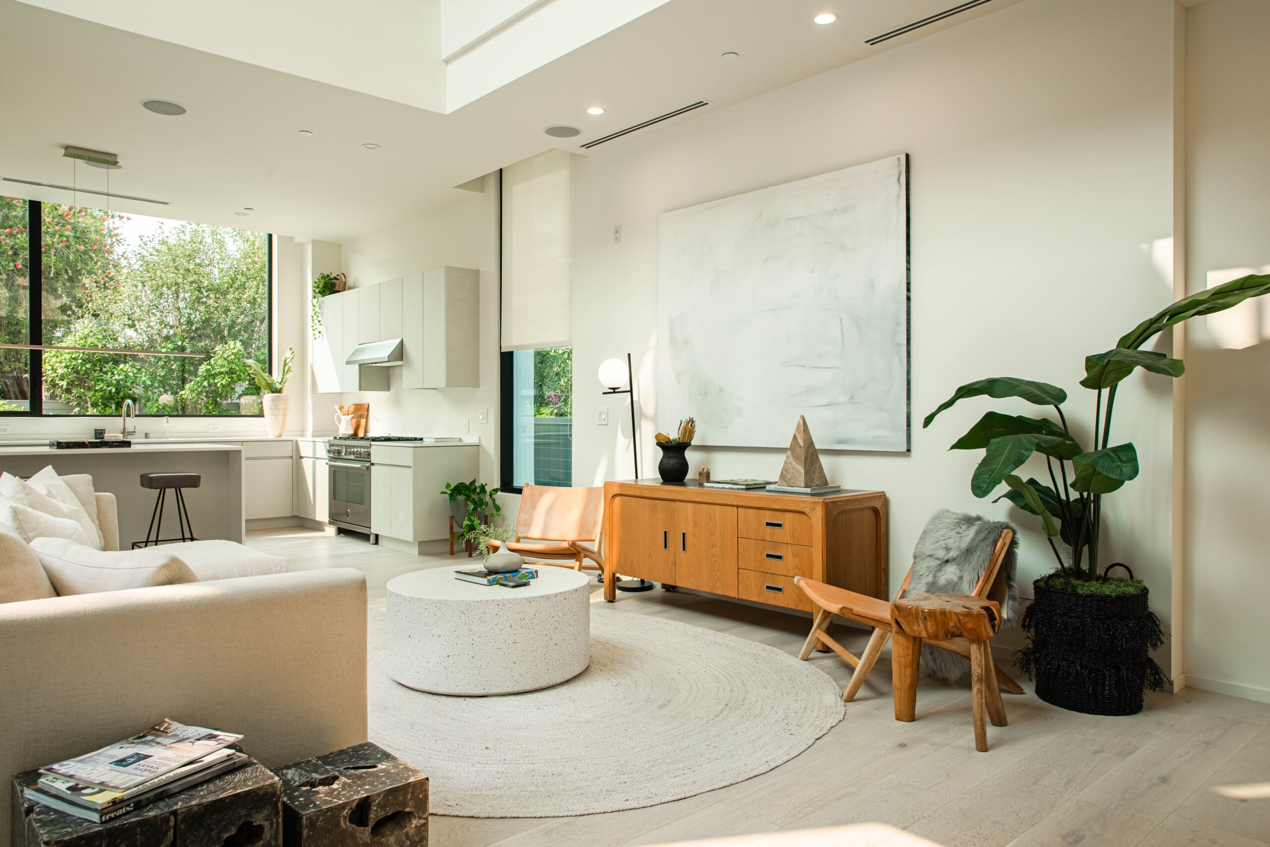
Color Trends for a Peaceful Home in a world that rarely slows down, our homes have become sanctuaries—refuges where serenity should take root and bloom. The secret to curating tranquility within four walls lies in a careful harmony of hues. Choosing a peaceful calming home palette isn’t simply about muted tones or soft shades. It’s about emotional resonance, the way certain colors slow the heartbeat, soften the breath, and quiet the mind. Whether you’re redesigning an entire space or simply refreshing a corner, tapping into the latest color trends can transform your home into a calming oasis.

The Psychology of Peaceful Colors
Colors don’t merely fill space—they affect how we feel, think, and behave. The human brain is wired to associate certain hues with nature, comfort, or safety. A peaceful calming home palette works in subtle ways:
Blues lower blood pressure and slow respiration
Greens balance emotion and energy
Beiges and off-whites offer psychological spaciousness
Soft pinks and lavenders reduce stress and aggression
When thoughtfully applied, these colors offer a cocooning effect—a gentle embrace that lingers.
1. Muted Sage and Olive Green: Nature’s Whisper
Why It Works
Sage and olive tones draw directly from nature—herbs, moss, eucalyptus, and forests. These greens are neither too bright nor too dark, making them the perfect balance between grounded and refreshing.
Application Tips
Use sage for bedroom walls to foster deep rest
Pair olive cabinetry with soft stone backsplashes for a spa-like kitchen
Incorporate woven textiles in green hues to enhance texture and warmth
Pair With
Cream, light wood, and matte black metal fixtures
These greens absorb light beautifully, muting harsh glares and creating a consistently soft glow throughout the day.
2. Warm Greige: The New Neutral
Why It Works
When grey and beige meet, magic happens. Greige provides the sophistication of gray with the warmth of beige—an ideal background for layering.
Application Tips
Use greige in living rooms to create a gallery-like calm
Paint entire open-plan spaces for visual continuity
Try greige floor coverings for timeless underfoot comfort
Pair With
Soft white trims, natural linen curtains, or caramel-toned woods
Greige neither dominates nor fades—rather, it breathes.
3. Dusty Rose and Blush: Subtle Romance
Why It Works
Soft pinks have evolved from their overly feminine past into serene, contemporary statements. They carry emotional warmth, conjuring comfort and quiet joy.
Application Tips
Use dusty rose for upholstered furniture or accent walls in reading nooks
Paint bathroom vanities in muted blush for a soothing routine
Choose soft pink bed linens for delicate, romantic layering
Pair With
Muted greens, matte brass hardware, and ivory tones
These hues bring a heart-centered energy to any space, radiating gentleness and subtle optimism.
4. Pale Sky Blue and Powder Blue: Airy Serenity
Why It Works
Sky blue evokes open air, endless skies, and gentle breezes. It’s an age-old favorite for a reason—it speaks directly to the nervous system’s need for peace.
Application Tips
Paint nursery walls or ceilings in powder blue for an instant sense of openness
Introduce sky blue ceramic tiles into the bathroom or kitchen
Use powder blue throws and pillows on cream-toned sofas for visual coolness
Pair With
White oak floors, cane accents, or cloud-white walls
Blues help elongate spaces visually while encouraging deep, mindful breathing.
5. Taupe and Stone: Earth-Based Tranquility
Why It Works
Rooted in nature, these tones offer the stability of rock and the warmth of dry earth. Perfect for anchoring larger rooms without making them feel heavy.
Application Tips
Choose stone-colored tiles for entryways or sunrooms
Layer taupe rugs over hardwood for sound absorption and warmth
Use taupe for baseboards and trims instead of stark white
Pair With
Olive greens, camel leather, or dried botanical arrangements
Their grounding nature makes them invaluable in building a peaceful calming home palette that feels sophisticated and safe.
6. Linen White and Bone: Pure Stillness
Why It Works
True white can feel sterile. But shades like linen and bone offer a warmer alternative that evokes softness and stillness without starkness.
Application Tips
Ideal for minimalist kitchens with wooden open shelving
Paint entire ceilings in bone for an enveloping glow
Use white linen fabrics for bedding, tablecloths, or window treatments
Pair With
Soft pastel accents, warm metals, or terracotta pottery
These near-whites reflect natural light beautifully, making spaces feel both expansive and soft.
7. Misty Lavender and Soft Lilac: Floral Calm
Why It Works
Lavender isn’t just a color—it’s a fragrance, a field, a memory. When diluted with gray or blue, it becomes a tranquil anchor.
Application Tips
Try soft lilac walls in guest bedrooms for a welcoming ambiance
Introduce misty lavender towels or bath mats in the bathroom
Use in home offices to gently encourage focus without pressure
Pair With
Warm gray, soft gold, or sheer fabrics for a dreamy effect
Lavender’s subtle vibrancy ensures it feels fresh, never flat.
8. Mushroom and Driftwood: Timeless Calm
Why It Works
These organic, muted browns mimic natural materials and neutral soil tones. They’re complex enough to remain interesting, yet subdued enough for layering.
Application Tips
Install mushroom-colored cabinetry in transitional kitchens
Choose driftwood-inspired planks for floors or wall paneling
Use mushroom-hued textiles in bedrooms for warm minimalism
Pair With
Frosted glass, eucalyptus, or ivory ceramic accents
Perfect for grounding airy color schemes while keeping the peace intact.
9. Soft Terracotta and Cinnamon Dust: Earth’s Warm Hug
Why It Works
Soft terracotta brings grounded warmth. These shades connect us to earth, warmth, and rustic simplicity.
Application Tips
Create terracotta feature walls in meditative spaces or yoga rooms
Add cinnamon-toned ceramics or planters around sunlit windows
Paint staircase risers or hallway nooks for hidden cozy surprises
Pair With
Wheat linen, olive green, or matte black accents
These earth-infused tones bring heart and hearth energy into your home.
10. Ocean Gray and Seafoam: Coastal Tranquility
Why It Works
Derived from water’s shifting hues, these colors represent emotional fluidity and inner reflection.
Application Tips
Use seafoam in bathrooms to invoke a soft coastal spa feel
Try ocean gray sofas or bed frames for structure that doesn’t overpower
Paint trims in seafoam or ocean gray as a whimsical deviation from white
Pair With
Pebble-toned rugs, light driftwood, or sea glass décor
These watery tones blend effortlessly with both modern and vintage aesthetics.
Building Your Palette
Crafting a cohesive peaceful calming home palette involves more than choosing pretty colors. It’s a layered process:
- Choose a primary neutral—greige, warm white, or taupe
- Incorporate 2–3 calm accents—sky blue, sage green, dusty pink
- Embrace texture—rattan, linen, matte finishes, brushed metals
- Test colors in natural light at different times of day
- Echo each hue in at least three elements for harmony
Light and Shadow
Color doesn’t exist without light. North-facing rooms benefit from warm blushes and bone, while south-facing spaces glow with pale blues and seafoam. Dimmers and layered lighting ensure your home stays peaceful from dawn till dusk.
Subtle Accents
For gentle contrast, introduce dusty mustard, soft charcoal, muted teal, or antique gold in small doses—pillows, lamps, or an accent chair.
Final Thoughts
Designing a peaceful home isn’t about stripping away personality—it’s about intentionality. Through a layered blend of texture, shadow, and hue, your home can become a sanctuary of stillness and renewal. A peaceful calming home palette does more than beautify—it nurtures. Let these trends guide you toward a home that feels like a deep, restorative breath.