
High-Contrast Color Trends That Pop in the ever-evolving world of design, high contrast color style has emerged as a bold, expressive approach that refuses to blend in. It’s not for the faint of heart—it’s for the fearless. From runway fashion to interior design, digital branding to street art, this dynamic aesthetic is reshaping visual landscapes with vibrancy and intention.
What Is High-Contrast Color?
At its core, high-contrast color is about juxtaposing colors that lie opposite on the color wheel or offer stark differences in value (light vs. dark). Think jet black against pure white, electric blue beside lemon yellow, or scarlet red framed by mint green. This clash isn’t accidental; it’s calculated brilliance.
Unlike low-contrast palettes that melt gently into one another, high contrast color style electrifies the eye. It stimulates attention, demands interaction, and creates a visual rhythm that’s hard to ignore.
Why It Works So Well
Our brains are wired to notice contrast. Whether it’s spotting ripe fruit in the wild or reading text on a screen, contrast helps us distinguish and decide quickly. Designers have long used this to their advantage, but today’s interpretation is far more than functional—it’s emotional and evocative.
When used skillfully, high contrast color style adds drama, depth, and daring to any design project. It can create hierarchy, highlight focal points, and infuse personality that leaps off the canvas.
Fashion’s Love Affair with Contrast
In the world of fashion, contrast is couture. Designers are pairing neons with neutrals, layering textures with metallics, and embracing maximalism like never before. The runways in 2025 are awash with bold statements—orange paired with cobalt, emerald clashing against fuchsia, and zebra prints making a grand comeback.
Black-and-white, the quintessential high contrast color style, remains a timeless staple in fashion. But the new wave is about unexpected pairings and asymmetrical boldness. Outfits aren’t just coordinated—they’re choreographed for impact.
Tips to Embrace High Contrast in Your Wardrobe:
- Pair a bright blazer with a muted base.
- Experiment with complementary accessories (think violet with chartreuse).
- Use color-blocking techniques to draw attention to silhouettes and structure.
Interior Design’s Bold Transition
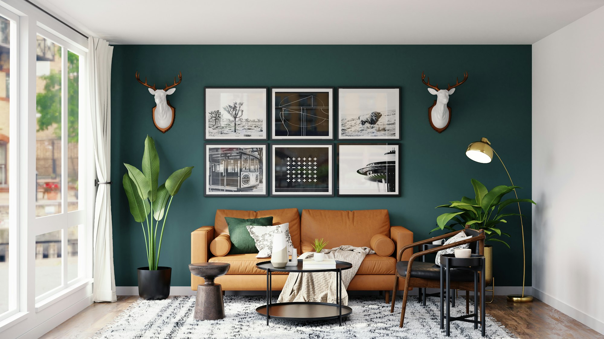
Home décor has shifted gears from safe beige to striking contrast. Accent walls are no longer just navy or burgundy—they’re graphic black-and-white stripes or vibrant murals that pulse with opposing hues. Furniture designers are blending materials like matte black metal with vivid glass tops in crimson or tangerine.
The key to using high contrast color style in interiors lies in balance. While contrast is king, chaos is not. Contrast should guide the eye, not confuse it.
Design Strategies for Interiors:
- Choose a neutral base (white, gray, or black), then add pops of contrast with throw pillows, artwork, or rugs.
- Play with finishes: glossy white against a textured charcoal wall creates depth and intrigue.
- Light matters. Let contrast shine under natural or well-placed lighting to avoid flatness.
Graphic Design and Branding: Where It Truly Pops
From logos to landing pages, high contrast color style is the lifeblood of visual storytelling in digital branding. In an attention economy, brands can’t afford to be ignored. High contrast commands presence, enhancing readability and reinforcing brand identity.
Bold colors are no longer optional—they’re essential. Tech startups, fashion houses, wellness brands—they all leverage contrast to stand apart in saturated markets.
Branding Done Right:
- Spotify’s use of neon green against dark backgrounds makes their logo pop across platforms.
- Nike’s classic black and white offers a clean, authoritative feel.
- Monzo, a challenger bank, uses hot coral and indigo for a fresh, disruptive tone.
These color decisions aren’t arbitrary; they’re meticulously calculated to leave a lasting impression.
The Psychology Behind the Pop
Color psychology explains why contrast affects us so deeply. High-contrast pairings, like red and white or black and yellow, are used in warning signs for a reason—they catch the eye, signal importance, and spark immediate attention.
In branding, these combinations evoke trust, urgency, or modernity, depending on the shades selected. The high contrast color style triggers emotional reactions faster than softer palettes.
Consider this:
- Black and gold = luxury.
- Red and white = urgency.
- Blue and orange = energy and friendliness.
Choosing the right contrast for the right message is a powerful psychological move.
Tech and UI Design: Contrast Meets Accessibility
Designing for screens isn’t just about beauty—it’s about usability. High contrast color style plays a vital role in making digital products accessible to all users, including those with visual impairments. The Web Content Accessibility Guidelines (WCAG) even mandate minimum contrast ratios for legibility.
High contrast buttons, icons, and text blocks ensure that apps and websites are not only stylish but inclusive.
Best Practices in UI/UX:
- Use dark text on light backgrounds and vice versa.
- Avoid overly saturated combos that strain the eyes.
- Ensure consistent contrast across states (hover, click, disabled) for intuitive interaction.
Accessibility can be aesthetic. In fact, the intersection of contrast and inclusivity is where some of the most innovative designs happen today.
Pop Culture and the Power of Contrast
From album covers to movie posters, high contrast color style has dominated visual narratives in pop culture. Think of the iconic “Black Panther” poster—a powerful use of metallic purples and deep blacks. Or Taylor Swift’s “Reputation” era with its stark black-and-white branding.
Contrast tells a story. It evokes mood, conflict, resolution, or rebellion. When used with intent, it’s more than just eye-catching—it’s soul-grabbing.
Art and Photography: Framing with Opposites
Photographers have long understood the impact of contrast—not just in light and shadow but in color composition. Juxtaposing a model in a fire-red dress against a muted landscape, or using a blue filter against a warm-toned setting, are techniques that create emotional resonance.
In art, high contrast is used to create visual tension, a push and pull that makes the viewer linger. The high contrast color style becomes a compositional tool, guiding the gaze and enhancing storytelling.
DIY and Crafting: Contrast with Creativity
Even in handmade crafts, scrapbooking, and DIY home projects, contrast plays a huge role. Crafters are embracing vibrant combinations like lime and violet or black and sunflower yellow to bring personal projects to life.
Tips for crafters:
- Use high contrast scrapbook paper for focal points.
- Mix glossy and matte textures in opposing colors for a layered effect.
- Explore tie-dye or resin art with daring color juxtapositions.
Contrast doesn’t require a big budget—it just needs brave creativity.
Cultural Interpretations of Contrast
Color contrast holds different meanings in various cultures. In traditional Chinese design, red and gold signify luck and wealth—a high contrast pairing with deep cultural roots. In Western funeral attire, black and white symbolize mourning and purity, respectively—again, contrast with emotional depth.
Understanding these interpretations ensures that the use of high contrast color style is both aesthetically compelling and culturally respectful.
High Contrast Color in Nature
Nature is the original contrast designer. Think of a toucan’s beak, a zebra’s stripes, or a coral reef teeming with electric blues and bright yellows. These are not just beautiful—they’re functional, often used for camouflage, mating, or warning predators.
Designers frequently take cues from these natural pairings, mimicking their energy and balance in man-made environments.
Emerging Color Pairings That Pop
The landscape of high-contrast design continues to evolve. Here are some emerging high contrast color style duos making waves in 2025:
- Digital Lavender and Burnt Orange – tech meets earthiness
- Butter Yellow and Ink Black – soft rebellion
- Lime Green and Deep Plum – unexpected harmony
- Ocean Teal and Cherry Red – energetic calm
- Neon Peach and Navy Blue – future-forward meets timeless
These pairings are being explored in everything from packaging to fashion campaigns, with brands hungry to stay ahead of visual trends.
Sustainability and Contrast
Sustainability meets high-contrast when ethical materials and minimalist shapes are paired with color statements. Eco-brands are ditching the dull greens and browns for bolder choices—because sustainability doesn’t mean boring. It means standing out for the right reasons.
Eco-packaging with high contrast color style communicates urgency and innovation. It shows that the product isn’t just environmentally friendly—it’s fresh, modern, and ready for the future.
The Future of Contrast
As AI-generated designs, AR/VR experiences, and wearable tech continue to develop, the role of color contrast will only grow. These immersive technologies rely on visual clarity and emotional impact—two domains where high contrast color style excels.
Expect to see contrast used not just for aesthetics but for navigation, mood modulation, and enhanced virtual environments.
Making It Work for You
Want to incorporate high contrast into your personal or professional aesthetic? Start small. A pair of shoes, a desktop wallpaper, a new Instagram highlight cover. Then experiment. Play. Clash on purpose. You’re not just creating a palette—you’re telling a story.
Guiding principles:
- Balance strong contrasts with areas of rest (neutrals or space).
- Be intentional. Every color should have a reason to be there.
- Test in context. What pops on a screen may behave differently in print or fabric.
Final Thoughts
Contrast is courage. It’s clarity. It’s confidence in color form. The high contrast color style isn’t just a fleeting trend—it’s a movement toward visual storytelling that’s rich, unapologetic, and powerfully human.
Whether you’re a designer, a brand strategist, a fashion lover, or just someone looking to brighten your space, embracing contrast will make your world a whole lot bolder—and a whole lot more beautiful.

:strip_icc()/living-room-blue-seating-tv-63771dae-64830a9709d941cfbc1fdd0f98587745.jpg "Color Trends That Work Year-Round")