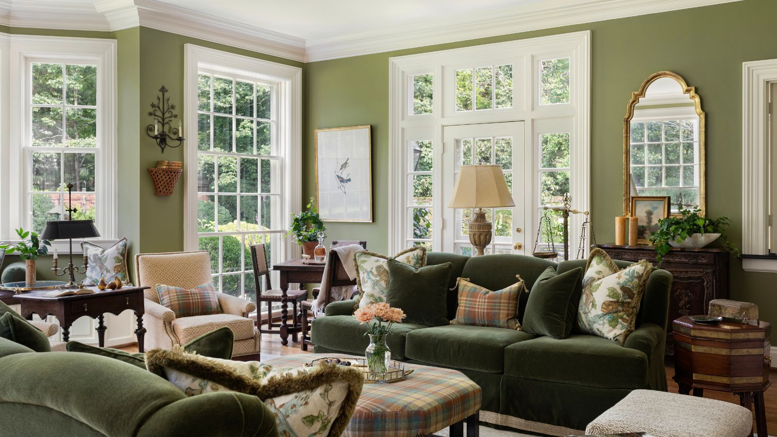
Rich Color Trends to Try Right Now the power of color cannot be overstated. It evokes emotion, defines a space, and sets the tone for how we experience our surroundings. While minimalism had its moment with icy neutrals and clinical whites, design has taken a sumptuous turn toward deeper, more indulgent hues. Today’s interiors are embracing richness—not just in pigment but in feeling. Think velvety depth, regal undertones, and hues that wrap around you like a cashmere blanket. Welcome to the world of rich warm color choices, where bold meets elegant and dramatic meets livable.
Let’s delve into this exciting trend, exploring shades that captivate the eye and envelop the senses. These are the color trends to try right now if you’re ready to elevate your home, wardrobe, or creative palette with saturated sophistication.
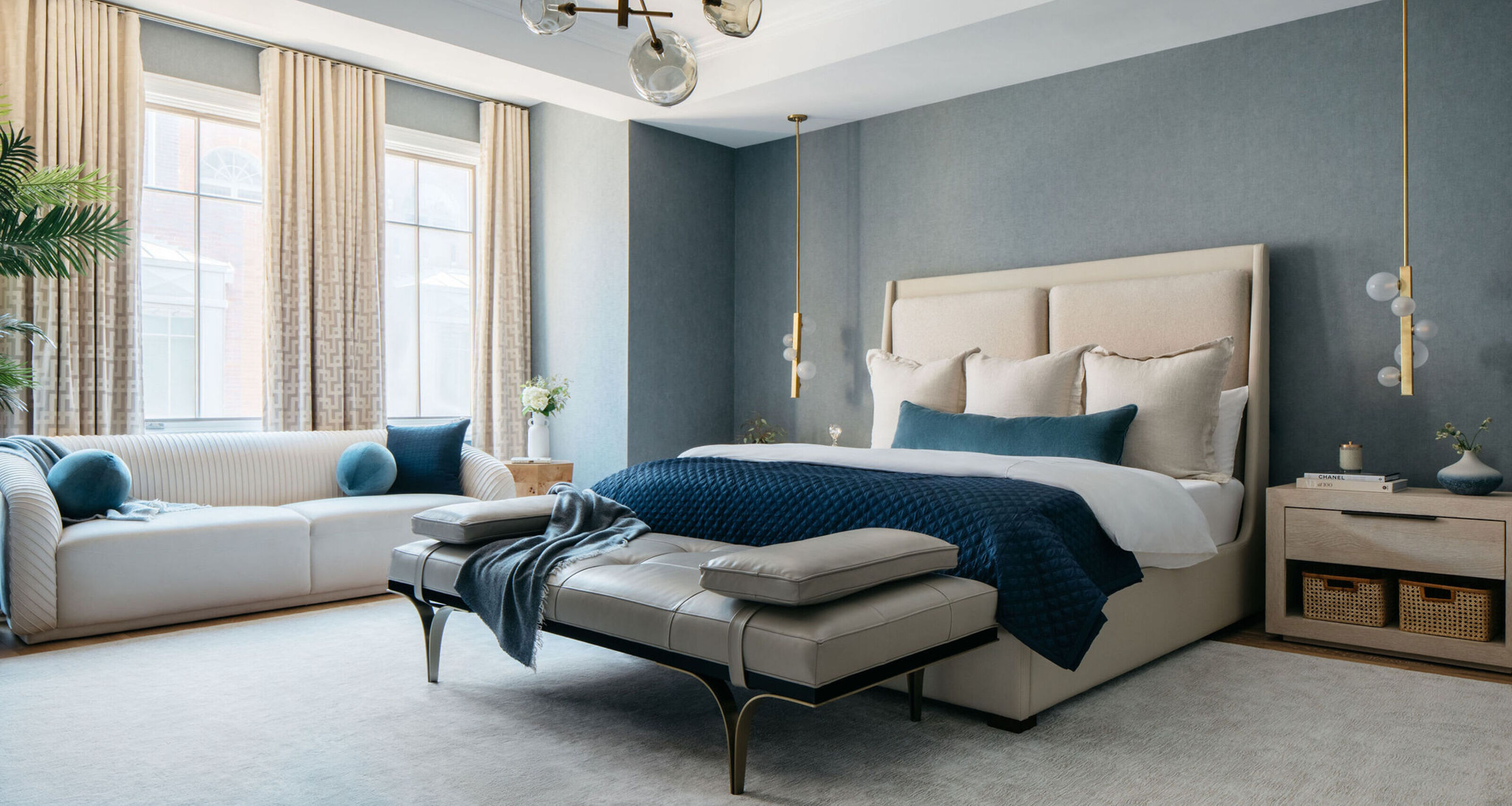
Why Rich Color Matters
Color is more than aesthetic—it’s a psychological driver. Rich tones, especially warm ones, create a sense of comfort, security, and intimacy. They bring a room to life, making it feel curated rather than cookie-cutter. These hues are not afraid to stand out, yet they never feel garish. They’re confident. Assured. Refined.
Interior designers, fashion houses, and even tech branding are all shifting toward rich warm color choices to convey luxury, tradition, and a touch of mystery. And unlike fleeting trends, these colors hold their ground season after season.
The Renaissance of Richness
Historically, deep and warm colors were associated with royalty, wealth, and sacred spaces. From the velvety crimsons of Renaissance paintings to the golden ochres of Byzantine mosaics, rich colors have always had a seat at the high table of design.
Today, we see that legacy translated into modern interiors, fashion-forward runways, and lifestyle products that exude warmth and sophistication. These aren’t just colors—they’re statements of taste and timelessness.
Core Characteristics of Rich Warm Colors
Before diving into specific hues, it helps to understand what makes a color feel rich and warm:
- Depth: Pigments with complex undertones feel more sophisticated.
- Warmth: Undertones that skew toward red, orange, or gold evoke coziness.
- Luminosity: Even dark shades can glow when paired with the right textures and lighting.
- Earthiness: Many rich tones draw inspiration from nature—clay, spice, wood, and wine.
Together, these qualities create a palette that is sensual, grounding, and endlessly versatile.
Must-Try Rich Warm Color Choices
Here’s a curated lineup of the most compelling rich warm color choices dominating design this year. Each one tells a unique story and offers practical inspiration for styling in real life.
1. Burnt Sienna
Burnt sienna is a warm, earthy red that exudes both comfort and strength. Reminiscent of desert cliffs and baked clay, it works beautifully in bohemian interiors, rustic kitchens, and accent walls.
Best Uses:
- Living room textiles like rugs or cushions
- Accent wall paired with creamy white trim
- Ceramic tiles or pottery
Pairs Well With:
- Olive green
- Ivory or pale taupe
- Brushed brass
Burnt sienna is a foundational element in the realm of rich warm color choices—earthy yet refined.
2. Aubergine
Deep, almost-black purple, aubergine brings a sultry richness perfect for creating dramatic spaces. It feels luxurious in velvet or silk textures and is a go-to for intimate dining rooms or moody bedrooms.
Best Uses:
- Upholstered furniture
- Wall paint in low-light rooms
- Fashion: coats, scarves, eveningwear
Pairs Well With:
- Rose gold
- Charcoal gray
- Amber
Aubergine’s depth invites contemplation and elegance, earning its place among this year’s standout rich warm color choices.
3. Amber Gold
Warmer than ochre, richer than mustard, amber gold glows with sunlit intensity. It brings vintage flair to modern designs and infuses a sense of optimism and nostalgia.
Best Uses:
- Kitchen backsplashes
- Bedding and drapery
- Velvet accent chairs
Pairs Well With:
- Navy blue
- Terracotta
- Walnut wood
This hue is for those who want to embrace boldness with warmth and vibrancy, making amber gold a top pick in rich warm color choices.
4. Deep Teal
A blend of peacock blue and forest green, deep teal strikes a harmonious balance between cool and warm. When used in plush materials or matte paints, it creates a luxurious, cocooning effect.
Best Uses:
- Office walls or built-ins
- Bathroom tiles
- Velvet couches
Pairs Well With:
- Antique brass
- Cream or soft camel
- Burgundy
Though technically not a warm hue by definition, deep teal behaves warmly when styled correctly, contributing richly to layered palettes.
5. Cognac
Cognac is a color you can taste—it’s smooth, aged, and subtly opulent. This rich, leathery brown works in traditional and contemporary spaces alike, adding a touch of masculinity and maturity.
Best Uses:
- Leather seating or accessories
- Hardwood floors
- Handbags and shoes
Pairs Well With:
- Soft gray or ivory
- Forest green
- Gold fixtures
Cognac’s understated elegance is what makes it a staple in rich warm color choices across both interiors and fashion.
6. Maroon
Deeper and more sophisticated than basic red, maroon carries weight and legacy. It’s often seen in classic libraries, heritage branding, and formal wear. It creates a rich, intellectual energy that never goes out of style.
Best Uses:
- Dining room walls
- Velvet throw blankets
- Outerwear for fall
Pairs Well With:
- Pale pink or blush
- Burnished copper
- Ebony wood
Maroon commands attention while remaining elegant and grounded.
7. Ochre
Ochre brings a sunbaked, mineral quality that adds warmth without being loud. It’s perfect for adding character to neutral spaces and pairs exceptionally well with natural materials.
Best Uses:
- Area rugs
- Wall paint for hallways
- Ceramics and vases
Pairs Well With:
- Olive or forest green
- Cream and beige
- Natural linen or raw wood
Ochre’s soft glow makes it an unsung hero among rich warm color choices.
Unexpected Color Pairings
Part of the magic in using rich colors is their ability to surprise. Here are a few creative pairings that elevate these tones to new heights:
- Amber + Plum: Warm, regal, and unexpected—perfect for holiday tablescapes or velvet bedding
- Terracotta + Blush: Earthy meets airy, striking a balance between grounded and graceful
- Teal + Cognac: A warm-cool combo that creates dynamic sophistication
- Ochre + Charcoal: Modern, edgy, and rooted in natural contrast
Design thrives on contrast and tension—don’t be afraid to mix warm with cool, light with dark, matte with gloss.
Rich Color in Interior Design
Rich hues are transformative. They shrink large rooms to create intimacy and elevate small rooms with character. The key lies in placement and proportion.
Living Room
Use rich warm color choices like maroon or cognac on a statement sofa, balanced with creamy pillows and brass lighting. Add depth with a navy or plum rug for a layered effect.
Kitchen
Incorporate deep teal cabinetry or burnt sienna backsplashes. Add amber pendant lights or ochre bar stools for contrast and warmth.
Bedroom
Opt for aubergine walls with blush bedding. Accent with walnut nightstands and antique gold frames to amplify coziness.
Bathroom
Try dramatic teal or maroon walls paired with white tile and brass fixtures. Rich color elevates even the smallest spaces when styled intentionally.
Rich Color in Fashion
Clothing is another canvas where rich warm color choices shine. These hues suggest confidence, elegance, and individuality.
Fall/Winter Staples:
- Cognac leather boots
- Deep plum scarves
- Maroon wool coats
- Ochre knitwear
Spring/Summer Transitions:
- Amber sundresses
- Teal silk blouses
- Clay-toned trousers
Rich colors translate beautifully into layered outfits and monochromatic statements alike. They elevate even the most casual silhouette.
Texture and Finish Matter
To make rich colors truly sing, think beyond flat paint or solid fabric. Use texture to enhance depth and richness:
- Velvet: amplifies light and shadow for dramatic impact
- Linen: softens bold tones with matte, organic touch
- Leather: adds depth and sheen, especially in cognac and maroon
- Silk or satin: perfect for teal, aubergine, or amber—creates elegant movement
Pairing the right finish with the right color brings richness to life in tactile, irresistible ways.
How Lighting Affects Rich Colors
Warm light enhances warm hues. Opt for soft white or gold-tinted lighting to make rich warm color choices glow. Avoid overly cool LEDs, which can flatten depth and kill ambiance.
Use layered lighting strategies:
- Ambient light for overall warmth
- Task lighting for accentuating materials
- Accent lighting (like wall sconces) to highlight texture and color variation
Lighting is the invisible brushstroke that can either dull or dramatize a rich palette.
Rich Colors and Emotional Impact
These colors aren’t just visually powerful—they’re emotionally intelligent:
- Amber and ochre radiate happiness and grounding
- Aubergine and maroon suggest mystery, elegance, and introspection
- Burnt sienna and cognac provide a sense of familiarity and warmth
- Deep teal and navy evoke calm authority
Use this knowledge to shape experiences. Create calm in the bedroom, energy in the kitchen, and reflection in the study.
Rich Color in Small Doses
Not ready to commit to full walls or wardrobes? Try these bite-sized applications:
- A maroon velvet cushion
- A clay-colored vase
- Ochre bedding
- Amber glassware
- Cognac leather tray or journal
Sometimes the subtlest expressions of rich warm color choices are the most effective.
Looking Ahead: The Evolution of Rich Color
As global design continues to shift toward personalization, sustainability, and emotional connection, rich hues will play an even greater role. Expect to see:
- Earth-mineral pigments made from sustainable sources
- Cultural heritage colors inspired by traditional textiles and craft
- Adaptive color palettes for multipurpose living spaces
- Mood-driven color curation based on circadian rhythm and biophilic design
Rich color is not a trend—it’s a reawakening. A return to sensuality, emotion, and human expression.
Final Thoughts
The world is rediscovering the comfort of color. In a landscape that once worshipped minimalism, we’re leaning back into boldness, warmth, and saturation. These rich warm color choices offer more than aesthetic appeal—they offer emotional resonance, personal style, and lasting beauty.
Whether you’re painting a wall, curating a wardrobe, or choosing a new throw pillow, let richness guide you. Choose colors that feel lived-in, deep, and evocative. Because right now, the world is ready to be colored in emotion—and you are the artist.