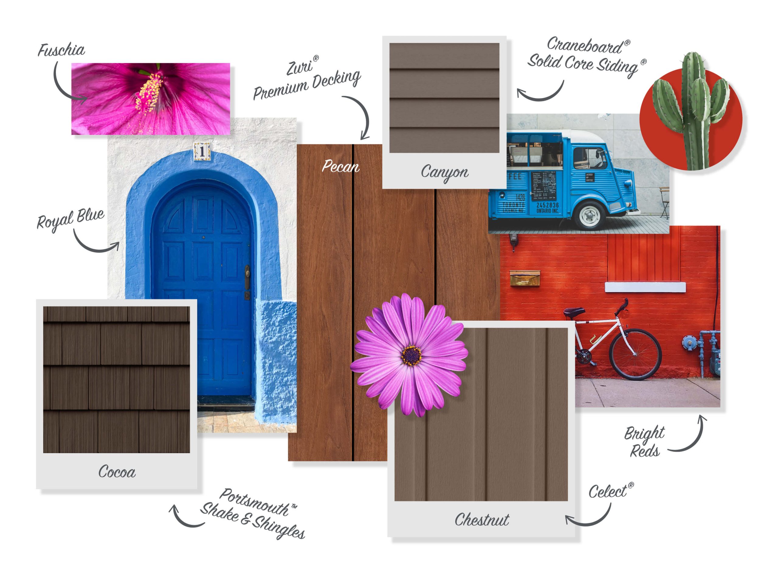
Color Trends That Feel Fresh and New in the ever-evolving world of design, color remains the most dynamic and expressive medium for reinvention. While classics never fade, there’s always room for hues that feel invigorating, unexpected, and full of promise. These modern palettes don’t just follow trends—they redefine them. They inspire creativity, evoke emotion, and reimagine what it means to feel current. Welcome to a spectrum of fresh new color inspiration that breathes life into interiors, wardrobes, and creative workspaces alike.
This exploration goes beyond just what’s trendy. It’s about hues that resonate with today’s sensibilities—sustainability, optimism, digital presence, and emotional well-being. Whether you’re looking to reinvent your home, rebrand your business, or refresh your creative canvas, these colors bring vibrancy and clarity in equal measure.

Why Color Refreshes the Soul
Color isn’t just seen—it’s felt. The right palette can uplift a tired space, spark new ideas, and stir emotion. Choosing new colors doesn’t always mean abandoning the familiar. Sometimes, a subtle shift in tone or a surprising pairing is all it takes to feel revitalized.
What makes a palette fresh today?
- Unexpected combinations that still feel cohesive
- Muted tones with clarity and depth
- Saturated hues grounded in nature or innovation
- Playful contrasts that spark curiosity
- Colors that align with emotional intelligence and mindfulness
Let’s dive into the shades and combinations offering fresh new color inspiration for this year and beyond.
1. Pistachio Green: Soft, Earthy, and Surprising
Pistachio is quickly emerging as the darling of contemporary interiors and fashion. It’s gentler than emerald, livelier than sage, and far more versatile than you’d expect.
Why it works:
- Evokes freshness without overwhelming
- Harmonizes with neutrals and pastels
- Lends a retro-modern feel in the right setting
Where to use it:
- Kitchen cabinetry
- Upholstered headboards
- Monochromatic outfits for spring
Color companions: Sand, terracotta, dusky rose, brushed gold
2. Digital Lavender: Tech Meets Tranquility
Part of the growing movement toward digital serenity, digital lavender offers a futuristic hue that still feels grounded. It exists at the intersection of calm and connectivity.
Why it works:
- Reflects the rise of well-being in tech design
- Feels nostalgic yet forward-thinking
- Energizes cool-toned neutrals
Where to use it:
- Minimalist bedrooms
- Wellness brand packaging
- Website accents and user interfaces
Color companions: Charcoal, pale mint, steel blue
3. Burnt Coral: A Sophisticated Sunset
Burnt coral revives the warmth of pink and orange while grounding them in maturity. It’s vibrant but tempered, playful yet poised.
Why it works:
- A spirited alternative to terracotta or blush
- Feels tropical and autumnal at once
- Perfect for statement walls or art
Where to use it:
- Feature chairs and stools
- Outdoor textiles
- Living room accessories
Color companions: Warm greys, olive, creamy white, indigo
4. Citron Yellow: The New Bold Neutral
Citron is bold—but not blinding. It walks the line between earthy and electric, making it one of the most intriguing shades in the current spectrum of fresh new color inspiration.
Why it works:
- Reflects light beautifully in modern spaces
- Adds pop without clashing
- Pairs with deep hues for drama or pale shades for balance
Where to use it:
- Entryway accents
- Bold bedding
- Abstract art pieces
Color companions: Slate, espresso, sky blue, ochre
5. Greige Reimagined: Cooler, Crisper, Cleaner
Greige isn’t new—but it’s getting a refreshing makeover. Today’s greige leans cooler, lighter, and far more modern, offering the perfect canvas for colorful accents.
Why it works:
- Works in both warm and cool-toned spaces
- Elegant and approachable
- Makes color layering easier
Where to use it:
- Entire walls
- Bathroom tiles
- Open concept living-dining areas
Color companions: Dusty lilac, navy, pine green, soft black
6. Electric Cobalt: Energizing and Edgy
Cobalt has always been dynamic, but today’s version is amped up with just enough luminosity to feel freshly charged. It’s being embraced by both high fashion and cutting-edge architecture.
Why it works:
- Adds depth and boldness without heaviness
- A versatile anchor for both minimalist and maximalist design
- Makes whites feel crisper
Where to use it:
- Kitchen backsplashes
- Oversized wall art
- Product branding
Color companions: Mustard, pearl grey, terra cotta, cream
7. Blush with Backbone
Forget pale pinks with no personality. Today’s blush has depth, a hint of moodiness, and surprising complexity. It’s modern, gender-neutral, and quietly dramatic.
Why it works:
- Warms up cold spaces
- Looks beautiful in natural light
- Unexpectedly pairs well with moody tones
Where to use it:
- Bathroom tiles
- Velvet armchairs
- Office walls
Color companions: Graphite, dusty olive, ivory, plum
8. Clay Blue: Rustic and Refined
Clay blue isn’t just coastal—it’s grounded. Unlike brighter teals or sky tones, it’s muted and natural, yet still distinctive.
Why it works:
- Inspired by earth and water
- Offers a rustic alternative to navy
- Works well with wood tones
Where to use it:
- Kitchen cabinetry
- Ceramic dishes
- Feature hallway walls
Color companions: Burnt orange, linen, bronze, taupe
9. Coral Red: Saturated and Confident
This bolder cousin of blush and coral feels decisive and radiant. Coral red makes no apologies—it’s energetic, expressive, and full of emotion.
Why it works:
- Great for accents that punch
- Modern without feeling aggressive
- Eye-catching but elegant
Where to use it:
- Front doors
- Accent furniture
- Digital branding
Color companions: Dusty blue, blackened teal, cream, muted lime
10. Moss Green: Modern Naturalism
Moss green is having a major revival as designers search for organic, grounding tones. It’s less yellow than olive, more vibrant than sage, and full of life.
Why it works:
- Feels restorative and grounding
- Pairs with both cool and warm palettes
- Evokes eco-conscious values
Where to use it:
- Bathrooms
- Living room walls
- Eco-luxe product design
Color companions: Pale blush, ash grey, walnut, ivory
The Power of Unlikely Pairings
One way to make a palette feel brand new is by combining familiar colors in unfamiliar ways. This method often leads to the most invigorating outcomes.
Try pairing:
- Clay blue + coral red = Mediterranean modern
- Digital lavender + pistachio = tech-meets-nature vibe
- Moss green + blush = botanical romance
- Cobalt + citron = high-energy modern
These fresh interactions breathe new life into palettes and contribute to the growing spectrum of fresh new color inspiration seen in art, retail, and residential design.
Texture and Finish: The Unsung Heroes
A color’s freshness isn’t just about the pigment—it’s also about how it’s presented. Matte, gloss, high-shine, or textured finishes can drastically alter perception.
Matte citron yellow on walls feels modern and architectural
Velvet blush upholstery adds depth and luxury
High-gloss digital lavender tiles reflect futuristic minimalism
Brushed cobalt blue on cabinetry gives an industrial yet refined aesthetic
Combining bold hues with thoughtful finishes is a surefire way to maximize their impact and keep them feeling fresh, not faddish.
Color Psychology and Emotional Freshness
Fresh color isn’t just about novelty. It’s also about how a shade makes you feel. Today’s palettes aren’t just visually appealing—they’re emotionally strategic.
- Pistachio soothes and uplifts
- Cobalt energizes and sharpens focus
- Moss green reconnects us to nature
- Blush nurtures and comforts
- Burnt coral inspires joy without overstimulation
Designers are increasingly using these insights to create interiors and products that resonate deeply with users—not just visually, but emotionally.
Bringing It Home: Easy Ways to Use Fresh Colors
You don’t have to overhaul an entire space to feel the energy of fresh new color inspiration. Sometimes a small change has a big impact.
- Paint a single door citron yellow
- Add pistachio or clay blue cushions to a neutral sofa
- Use digital lavender linens for a bedroom refresh
- Introduce cobalt ceramics into your kitchen
- Hang art with coral red or blush tones in a monochrome hallway
Color is meant to play, to experiment, and to evolve. Use it boldly, and let it tell a story that feels uniquely yours.
Final Reflections
Today’s color trends aren’t just reactions to what’s “in.” They are reflections of how we want to live—more present, more joyful, and more connected. These hues represent a shift away from conventional palettes and toward experimentation, optimism, and renewal.
The world of color is vast and alive, and there’s no shortage of fresh new color inspiration waiting to be discovered. Whether through gentle pistachio tones or fiery coral accents, these shades invite you to reimagine your environment with clarity, confidence, and creativity.
So go ahead. Paint boldly. Choose unexpectedly. Design with emotion. Because the colors that feel fresh today might just become the classics of tomorrow.