
Color Trends with Global Influence in the world of design, color transcends mere aesthetics—it tells stories, evokes emotions, and bridges continents. As homes and lifestyles become increasingly multicultural, color palettes infused with global culture color influences are redefining modern interiors. This global fusion doesn’t just reflect the beauty of distant lands; it brings a sense of travel, curiosity, and narrative depth to our everyday spaces.
Color, after all, is universal—but how we use it is deeply cultural.
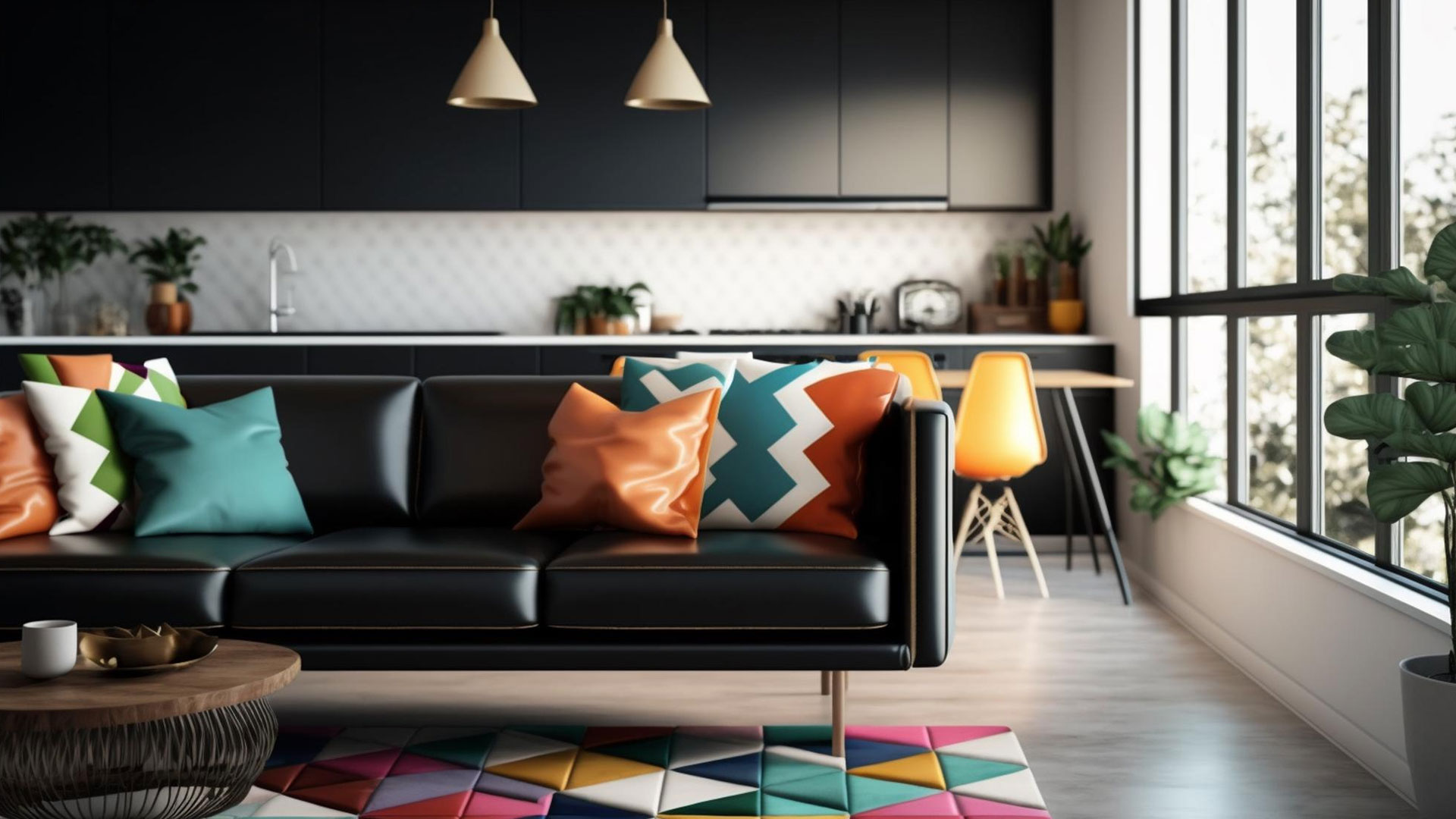
A Journey Through Hues: The Cultural Narrative of Color
Each region of the world possesses unique symbolic meanings and aesthetic preferences tied to color. By exploring these visual languages, designers are creating immersive, meaningful spaces that celebrate both individuality and connection.
Whether it’s the saffron orange of Indian textiles, the indigo blues of West African fabrics, or the earthen reds of Andean pottery, global culture color influences infuse interiors with a spirit of authenticity and exploration.
1. Moroccan Majesty: Ochre, Teal, and Terracotta
Morocco’s vibrant culture and architectural wonder inspire rich, warm palettes that dance between tradition and boldness. Ochre represents the desert sands, teal captures the Mediterranean, and terracotta symbolizes handcrafted clay tiles.
Perfect For:
- Courtyard-inspired patios
- Layered living rooms with mosaic elements
- Tiled entryways with handwoven rugs
This palette combines texture with saturated warmth, conjuring an atmosphere of ancient mystique and artisanal beauty.
2. Scandinavian Simplicity: Ice Blue, Pale Birch, and Charcoal
Northern Europe brings balance and clarity through its minimalist ethos. Inspired by snowy landscapes and understated luxury, this color trend embraces cool neutrals and organic materials.
Ideal In:
- Light-filled kitchens
- Hygge-infused bedrooms
- Minimalist workspaces
These hues provide a soothing backdrop for modern living, proof that global culture color influences don’t need to be loud to be impactful.
3. Japanese Serenity: Matcha Green, Indigo, and Soft Sand
Rooted in Wabi-sabi aesthetics, Japanese color palettes celebrate simplicity, imperfection, and natural beauty. Matcha green evokes tea ceremonies and peaceful gardens, while indigo nods to traditional dyeing techniques.
Best For:
- Zen-style bathrooms
- Tatami-inspired meditation rooms
- Wooden-finished kitchens
These tones create a meditative environment, encouraging mindfulness and connection to the natural world.
4. Latin American Passion: Chili Red, Cactus Green, and Marigold
Latin American color stories are expressive, joyful, and grounded in community traditions. From festive street art to traditional embroidery, the palettes are as dynamic as the cultures they represent.
Use In:
- Bold accent walls
- Playful dining areas
- Outdoor living spaces
These colors exude warmth, celebration, and resilience—perfect for interiors that spark conversation and life.
5. African Textural Depth: Earth Brown, Indigo Dye, and Sunset Orange
Sub-Saharan African influences blend bold hues with texture-rich materials. These palettes are inspired by tribal patterns, earthen homes, and natural dyes.
Best Suited For:
- Textured living room schemes
- Gallery-style halls
- Mixed-media home offices
The tones bring strength and grounding, showcasing how global culture color influences extend beyond shade to incorporate texture, history, and spirit.
6. Mediterranean Brights: Seafoam, Lemon, and Sun-Baked Clay
Drawing inspiration from Greece, Italy, and Spain, this color story is luminous and full of life. Seafoam echoes the Aegean, lemon adds a burst of citrus energy, and sun-baked clay connects to traditional terracotta architecture.
Perfect For:
- Indoor-outdoor kitchens
- Coastal dining nooks
- Tile-backed bar areas
The palette is lively yet effortless, marrying natural elegance with summery charm.
7. Middle Eastern Opulence: Sapphire, Gold, and Deep Plum
Luxurious and jewel-toned, Middle Eastern palettes bring drama and decadence. These colors evoke the richness of Persian carpets, ancient palaces, and intricate mosaics.
Ideal Settings:
- Velvet-upholstered lounges
- Accent ceilings with metallic finishes
- Intimate dining spaces
These hues add grandeur and depth, inviting storytelling and layers of interpretation.
8. Indian Heritage: Saffron, Peacock Blue, and Rosewood
India’s cultural vibrancy is beautifully reflected in its use of color. Saffron represents sacred rituals, peacock blue speaks of royal artistry, and rosewood grounds the scheme with earthy warmth.
Best Used In:
- Art-filled living areas
- Eclectic libraries
- Statement staircases
Pair with hand-carved furniture and block-printed textiles for a rich, immersive aesthetic rooted in heritage.
9. Arctic Minimalism: Snow White, Slate Gray, and Glacial Blue
Inspired by icy landscapes and a connection to vast, open skies, this palette channels the stillness and resilience of life near the poles.
Ideal For:
- Sleek modern kitchens
- Reading nooks with faux fur
- Monochromatic bathrooms
These serene tones bring clarity and calm, exemplifying how global culture color influences can also reflect isolation, endurance, and the power of simplicity.
10. Southeast Asian Fusion: Palm Green, Mango, and Warm Sand
Tropical yet grounded, this palette reflects the lush biodiversity and spiritual vibrancy of countries like Thailand, Indonesia, and Vietnam.
Use In:
- Indoor gardens
- Laid-back open living areas
- Textile-heavy bedrooms
Combine with bamboo, handwoven baskets, and artisanal lanterns to complete the look.
Why These Palettes Work in Today’s Homes
Modern design is about storytelling. These palettes offer more than just color—they provide context, identity, and emotional connection.
Incorporating global culture color influences invites:
- A celebration of heritage and diversity
- Opportunities for deeper design narratives
- A break from homogenous trends
- A heightened sense of belonging and inspiration
Materials and Patterns to Complement Global Color Palettes
Color alone doesn’t create impact—it’s the pairing with texture, pattern, and material that completes the picture.
Key Pairings:
- African indigos with woven mudcloth and clay beads
- Mediterranean brights with mosaic tile and wrought iron
- Scandinavian neutrals with pale wood and sheepskin
- Indian jewel tones with mirror work and silk brocade
These pairings add tactile interest, storytelling depth, and cultural integrity.
Balancing the Bold and the Subtle
When working with internationally inspired hues, balance is key. Not every wall needs a deep magenta or sunset orange. Use bolder tones for focal points, and offset with neutral or natural tones.
Tips:
- Try one bold wall, balanced by natural textures elsewhere
- Use textiles to introduce vibrant colors that are easy to swap
- Blend culturally inspired pieces with modern furniture to keep things fresh
This approach keeps your design grounded and versatile, even when incorporating daring colors.
Lighting and Environment
Cultural colors often come from environments with intense natural light—think of the sunlit streets of Marrakech or the bright coastlines of the Mediterranean. In more muted climates, adjust your lighting strategy to do these hues justice.
Consider:
- Warm white bulbs for reds, saffrons, and oranges
- Cooler lights for blues, whites, and icy tones
- Layered lighting (ceiling, floor, accent) to control ambiance
With the right illumination, global culture color influences feel natural, not overwhelming.
Creating a Cohesive Look
Blending global inspirations doesn’t mean turning your home into a cultural collage. Harmony comes from:
- Repeating one key color throughout various rooms
- Mixing traditional patterns with contemporary layouts
- Choosing two to three core cultural references rather than ten
When done thoughtfully, your home becomes a cultural tapestry—rich, expressive, and unique to you.
The Rise of Conscious Color Curation
Today’s homeowners are more informed and intentional. They seek meaning, sustainability, and inclusivity. This has driven the popularity of global culture color influences, aligning design with values.
Trends on the Rise:
- Custom paint mixes inspired by travel photos
- Collaborations with artisans to develop authentic palettes
- Homeware brands sourcing pigments and patterns from indigenous crafts
This shift reflects a deeper respect for cultural context and creative originality.
Final Reflections: The World in Color
Color is more than decoration—it’s expression, tradition, and celebration. The palettes shaped by global cultures bring humanity into our interiors. They teach, honor, and inspire.
By embracing global culture color influences, you don’t just transform your space—you open your doors to the world.
So whether you’re channeling Tokyo minimalism or Bolivian exuberance, let color be your passport. Because the most beautiful homes are those that tell global stories with local heart.
:max_bytes(150000):strip_icc()/thespruce-creampaintcolors-ashleymontgomerydesign-9a263826688340ba88b11395b73e56d1.png "Color Trends for Nature-Inspired Homes")
