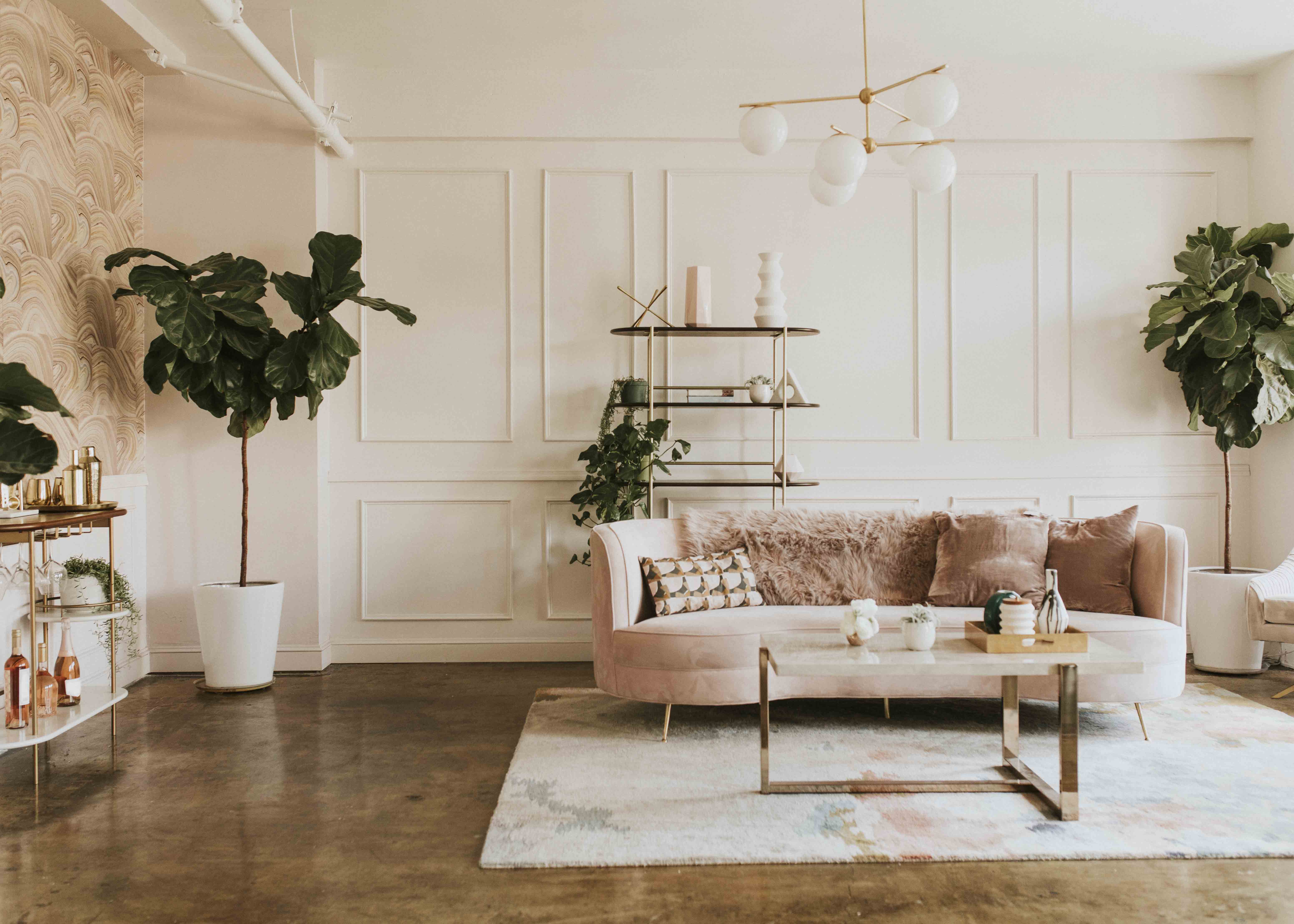
Simple Color Trends with Stunning Results Color has the power to transform a space in an instant. It can awaken a room’s personality, elevate everyday moments, and infuse even the humblest corner with flair. The secret lies not in complex palettes but in thoughtful restraint. With simple stunning color ideas, a pared-back approach yields maximum impact. These trends prove that a limited number of hues—deployed strategically—can achieve breathtaking outcomes.
Whether you’re painting walls, updating textiles, or selecting accent pieces, these straightforward strategies will guide you to results that feel both fresh and timeless.

The Case for Simplicity
Overcomplicated color schemes can overwhelm. Too many competing hues muddle cohesion and dilute impact. In contrast, simplicity in color:
- Creates a sense of calm and clarity
- Establishes a strong visual hierarchy
- Makes styling and future updates effortless
- Ensures longevity beyond fleeting fads
By embracing simple stunning color ideas, you focus on harmony, contrast, and intentionality. The result is a space that feels curated, not chaotic.
1. Monochromatic Mastery
Concept
Leverage one color family in varying tints, tones, and shades to build depth and interest.
Why It Works
- Depth through tonal gradation without extra hues
- Textural interplay comes forward when color is unified
- Effortless cohesion across walls, furniture, and accessories
Implementation Steps
- Choose a base hue: Blue, green, or terracotta are versatile.
- Define tonal range: Lightest tint for walls; mid-tone for upholstery; darkest shade for accents.
- Layer textures: Combine matte paint, glossy ceramics, nubby textiles, and natural fibers.
- Introduce a neutral punctuation: A single white or black object adds clarity.
Pro Tip
Use “negative space” in the palette—areas left unadorned—to allow the color story room to breathe.
2. Duo-Tone Dynamics
Concept
Pair two contrasting or complementary colors for energetic—and balanced—visual effect.
Why It Works
- Natural contrast draws the eye and delineates zones
- Can be softened or amplified depending on saturations
- Easily expanded with neutral or metallic accents
Popular Pairings
- Navy & Mustard: Classic yet contemporary
- Olive & Blush: Earthy meets romantic
- Charcoal & Teal: Moody with modern punch
Implementation Steps
- Select your duo: Use a color wheel to find opposites or adjacent hues.
- Assign prominence: One color anchors (walls/floor), the other highlights (pillows/artwork).
- Repeat three times: Place each color in at least three spots for rhythm.
- Temper with neutrals: Whites, woods, or grays to prevent visual fatigue.
Pro Tip
Adjust the vibrancy: choose muted or jewel-tone variations to suit your mood.
3. Neutral Canvas + Pop Accent
Concept
Create a serene foundation with neutrals—ivory, greige, stone—and introduce a single vibrant accent hue.
Why It Works
- Accent leaps into focus against calm backdrop
- Flexibility to shift accent color seasonally
- Neutral base guarantees timelessness
Accent Options
- Chartreuse for botanical zing
- Vermilion for fiery drama
- Ultramarine for crisp sophistication
Implementation Steps
- Paint walls in neutral: Greige or soft white for maximum versatility.
- Place accent in accessories: Pillows, vases, lamps.
- Scale nodes of color: A large rug or artwork can serve as primary accent.
- Echo subtly: A tiny accent on hardware, like knobs or frames, reinforces the pop.
Pro Tip
Limit accent coverage to 15–20% of the visual field to maximize its punch.
4. Tonal Terracotta
Concept
Explore the warmth of terracotta and related hues—clay, rust, sienna—via a tonal, one-family approach.
Why It Works
- Evokes organic materials and earthen landscapes
- Feels cozy yet refined
- Available in matte paints and dusty textiles
Implementation Steps
- Choose a terracotta base: Walls, tiles, or large rugs.
- Layer darker and lighter tones: Rust pillows, clay-hued throws, sienna ceramics.
- Add a contrasting neutral: Cream or pale gray to lighten the scheme.
- Bring in natural greenery: Potted plants emphasize earthiness.
Pro Tip
Use plaster or limewash finishes to enhance terracotta’s tactile, handcrafted vibe.
5. Pastel Precision
Concept
Soft pastels—mint, powder blue, peach—offer a gentle palette that feels fresh and uplifting.
Why It Works
- Evokes light, air, and optimism
- Soft enough to cover large areas without overpowering
- Pairs beautifully with pale woods and white accents
Implementation Steps
- Pick one pastel as main: Accent wall or cabinetry.
- Complement with muted neutrals: White oak, cream, or washed linen.
- Use secondary pastels sparingly: Towels, vases, or pillow accents.
- Incorporate reflective surfaces: Mirrored trays or glass décor to bounce light.
Pro Tip
Add a dash of warm metallic—rose gold or champagne—to elevate pastel softness.
6. Moody Minimalism
Concept
Dark, moody base color paired with black-and-white accents for high-contrast minimalism.
Why It Works
- Feels intimate yet modern
- Reflects light strategically for dramatic effect
- Suitable for powder rooms, entryways, and nooks
Implementation Steps
- Paint one wall or the entire room: Charcoal, forest green, or navy.
- Select black-and-white furnishings: Frames, side tables, pillows.
- Deploy soft lighting: Warm LEDs and dimmers to soften the depth.
- Layer textures: Wool, leather, concrete for tactile dimension.
Pro Tip
Use glossy finishes—lacquered cabinets, polished stone—to catch ambient light.
7. Gradient Glam
Concept
An ombré or gradient wall transitions from light to dark within one hue family.
Why It Works
- Functions as living art
- Introduces multiple tones without extra colors
- Guides the eye vertically or horizontally
Implementation Steps
- Select the hue: Blues, pinks, or grays.
- Blend 4–6 tints: From near-white to darkest shade.
- Apply carefully: Use sponges or specialized brushes for seamless transitions.
- Keep furniture neutral: Allow gradient to remain focal.
Pro Tip
Pair with matte wallpaper or wood paneling to integrate gradient seamlessly.
8. Dual-Finish Drama
Concept
Combine matte and glossy finishes of the same color for textural intrigue.
Why It Works
- Exploits light reflection for depth
- Introduces subtle complexity in a simple palette
- Perfect for cabinetry, walls, or furniture
Implementation Steps
- Choose your color: Teal, blush, or mustard.
- Paint majority in matte: Walls or large surfaces.
- Highlight areas in gloss: Doors, cabinets, or trim.
- Accentuate with lighting: Spotlights to enhance gloss effects.
Pro Tip
Gloss works best in small zones to avoid overwhelming glare.
9. Micro-Accent Magic
Concept
Infuse bold color in micro-doses—switch plates, knobs, picture frames—for playful surprise.
Why It Works
- Unexpected delight in everyday details
- Inexpensive, low-commitment updates
- Easily changed or expanded
Implementation Steps
- Identify micro surfaces: Hardware, trim, small décor pieces.
- Select bold hue: Like coral, lime, or cobalt.
- Paint or purchase: Repaint switch plates or swap out knobs.
- Spread evenly: Place accents in entry, kitchen, and bedroom for cohesion.
Pro Tip
Keep each micro-accent element the same color for maximum visual unity.
10. Black & White Reimagined
Concept
A nearly colorless palette where drama emerges through high-contrast forms and light interplay.
Why It Works
- Timeless minimalism with maximum graphic impact
- Emphasizes form, material, and shadow
- Fleeting trends don’t diminish its appeal
Implementation Steps
- Apply matte white: Walls, ceilings, and large fixtures.
- Introduce glossy black: Furniture, shelving, or feature trim.
- Use colored lighting: Gels or warm bulbs to cast gentle hues into the scheme.
- Select sculptural pieces: Black-and-white art or vases for dramatic presence.
Pro Tip
Rotate accent lighting to cast different moods—warm amber one evening, cool blue the next.
Bringing It All Together
- Start simple: Choose one trend and apply in one room.
- Test first: Swatch paints and fabrics under your actual lighting conditions.
- Balance intensity: Anchor bold elements with neutrals and texture.
- Repeat wisely: Echo each hue three times for cohesive rhythm.
- Let light guide you: Adjust finishes and color placement based on daylight and lamps.
Harnessing simple stunning color ideas doesn’t require a design degree—just a clear vision and thoughtful restraint. Apply these streamlined strategies, and watch your home transform into a gallery of understated yet unforgettable style.