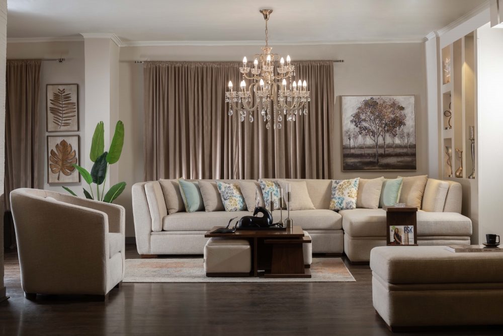
Vibrant Color Trends Taking the Lead as interior spaces evolve, color trends have taken on a new life—becoming bold, expressive, and undeniably vibrant. In a design era that celebrates fearless creativity, homeowners and designers alike are leaning into vibrant trending color updates that command attention and redefine modern elegance.
The days of playing it safe with neutrals are fading. In their place? A resurgence of rich pigments, electric tones, and mood-enhancing shades that infuse spaces with emotion and energy.
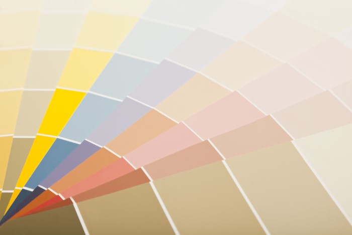
The Psychology Behind Vibrant Colors
Vibrancy in color speaks to emotion. These are not just pigments on a wall—they’re expressions of identity, passion, and optimism. A vivid coral can energize a tired corner. A pop of sunflower yellow can uplift an entire room.
Color affects mood, and in today’s world, the trend is clear: people want spaces that feel alive.
Why Vibrant Is Trending Now
Several global shifts have fueled the rise of vibrant trending color updates:
- Post-pandemic optimism: Bright colors reflect renewed hope and joy.
- Digital influence: Instagrammable interiors love bold backdrops.
- Individuality: Personal expression through decor is more important than ever.
- Global inspirations: World culture and travel have brought color diversity into homes.
These trends reflect a collective desire to make home not just a shelter, but a canvas.
1. Electric Blues
Vivid blue tones—from cerulean to ultramarine—are dominating walls, upholstery, and even ceilings. They provide clarity and confidence.
Where to Use:
- Accent walls in creative offices
- Tile backsplashes in kitchens
- Velvet sofas in open-concept living rooms
Pair electric blue with crisp white for nautical contrast, or with burnt orange for bold interplay.
2. Juicy Oranges and Tangerine
Orange is no longer a seasonal whim. It’s year-round firepower.
These citrus hues inject zest, creativity, and sociability. Tangerine is especially trending as it feels modern, spicy, and unexpected.
Ideal For:
- Entryways that energize
- Dining rooms that encourage conversation
- Retro-inspired dens with brass accents
These tones say: this space is alive.
3. Fuchsia and Berry Tones
Rich, romantic, and high-impact, deep pinks and fuchsias are not just for teenage bedrooms anymore. They’re chic, bold, and intoxicating.
Try Them In:
- Powder rooms with gold fixtures
- Upholstered headboards
- Statement art and textiles
Combine with navy, moss, or gray for balance.
4. Vibrant Yellows
Not just any yellow—this trend is all about sun-drenched, optimistic hues that mimic sunshine and radiate happiness.
Use In:
- Kitchen cabinets
- Children’s playrooms
- Art studios or creative corners
This color awakens the mind and spirit. It pairs effortlessly with teal, wood tones, or blush pink.
5. Lime Green and Chartreuse
These edgy greens are redefining freshness in modern interiors. Slightly jarring, endlessly playful.
Where It Shines:
- Accent chairs in minimalist rooms
- Painted furniture for bold contrast
- Unexpected color pops in neutral kitchens
This is the color of rebellion—in the best way.
6. Red Revival
Fiery reds are back, not in muted tones, but in full, unapologetic brilliance. These reds are theatrical, confident, and power-packed.
Perfect For:
- Dining room feature walls
- Home theaters or lounges
- Upholstered panels and curtains
Balance them with warm wood, dark gray, or monochromatic palettes for sophistication.
7. Aqua and Poolside Tones
Aqua has moved beyond beach homes and entered urban interiors as a mood refresher. It’s bright, happy, and cooling.
Consider For:
- Bathroom tiles
- Hallways with natural light
- Breakfast nooks
Combine with crisp white, navy, or coral for vibrancy without chaos.
8. Multi-Tonal Layering
Rather than one color dominating a space, layering multiple bold colors creates depth and narrative.
How To Do It:
- Use color blocking with mustard and lilac
- Try split walls with two vibrant tones
- Incorporate multicolored furniture
Vibrant trending color updates are no longer about choosing one bold shade—they’re about building harmony through complexity.
Global Influences on Vibrant Color Trends
Vibrant palettes often take cues from:
- Mexican talavera tiles (bright yellows, cobalt blues)
- Moroccan ceramics (turquoise, rust, and saffron)
- Indian textiles (magenta, vermilion, peacock)
- African wax prints (electric red, neon green, indigo)
These colors are steeped in tradition yet feel ultra-modern in contemporary interiors.
Materials and Finishes that Amplify Color
A color’s effect isn’t only about hue—it’s also about texture and finish.
Combine With:
- Gloss finishes for high-shine drama
- Matte walls for richness without glare
- Velvet and silk for sensual saturation
- Glass or acrylic to make colors feel lighter
Different finishes alter how color behaves in light, making the space dynamic and multidimensional.
Complementing Neutrals
Vibrancy needs its supporting cast. Pair bold colors with these updated neutrals:
- Warm sand
- Creamy almond
- Dusty blush
- Charcoal
These tones provide breathing room and contrast, allowing bold hues to shine without overwhelming.
Accent Pieces That Make a Splash
If committing to a bold wall is too much, try adding vibrancy through accent pieces:
- Art and sculpture
- Lampshades and lighting
- Rugs and cushions
- Painted cabinetry
Accent pieces allow for flexibility and experimentation with vibrant trending color updates.
Outdoor Vibrancy
Bright colors aren’t just for indoor use. Bring your garden, patio, or balcony to life with:
- Painted terracotta pots
- Colorful outdoor rugs
- Bright Adirondack chairs
- Bold garden walls
These splashes of color connect nature with creativity, making outdoor time more joyful.
Vibrancy for Every Style
No matter your aesthetic, there’s a way to integrate bold hues:
Modern:
- Use saturated primaries with geometric forms
Bohemian:
- Mix multiple intense shades with layered textures
Scandinavian:
- Use one vibrant element as a visual anchor in a neutral palette
Rustic:
- Pair bright color with distressed wood and vintage metal
Vibrant trending color updates adapt well to every taste—it’s about balance, not just bravery.
Light and Color Dynamics
Light alters how we perceive color. Vibrant tones respond dramatically to natural and artificial light.
Pro Tips:
- Use daylight to enhance cooler bright tones
- Use warm LED light to intensify reds and yellows
- Avoid fluorescent bulbs—they distort color nuance
Always test swatches in various lighting before committing.
The Return of Color Confidence
Vibrancy represents a return to emotional design. It’s confident, expressive, and full of life.
Interior spaces today don’t shy away—they shout joy, movement, and modernity. People are embracing what speaks to them rather than what pleases the masses.
Color becomes a declaration: This is who I am.
Forecast: What’s Next in Vibrancy
Looking ahead, expect:
- More hybrid hues like “digital lavender” and “electric melon”
- Fluorescent-inspired color pops
- Custom-painted furniture with abstract color blends
- Deeply saturated ceiling treatments
Innovation and technology will continue to push how we apply color—wallpapers that react to light, paints made from algae or clay, and digital projections for ever-changing color.
Final Thoughts
The era of vibrant interiors has arrived in full force. With creativity as the compass, the possibilities are endless. Whether you’re revamping a room or simply adding a dash of boldness, remember:
Vibrant trending color updates aren’t about perfection. They’re about expression, daring, and delight.
Because nothing sets the tone for a joyful life like a home that radiates color from every corner.