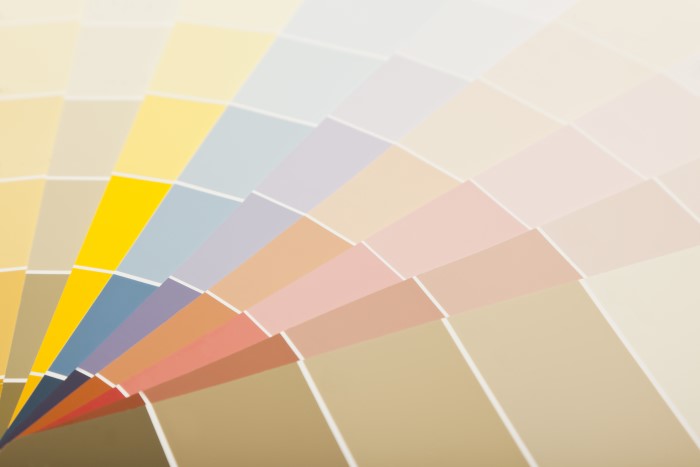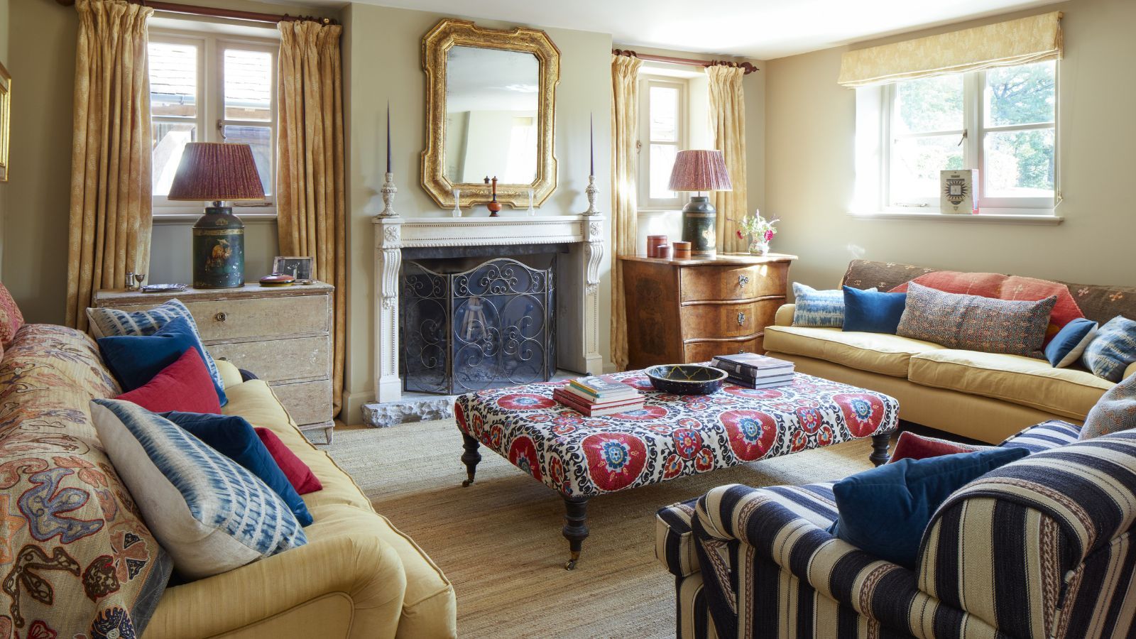
Color Trends That Work Year-Round color is more than decoration. It’s a language of mood, identity, and intention. And while seasonal hues tend to dominate runway trends, home décor, and branding for short bursts of time, the ultimate aspiration for designers and style-savvy individuals is to find a year-round color palette that feels timeless yet current. Imagine a set of colors that can shift effortlessly from spring’s optimism to winter’s introspection—offering elegance, warmth, and flexibility in every light and season.
Welcome to the world of perennial color. These enduring hues are as functional as they are beautiful—able to shape-shift their emotional impact depending on how they’re used, what they’re paired with, and the materials that accompany them.

The Power of a Year-Round Palette
Trendy colors come and go. Neon pinks, acid greens, millennial purples—they all have their moment. But a true year-round color palette is about endurance. It works just as well on a breezy July afternoon as it does in the golden stillness of November. These hues hold their charm across the calendar because they adapt. They blend. They remain visually relevant even as everything else changes.
More than just neutral, these palettes are layered, multifaceted, and rooted in natural inspiration. They can be dressed up or down, warmed or cooled, made bold or subtle. The secret lies in balance.
Understanding Timeless Color Harmony
The most enduring colors often share a few characteristics. They’re typically grounded in the natural world—tones that evoke sky, earth, stone, water, and flora. Their saturation is soft enough to feel timeless, yet rich enough to avoid being washed out. They can stand alone or play nicely with brighter accents and seasonal embellishments.
The magic happens when these tones are grouped into a cohesive year-round color palette that delivers flexibility, elegance, and emotional resonance throughout the year.
Core Year-Round Colors to Embrace
Here are the foundation hues that serve as pillars of perennial color design—spanning interiors, fashion, branding, and beyond.
1. Warm Taupe
A chameleon shade that shifts between gray and beige, warm taupe is an essential neutral. It exudes sophistication and can be styled cool or warm depending on context.
- In summer: Pair with white, terracotta, and rattan textures.
- In winter: Combine with deep browns, oxblood, and burnished gold.
2. Dusty Olive
Less saturated than standard green, dusty olive nods to nature without feeling too rustic. It brings an earthy, calm presence that works across all design disciplines.
- In spring: Refresh it with blush and peach.
- In autumn: Deepen it with mustard and burgundy.
3. Muted Navy
Not your traditional nautical blue—muted navy is rich but desaturated, making it incredibly versatile. It grounds lighter tones and adds drama without harshness.
- In summer: Contrast it with linen and sandy tones.
- In winter: Layer it with charcoal and icy gray.
4. Soft Clay
A gentle take on terracotta, soft clay combines the warmth of red with the mellowness of beige. It brings personality and a touch of the unexpected to any space or outfit.
- In spring: Brighten with sage and butter yellow.
- In fall: Embrace with cocoa brown and dusty plum.
5. Chalky White
Slightly warm, slightly cool—chalky white provides the perfect blank canvas. It’s creamy enough to feel inviting, with enough structure to avoid looking flat.
- In every season: Let it breathe and balance bold tones.
These colors form the foundation of a truly effective year-round color palette. But the beauty of these hues lies in their adaptability—they can morph and mold to suit a wide array of environments and expressions.
Layering with Accent Colors
A great palette needs depth. Accent shades inject vibrancy, individuality, and season-specific energy into a color scheme. The trick is selecting accent hues that harmonize with your core tones while adding personality.
Spring Accents:
- Pale lavender
- Soft butter yellow
- Sky blue
These accents add freshness and optimism—pair beautifully with chalky whites and dusty olive for a blooming spring vibe.
Summer Accents:
- Coral rose
- Crisp aqua
- Sun-bleached peach
Layered against muted navy and soft clay, these tones add punch without overwhelming.
Autumn Accents:
- Goldenrod
- Burnt cinnamon
- Olive gold
They create richness when combined with warm taupe and dusty olive, evoking a harvest-inspired ambiance.
Winter Accents:
- Deep mulberry
- Frosted slate
- Evergreen
These hues bring coziness and quiet luxury—especially when paired with soft clay or muted navy.
Incorporating seasonal accents into a stable year-round color palette allows for visual interest and emotional variation without overhauling your entire scheme.
Material Influence on Color Perception
Color doesn’t exist in a vacuum. It changes depending on the surface, lighting, and material it appears on. A dusty olive on a linen sofa reads differently than the same tone on silk or matte-painted walls.
- Velvet enriches colors, making them look deeper and more luxurious.
- Matte finishes mute saturation and add softness.
- Glossy textures make colors appear brighter and sharper.
- Natural fibers (like jute, wool, or linen) bring warmth and depth to muted tones.
When designing with a year-round color palette, consider how texture and finish will influence how a hue is perceived.
Application in Interior Design
Designers aiming for lasting elegance often ground spaces in a neutral base and build with seasonal accents through accessories, textiles, and artwork.
Living Room:
- Base: Warm taupe walls, muted navy sofa
- Spring/Summer: Add coral and ivory throw pillows, soft green florals
- Autumn/Winter: Swap in mulberry cushions, brass accents, dark wood frames
Kitchen:
- Cabinetry in chalky white with muted navy island
- Accents shift from pale pastels in summer (linen tablecloths, glass vases) to deep plums and golds in winter (candlesticks, ceramics)
Bedroom:
- Dusty olive headboard, soft clay bedding
- Rotate accessories like lampshades, art, and throws seasonally to maintain freshness without redesign
These strategies allow interiors to feel dynamic year-round without needing constant redecoration.
Application in Fashion
In wardrobe planning, a year-round color palette means investing in pieces that transcend seasonal fashion. It encourages intentional shopping and capsule wardrobes.
Foundation Pieces:
- Camel trench coat
- Muted navy blazer
- Warm taupe trousers
- Soft clay knit sweater
- Chalky white button-up
These items can be rotated and restyled endlessly with accessories and accent pieces.
Seasonal Switch-Ups:
- Spring: Add blush ballet flats and pale yellow scarves
- Summer: Mix in coral tanks and straw accessories
- Fall: Layer with gold-toned jewelry and rich chocolate outerwear
- Winter: Bring in textured knits in eggplant or spruce green
The consistent foundation keeps your wardrobe cohesive while allowing seasonal flavor to shine.
Application in Branding and Packaging
Brands seeking a consistent identity across seasons and trends often adopt a year-round color palette that speaks to their core values. The right tones can evoke trust, modernity, and approachability—without leaning too heavily into trend cycles.
Successful Brand Color Strategies:
- Skincare brands: Earthy neutrals paired with pale greens and soft whites signal wellness and purity.
- Tech companies: Muted navies and greys, offset by a signature accent like turquoise or coral.
- Luxury fashion: Warm taupes, dusty mauves, and soft golds convey timeless elegance.
This consistency builds brand recognition and reduces the need for frequent rebranding. Accents can be introduced subtly through seasonal campaigns, but the overall identity remains strong and clear.
Lighting Considerations
Lighting plays a pivotal role in how colors appear throughout the year. A space bathed in natural light will see its hues shift hour by hour, while artificial lighting can change a color’s entire personality.
Warm vs. Cool Light:
- Warm lighting (yellow tones) enhances cozy colors like soft clay or warm taupe.
- Cool lighting (blue tones) sharpens colors like dusty olive and muted navy.
- Neutral lighting (daylight balance) offers the truest representation of a color.
A thoughtful year-round color palette will look balanced in all lighting scenarios, but testing swatches in real-world lighting is always recommended—especially in interior applications.
Psychological Resonance of Year-Round Colors
Color influences our emotions and behaviors. That’s why colors chosen for year-round appeal often strike a balance between calmness and vitality. They don’t overstimulate or underwhelm—they ground us.
- Warm taupe and chalky white promote calm, clarity, and stability.
- Muted navy creates focus, strength, and elegance.
- Dusty olive evokes nature, balance, and harmony.
- Soft clay offers warmth, approachability, and a sense of home.
These colors build environments and identities that feel good all the time—not just during peak trends.
Sustainability and Longevity
Opting for a year-round color palette is not just stylish—it’s sustainable. It reduces waste, minimizes the need for constant updates, and supports slower consumption. Whether in fashion, interior design, or product development, investing in a flexible palette is a commitment to long-term thinking.
Eco-conscious consumers and brands are increasingly embracing this philosophy, choosing timeless colors and classic silhouettes that won’t end up in landfills or clearance racks.
Creating Your Personalized Year-Round Palette
A universal palette may not suit every person, space, or brand. The key is selecting hues that align with personal style, environmental factors, and emotional tone.
How to Curate Your Own:
- Choose 3–5 base colors from the perennial hues above that you love in every season.
- Test them in different lights—natural, warm, cool—to ensure they feel consistent.
- Add seasonal accents that match your energy or surroundings during specific times of year.
- Commit to quality—in materials, textures, and applications. A great color can fall flat if the finish is subpar.
This intentional approach ensures your palette supports beauty and functionality across seasons.
Final Thoughts
The elegance of a year-round color palette lies in its ability to adapt without compromise. It’s timeless but never stale. Calm but never dull. From interiors and fashion to branding and lifestyle, embracing enduring hues leads to spaces and styles that breathe with you throughout the year.
Rather than chasing fleeting trends, consider the quiet power of colors that evolve, complement, and elevate every moment. These are the colors that truly never go out of season.