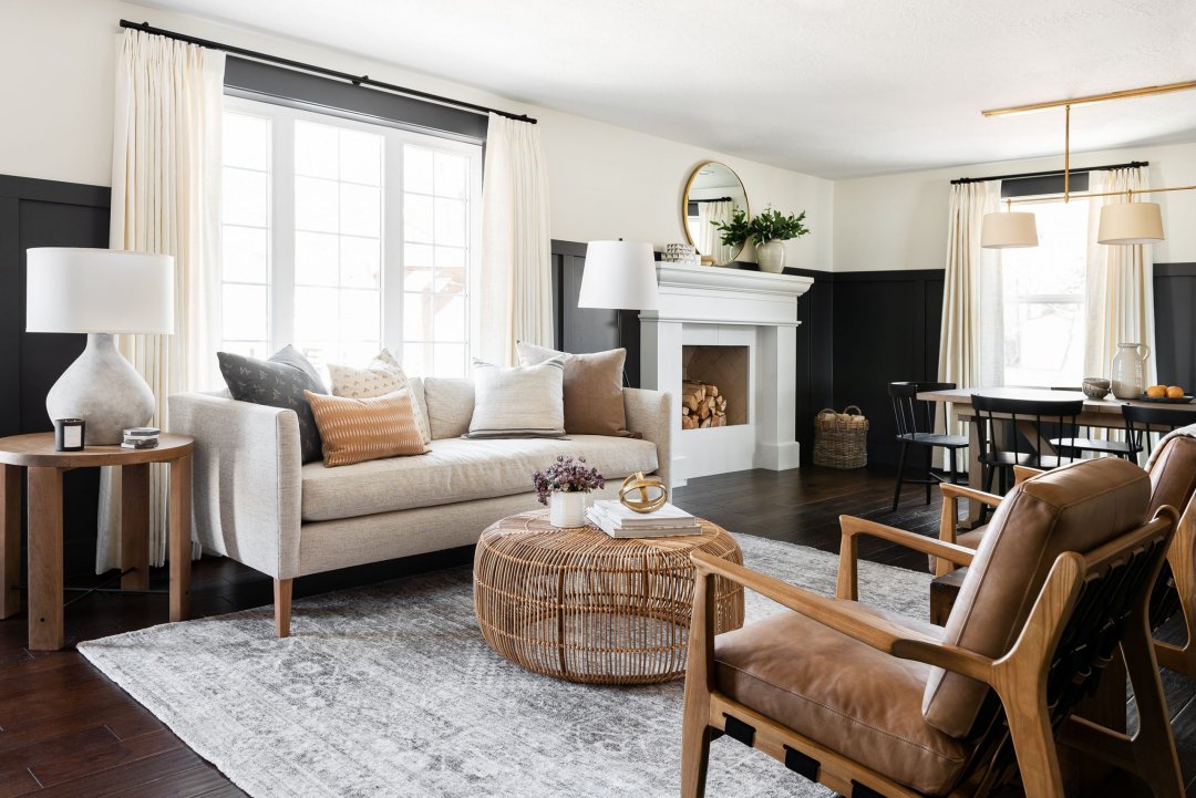
The Most Surprising Color Trends of 2025 bold shifts are on the horizon. Unexpected hues are supplanting long-standing favorites. From subterranean browns to iridescent metallics, 2025’s palette revolution promises to reshape interiors, fashion, and product design alike. Dive into these surprising 2025 color trends, each trend unpacked with insights, usage tips, and the unique emotions they evoke.

1. Subterranean Brown Revival
Once relegated to rustic kitchens, intense browns are burrowing into contemporary spaces. Think deep umber, chocolate truffle, and espresso tones—shockingly versatile in modern décor. These profound pigments lend gravity. They pair effortlessly with cream linens, matte black steel, and verdant plants. An espresso-hued accent wall anchors airy rooms, while truffle-colored cabinetry elevates minimalist kitchens.
Usage Tip: Balance with reflective surfaces—brass pulls or high-gloss tiles—to prevent visual depletion.
2. Bioluminescent Blues
Neon is passé. Instead, designers are embracing low-voltage, glowing blues reminiscent of bioluminescent plankton. These shades—cerulean phosphor, midnight glow, and lagoon luminescence—emit a subtle inner radiance. Ideal for accent lighting or textiles, they cast a serene, otherworldly ambiance. Imagine curtains that softly glow after dusk or wallpaper that shimmers under LED fixtures.
Usage Tip: Employ as backlighting behind shelving or within coves to intensify the luminescent effect.
3. Clay-Infused Terracotta
Terracotta has matured. Clay-infused variants—terra oyster, dusty adobe, and rust-flecked sienna—offer a refined take on sun-baked earth tones. They resonate with biophilic design, grounding interiors in antiquity while nodding to modern craftsmanship. These hues are sublime on earthenware planters, hand-troweled walls, and woven fabrics. Each surface feels tactile and storied, as if molded by millennia of tradition.
Usage Tip: Introduce via artisanal ceramics grouped as a curated vignette.
4. Iridescent Pearl Pastels
Soft pastels morph into chameleonic marvels when infused with pearlescent finishes. Blush opal, mint aurora, and lavender pearl catch shifting light, revealing hidden complexity. In textile form—silk drapes, satin cushions—these tones ripple like mother-of-pearl. On walls, they transform with the sun’s arc, creating an ever-evolving backdrop.
Usage Tip: Use on large surfaces sparingly; concentrate on accent pieces to maximize shimmer.
5. Solar Flare Yellows
Forget soft buttercream. Solar flare yellows—lemon voltaic, canary ion, and chrome citrine—are electric. They cut through muted palettes with audacity, injecting rooms and outfits with radiant energy. These hues work wonders as focal points. A chromed citrine pendant lamp or a lemon-voltaic accent chair draws the eye instantly.
Usage Tip: Counterbalance with deep charcoals or muted grays to avoid visual fatigue.
6. Oxidized Metal Greens
Patina-inspired greens are trending. Patinated copper and verdigris hues—moss copper, teal rust, and jade verdure—imbue spaces with a weathered elegance. Suited for metal finishes, hardware, and tiles, these colors celebrate age and imperfection. They evoke maritime relics and time-worn facades.
Usage Tip: Combine with warm neutrals—sandstone or parchment—for a harmonious contrast.
7. Ember-Glazed Reds
Red transcends passion; it embraces ember-glaze. This trend spotlights deep, smoldering shades—garnet ash, burnt ember, and brick kiln—imbued with muted orange undertones. These reds function as powerful anchors. They enrich leather upholstery, hand-glazed pottery, and statement walls with an intensity that feels both retro and futuristic.
Usage Tip: Offset with cool whites and pale greys to allow reds to sing without overwhelming.
8. Chalkboard Charcoals
Black is no longer binary. Chalkboard charcoals—soft black hues with whisper-soft undertones—offer a writable, interactive canvas. Reimagined in matte form, they invite hand-lettering and seasonal embellishment. Use in kitchens, kids’ rooms, or creative studios. Each scrawl becomes part of the décor, transforming static walls into living ideas.
Usage Tip: Frame chalkboard panels with minimal molding to elevate utility into art.
9. Lavender Smoke
Ethereal and enigmatic, lavender smoke emerges as a gray-inflected purple. This hue balances nostalgia with novelty, invoking twilight skies and antique glassware. Ideal for bedrooms and lounges, it fosters introspection and calm, softly coloring upholstery, rugs, and drapery.
Usage Tip: Pair with matte black fixtures for a sophisticated edge.
10. Pollen Golds
Pollen gold transcends ostentation. Its softer sibling—honeyed amber, pollen dust, and soft ochre—carries warmth without gaudiness. These hues channel sunlit meadows and ripened grains. Perfect for brass fixtures, throw pillows, and artisanal textiles. Each touchpoint feels inviting, luminous, and exquisitely tactile.
Usage Tip: Layer pollen tones over a base of clean whites and muted taupes.
11. Frosted Mint
Mint evolves into frosted mint—a pastel green with silvery undertones and a crisp, chilled finish. This trend injects refreshing coolness into interiors and attire. Picture frosted mint kitchen cabinets against marble countertops, or mint-tinted outerwear paired with charcoal trousers.
Usage Tip: Combine with brushed nickel accents for an ice-like sophistication.
12. Graphic Monochromes
Monochrome reimagines itself through hyper-graphic contrast. Walls, floors, and fabrics deploy single hues in varying saturations—coal black to ash gray, ivory to bone white. This graphic language simplifies yet amplifies. Interiors feel streamlined, yet layered. Fashion ensembles appear cohesive but never boring.
Usage Tip: Employ monochrome layering across textiles and paint for depth.
13. Terrarium Teals
Rainforest-inspired teals—deep aquarium, muted patrol, and fern lagoon—capture subterranean mystery. They channel the stillness of shaded pools and secret grottos. Ideal for feature walls, upholstery, and ceramic tile. When paired with golden accents, these teals glow with latent luminosity.
Usage Tip: Anchor with warm wood tones to balance cool vibrancy.
Integration Strategies
- Accent Sampling: Test unusual shades in small doses—throw pillows, art pieces, or tableware—before committing to walls or large furniture.
- Textural Juxtaposition: Pair flat pigments with reflective or textured finishes (matte-to-gloss, boucle-to-velvet). Contrast enhances perception of color.
- Layered Harmony: Combine two or three complementary trends within a cohesive scheme. For example, ember-glazed reds, charcoal chalkboard panels, and pollen gold accents can share a single space.
- Temporal Flexibility: Select surprising 2025 color trends that transcend seasonality—terracotta, charcoal, and frost mint adapt year-round.
The dawn of 2025 marks a bold chromatic chapter. These surprising 2025 color trends invite fearless experimentation. Whether you immerse a room in subterranean browns or punctuate an ensemble with solar yellows, each hue carries its own subliminal narrative. Embrace the unexpected. Let color become more than decoration—let it become dialogue.


