
Color Trends That Set the Mood in the ever-evolving world of interior design, color continues to play a pivotal role in shaping how a space feels, functions, and flows. As our emotional relationship with our homes deepens, the concept of mood setting color ideas has risen to prominence. From vibrant, high-energy hues to deeply calming neutrals, today’s color trends go far beyond aesthetics—they create emotional experiences.
This year, designers and homeowners alike are embracing color palettes that serve as mood enhancers, reflecting inner states or aspirations. Whether it’s tranquility, vitality, nostalgia, or grounded sophistication, there’s a color story to match. Let’s explore how strategic use of color can completely transform your interior environment, not just visually, but emotionally too.
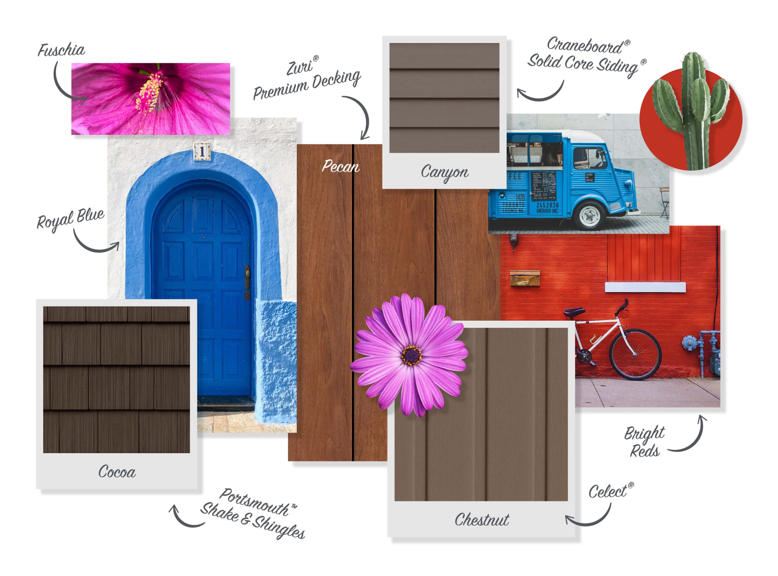
The Power of Color Psychology
Color has the unique ability to evoke emotion without a single word. Studies in color psychology show that certain shades can lower stress, boost creativity, or increase focus. That’s why curating a palette based on mood setting color ideas can make a home not only more beautiful but also more livable.
- Blues and greens calm the mind and body.
- Yellows and oranges stimulate creativity and conversation.
- Dark tones like charcoal or deep plum add drama and coziness.
- Light neutrals create openness and reduce anxiety.
The beauty of these color choices lies in their adaptability. When paired with the right lighting, materials, and textures, even bold hues can become soothing and soft colors can feel surprisingly powerful.
1. Tranquil Retreat: Soft Blues, Sage Greens, and Driftwood Gray
Perfect for bedrooms, bathrooms, and quiet corners, this palette evokes the serenity of a misty forest or a calm seashore.
These hues are deeply rooted in nature, making them ideal for mindfulness-centered interiors. Soft blues, like periwinkle or powder blue, soothe the nervous system. Sage green introduces organic vitality, while driftwood gray anchors the look.
Pair With:
- Natural linen
- Woven textures
- Matte ceramics
This color story is one of the most beloved among designers focusing on mood setting color ideas that encourage stillness and mental restoration.
2. Energizing Spirit: Citrine Yellow, Coral, and Terracotta
Want a room that feels like a jolt of sunshine? These optimistic shades bring playfulness and movement into spaces.
Citrine yellow is the color of joy and curiosity. Coral offers warmth with a hint of softness, while terracotta adds an earthy foundation that prevents the palette from feeling too sweet.
Best For:
- Kitchens
- Home offices
- Creative studios
Mood setting color ideas in this family create a vibrant, uplifting atmosphere, ideal for spaces where inspiration is needed daily.
3. Deep Focus: Navy, Olive, and Espresso Brown
Grounded, intelligent, and comforting—this trio is designed for deep thinking and intimate conversation.
Navy stimulates focus without overstimulation. Olive provides a sophisticated natural contrast, and espresso brown deepens the palette with a moody elegance.
Ideal For:
- Libraries
- Studies
- Media rooms
Use these mood setting color ideas when you want a space to feel intellectual and introspective. Add brass or walnut accents to elevate the richness.
4. Romantic Escape: Blush, Dusty Rose, and Mauve
Soft and sensuous, this palette speaks of calm luxury. It’s feminine without being girly, elegant without being cold.
Blush tones add warmth, dusty rose introduces nostalgia, and mauve gives the look a grounded maturity. The interplay between warmth and softness makes this palette perfect for intimate or emotional spaces.
Great In:
- Master bedrooms
- Dressing rooms
- Quiet lounges
These shades are timeless staples in the realm of mood setting color ideas for emotional comfort and affection.
5. Earthbound Harmony: Clay, Ochre, and Moss Green
This trend taps into our growing desire for sustainability and connection to the earth. Clay brings terra-cotta richness, ochre radiates warmth, and moss green ties it all together with a lush grounding effect.
These colors bring the outdoors in, encouraging mindfulness and an appreciation for simplicity.
Works Well In:
- Entryways
- Dining rooms
- Artisan kitchens
Mood setting color ideas like this offer both grounding and glow, ideal for building spaces that feel alive and rooted.
6. Minimal Zen: Bone White, Soft Taupe, and Warm Sand
Monochrome neutrals are having a quiet resurgence—but they’re far from boring.
Bone white acts as a clean, luminous base. Soft taupe adds subtle sophistication. Warm sand delivers a tactile, sunbaked softness. Together, they evoke a sense of gentle order.
Recommended For:
- Open-concept living
- Meditation rooms
- Minimalist interiors
When in doubt, neutrals always find their way back into the best mood setting color ideas, offering calm and cohesion without fuss.
7. Mystical Depths: Aubergine, Indigo, and Storm Gray
These sultry tones are for those who want their interiors to feel magical, mysterious, and a bit daring.
Aubergine adds opulence, indigo brings a spiritual richness, and storm gray softens the edges without breaking the spell. This palette is emotionally intense but deeply nurturing when paired with velvet or moody lighting.
Perfect For:
- Bedrooms with layered lighting
- Intimate dining rooms
- Boutique-style bathrooms
These are mood setting color ideas for emotional exploration and cozy indulgence.
8. Fresh Renewal: Mint, Pistachio, and Pale Sky
Greens and blues in pastel tones are like a breath of fresh air. These colors hint at springtime, awakening, and clarity.
Mint energizes gently. Pistachio brings novelty with a hint of tradition. Pale sky balances the palette with airy spaciousness.
Ideal For:
- Guest bedrooms
- Sunrooms
- Small living rooms
Mood setting color ideas in this palette create an open, welcoming feeling—a soft reset for the senses.
9. Warm Industrial: Charcoal, Rust, and Putty
Blending warmth with edge, this trio brings texture and contrast to loft-inspired or contemporary spaces.
Charcoal is bold yet neutral, rust adds warmth with a masculine twist, and putty bridges both with an urban softness.
Best Uses:
- Modern kitchens
- Converted industrial apartments
- Entryways with personality
This is one of the more unexpected mood setting color ideas, ideal for those who like grit with grace.
10. Nostalgic Modernism: Teal, Mustard, and Walnut
Pulling from mid-century palettes, this trend combines retro charm with current sensibilities.
Teal is vibrant and thoughtful. Mustard adds golden warmth, and walnut delivers classic depth. Together, they create a space that feels smart, joyful, and familiar.
Best In:
- Living rooms
- Dining areas
- Home offices with flair
This palette proves that mood setting color ideas can blend eras without feeling dated or forced.
The right color doesn’t just decorate a space—it transforms how that space feels. With this collection of curated mood setting color ideas, you can create an environment that reflects your emotional needs, daily rhythms, and personal story.
Whether you crave calm, connection, creativity, or contemplation, there’s a palette for you. Let your walls, furnishings, and accents speak in hues that uplift and inspire. With intentional color, every room becomes more than a place—it becomes a feeling.


