
Color Trends from the Runway to Your Room color speaks the language of style. From couture catwalks in Paris to bespoke interiors in Milan, designer runways constantly debut hues that capture our imagination. These same show-stopping shades can be seamlessly translated into home décor, infusing living spaces with high-fashion flair. Welcome to a deep dive into runway inspired home colors—vibrant, avant-garde, and irresistibly chic.
Explore how to harness the very latest runway palettes and adapt them to everyday interiors. Discover lush jewel tones, muted pastels with a twist, and bold pops of neon that feel utterly modern. Prepare to transform your room into a sartorial showcase.
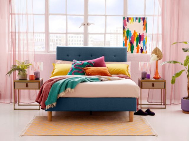
The Intersection of Fashion and Interiors
Traditionally, fashion and interiors were treated as separate disciplines. Today, they share a dynamic synergy:
- Seasonal color forecasts from the Pantone Color Institute influence both apparel and paints.
- Designers like Virgil Abloh and Raf Simons blur lines between garments and textiles.
- Luxury brands license their signature hues across furniture, wallpaper, and home accessories.
By adopting runway inspired home colors, your space becomes a living runway—curated, confident, and utterly contemporary.
1. Bold Jewel Tones: Emerald, Sapphire, and Amethyst
Why Jewel Tones Command Attention
Rich, saturated, and luxurious, jewel tones evoke precious gemstones. On the runway, they drape models in opulence; in interiors, they cocoon spaces in drama and depth.
How to Use Them at Home
- Feature Walls: Paint a single wall in emerald green behind a velvet sofa to create a focal point.
- Accent Furniture: A sapphire-blue armchair or amethyst side table adds luxe contrast to neutral floors.
- Soft Furnishings: Layer jewel-toned velvet cushions and silk drapes for sumptuous texture.
Styling Tip
Balance the intensity with metallic accents—brass lighting, gold-trimmed mirrors, or chrome hardware—to echo runway-level glamour.
2. Neo-Pastels: Powder Pink, Mint Spritz, and Sky Fog
The Evolution of Pastels
Pastels have shed their saccharine reputation. Contemporary collections infuse them with grey undertones, producing muted hues that feel sophisticated rather than sweet.
Home Applications
- Kitchen Cabinets: A powder-pink island feels modern when paired with stark white quartz countertops.
- Bedroom Retreats: Mint spritz walls invite relaxation, especially when offset by charcoal bedding.
- Home Office: Sky fog desks and shelving provide a calming backdrop for focused work.
Stylist’s Insight
Use high-gloss finishes or lacquer to reflect light off these subtle hues, echoing the polished sheen of runway fabrics.
3. Neon Accents: Electric Tangerine, Laser Lemon, and Ultra Violet
Why Neon Pops Persist
Neon’s vibrancy jolts senses awake—perfect for designers seeking to inject energy into collections. In interiors, a neon splash enlivens an otherwise subdued palette.
Risk-Free Neon Integration
- Art & Accessories: Neon wall art, vases, or lamps serve as safe, removable pops.
- Trim & Molding: Paint door frames or baseboards in electric tangerine for unexpected flair.
- Outdoor Spaces: Laser lemon planters or ultra violet cushions enliven patios and balconies.
Cautionary Note
Neon is best used sparingly. A little goes a long way—just like a statement runway piece.
4. Earthy Neutrals with a Twist: Terracotta, Clay Blush, and Umber Taupe
Grounded, Yet Modern
Runways are embracing artisanal, earth-inspired tones. These grounded neutrals add warmth and authenticity to interiors.
Translating Clay-Inspired Hues
- Flooring & Tile: Terracotta-tone tiles in kitchens or entryways create a sun-baked, Mediterranean feel.
- Painted Ceilings: Clay blush overhead draws the eye upward and cocoons the space in subtle warmth.
- Built-In Units: Umber taupe cabinetry blends seamlessly with both light and dark stone countertops.
Expert Tip
Pair these hues with organic materials—rattan, cork, and raw wood—to underscore their earthy origins.
5. Monochrome Minimalism: Ink Black, Chalk White, and Graphite Gray
The Power of Contrast
High-contrast monochrome remains a staple on minimalist runways. Translating this to interiors yields spaces that feel modern, sleek, and architecturally grounded.
Implementing Monochrome Schemes
- Open-Plan Living: Use ink black kitchen islands against chalk white walls for crisp definition.
- Bathrooms: Graphite gray tiles with matching grout achieve seamless sophistication.
- Textiles: Layer black, white, and gray throws and cushions for depth without color overload.
Designer’s Note
Vary finishes—matte, satin, and gloss—to create visual interest without introducing additional hues.
6. Opulent Metallics: Rose Gold, Polished Brass, and Nickel Chrome
Beyond Classic Gold
Metallics are staging a comeback. Runways showcase metallic fabrics and hardware—and interiors follow suit with bold, reflective surfaces.
Key Areas to Shine
- Lighting: Rose gold pendant lights cast a warm glow.
- Fixtures & Hardware: Polished brass faucets and door handles elevate everyday details.
- Furniture Accents: Nickel chrome frames on coffee tables or chairs add modern edge.
Integration Tip
Balance metallic surfaces with matte textures—velvet upholstery or raw-edged wood—to avoid overwhelming glare.
7. Biophilic Blues & Greens: Deep Teal, Forest Canopy, and Oceanic Turquoise
Nature-Inspired Serenity
Runways increasingly spotlight biophilic design—hues drawn directly from nature’s palette. These shades bring the outdoors in, fostering calm and well-being.
Bringing Biophilia Home
- Living Walls: Deep teal painted accent walls mimic lush foliage silhouettes.
- Upholstery: Forest canopy green sofas or headboards evoke a woodland sanctuary.
- Bathrooms & Pools: Oceanic turquoise tiles create a spa-like immersion.
Green Thumb Tip
Complement these hues with actual greenery—potted plants, hanging baskets, or living art walls.
8. Subtle Metallic Sheens: Pearl Luster, Satin Silver, and Champagne Quartz
Understated Luxury
Not every metallic must be shiny. Satin and pearlescent finishes offer whisper-soft glimmers that shift in the light.
Usage Suggestions
- Wallpaper & Wall Coverings: Pearl-lustered murals add dimensional sheen.
- Textile Weaves: Fabrics woven with silver threads catch the light subtly.
- Accessories: Champagne quartz vases or trays infuse quiet sparkle.
Styling Insight
Rotate metallic elements seasonally—brighter in summer, more muted in winter—to maintain freshness.
9. Warm Modern Reds: Rusty Vermillion, Currant Wine, and Blush Maroon
The New Neutral
Runways are adopting richer, warmer reds as modern neutrals. They anchor collections without dominating.
Interior Applications
- Accent Chairs: A blush maroon armchair creates cozy contrast in a neutral living room.
- Rugs & Carpets: Rusty vermillion area rugs ground pale wood flooring.
- Kitchen Islands: Currant wine cabinetry pairs beautifully with marble surfaces.
Designer Hint
Use red-based neutrals to draw connections between zones in open-concept homes.
10. Soft Metallic Pastels: Rose Pearl, Minted Silver, and Opal Peach
Dual Personality Hues
These pastel-metallic hybr ids feel dreamy and futuristic. On runways, they shimmer under spotlights; at home, they cast soft, reflective glows.
Key Placements
- Furniture Finishes: Minted silver side tables or consoles stand out subtly.
- Paint Effects: Opal peach paint with metallic mica creates depth on walls.
- Décor Objects: Rose pearl ceramics, vases, and lamps catch and diffuse light.
Integration Tip
Pair with neutral stone and chopped greenery for a balanced, ethereal look.
Harmonizing Runway Colors with Your Existing Decor
Translating high-fashion hues to your home requires balance:
- Assess your baseline: Identify your room’s dominant tones—flooring, trim, major furniture.
- Choose one statement hue: Use it on a feature wall or a single large piece.
- Layer accent colors: Introduce secondary shades via textiles, art, or accessories.
- Control saturation: Use diluted paints or washed finishes to prevent visual overload.
- Mind scale and proportion: A little neon goes a long way; jewel tones can envelop a large space with warmth.
The art of adopting runway inspired home colors lies in restraint and intentional layering.
Lighting: The Ultimate Color Amplifier
Color behaves differently under varied lighting:
- Daylight (north-facing): Brings out cooler undertones—ideal for blues and grays.
- Direct sun (south-facing): Enhances warmth—perfect for reds and oranges.
- Incandescent bulbs: Deepens warm hues, softens cooler tones.
- LED lights: Preserve color fidelity but choose the right Kelvin rating (2700K–3000K for warmth; 4000K for neutrality).
Always test paint swatches in situ, at various times, to ensure your chosen runway hues perform beautifully.
Final Flourish: Personalizing High-Fashion Hues
Your home should reflect personal narrative, not just follow trends. To truly make runway colors your own:
- Curate artwork: Commission pieces that echo your chosen palette.
- Handpick fabrics: Seek out specialty textiles—hand-dyed silks, artisanal weaves—that resonate with couture craftsmanship.
- Layer patterns: Mix geometric prints with organic motifs for complexity.
- Infuse memorabilia: Combine high-fashion hues with travel finds or heirlooms to root trends in personal memory.
With these strategies, runway inspired home colors become chapters in your story—timeless, evocative, and utterly you.