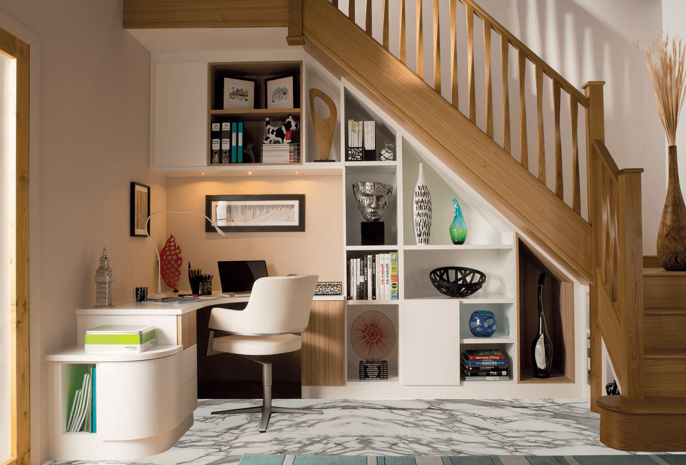
Color Trends That Never Go Out of Style certain hues possess enduring appeal. They transcend fleeting fads, anchoring interiors in elegance and poise. These timeless interior color trends have graced grand estates, cozy cottages, and ultramodern lofts alike. By weaving classic pigments into contemporary schemes, you ensure your home remains perpetually refined.

Understanding the Enduring Power of Color
Color shapes perception. It influences scale, light, and mood. Timeless shades—rooted in nature and heritage—carry psychological resonance. When employed judiciously, they create spaces that feel both current and age-defying.
1. Soft White Variations
White has infinite nuances. From ivory to eggshell, soft whites provide a neutral backdrop that brightens while adding subtle warmth.
- Application: Walls, moldings, and ceilings.
- Result: Expanded spaces and calm neutrality.
- Pairing: Natural wood for organic contrast.
2. Charcoal Gray Foundations
Charcoal is the new black. Less stark than pure black, it offers depth without heaviness.
- Application: Accent walls, cabinetry, and trim.
- Result: Modern sophistication with timeless gravitas.
- Pairing: Crisp whites or metallic touches for drama.
3. Navy Blue Anchors
Navy blue conjures nautical tradition and tailored elegance.
- Application: Upholstery, feature walls, and built-ins.
- Result: A sense of structure and calm.
- Pairing: Brass hardware and pale neutrals.
4. Warm Taupe and Greige
Situated between gray and beige, greige unites cool and warm undertones, creating versatile neutrality.
- Application: Full-room paint or large-scale furnishings.
- Result: Cohesive warmth that adapts to accents.
- Pairing: Black accents or pastel highlights.
5. Forest Green Depths
Forest green echoes verdant canopies, fostering a biophilic connection.
- Application: Cabinets, trim, or accent furniture.
- Result: Rich serenity with natural homage.
- Pairing: Cream linens and rattan elements.
6. Muted Terracotta and Clay
Warm clay hues mirror earthenware and traditional craftsmanship.
- Application: Terracotta planters, accent walls, and tile.
- Result: Grounded warmth and artisanal charm.
- Pairing: Olive greens and sandstone neutrals.
7. Blush Pink Subtlety
Soft blush imparts a whisper of warmth, blending seamlessly into neutral palettes.
- Application: Upholstery, cabinetry, and décor accents.
- Result: Delicate warmth without overt femininity.
- Pairing: Charcoal grays and brass fixtures.
8. Slate Blue Calm
Slate blue, reminiscent of serene waters, offers a tranquil counterpoint to brighter hues.
- Application: Bathrooms, bedrooms, and textiles.
- Result: Calming coolness that never feels icy.
- Pairing: White trim and wooden furnishings.
9. Mustard Gold Accents
Rich mustard harkens to vintage textiles and mid-century palettes.
- Application: Throw pillows, art frames, and lamps.
- Result: A touch of retro optimism.
- Pairing: Deep blues or charcoal backgrounds.
10. Crisp Mint Touches
Mint green evokes freshness without overwhelming.
- Application: Cabinet interiors, vases, and trim.
- Result: Subtle vitality and freshness.
- Pairing: Polished chrome and white marble.
11. Classic Black Evidences
Black remains indispensable. Used sparingly, it defines and dignifies.
- Application: Window frames, door hardware, and accent furniture.
- Result: Sharp definition and timeless contrast.
- Pairing: White surfaces and warm woods.
12. Dusty Lavender Whispers
Lavender’s muted variants offer serene sophistication, avoiding overt sweetness.
- Application: Bed linens, drapery, and ceramics.
- Result: Romance tempered with poise.
- Pairing: Slate gray and silver accents.
13. Rich Chocolate Brown
Dark cocoa shades evoke leather and wood—classic, comforting, and refined.
- Application: Leather sofas, wooden furniture, and cabinetry.
- Result: Luxuriant depth and tactile warmth.
- Pairing: Creamy neutrals and brass details.
14. Immutable Olive Tones
Olive green bridges earth and forest, offering muted verdancy.
- Application: Accent walls, planters, and upholstery.
- Result: Subdued organic presence.
- Pairing: Terracotta and sandstone for cohesion.
15. Timeless Taupe and Brown Pairings
The combination of taupe and dark brown exudes restraint and elegance.
- Application: Two-tone walls, textiles, and carpets.
- Result: Layered neutrality with depth.
- Pairing: Black metal accents and ivory décor.
Incorporating Timeless Trends
- Focus on Key Elements: Apply classic hues to substantial surfaces—walls, floors, and large furniture.
- Use Accent Variations: Introduce bolder classic colors in smaller doses via décor and textiles.
- Layer Neutrals: Combine neutrals with complementary undertones for dimensionality.
- Balance Warm and Cool: Counter warm earth tones with cool grays or blues.
- Texture Integration: Employ varied materials—velvet, wood, stone—to elevate simple colors.
Room-by-Room Enduring Elegance
Living Room
Paint walls in a warm greige. Introduce charcoal accents and forest-green cushions. Add a chocolate-brown leather armchair.
Kitchen
Opt for slate blue lower cabinets and ivory uppers. Incorporate terracotta tile and brass hardware.
Bedroom
Use blush linens and dusty lavender accent pillows. Paint the headboard wall in olive green.
Bathroom
Frame mirrors in matte black. Incorporate mint-green cabinetry and soft white tiles.
Home Office
Feature a two-tone wall: soft white above, charcoal below. Add a moss-green desk lamp.
Embracing timeless interior color trends ensures your home stands the test of aesthetic evolution. By integrating these enduring hues—ranging from subtle neutrals to rich jewel-inspired shades—you create a space that resonates with perpetual style and sophistication.