Fresh Color Trends This Season in the ever-evolving world of interior design, fashion, and lifestyle, colors do more than fill space—they narrate stories, evoke emotion, and define entire moods. As we transition into a new season, a wave of captivating shades is emerging to breathe new life into our surroundings. This season’s palette reflects a dynamic fusion of bold optimism, serene minimalism, and nature-rooted elegance. Whether you’re revamping a room, updating your wardrobe, or crafting compelling visuals, staying attuned to the freshest seasonal color trend ideas will keep your style refreshingly current.

Earthy Revival: Rooted in Nature
This season, designers are digging deep—literally. Warm, grounding tones inspired by soil, sand, and stone are taking over. Think of shades like terracotta, clay, rust, ochre, and mushroom taupe. These hues draw from the earth’s most organic pigments and deliver a quiet, unpretentious beauty.
Why it works: These earth-infused tones establish a feeling of safety and groundedness. They’re ideal for cozy home environments, inviting hospitality settings, and autumnal apparel.
How to use it: Incorporate rust-colored upholstery, hand-glazed ceramics in ochre, or a feature wall in matte terracotta. Pair these with textured neutrals and tactile fabrics like linen and boucle for a rich, layered effect.
Botanical Greens: From Soft Moss to Deep Forest
Green remains an evergreen choice, but this season’s twist is its botanical spectrum. From whisper-light pistachio to shadowy forest tones, green continues to rise in favor due to its versatility and biophilic appeal.
Why it works: Green is inherently calming. It symbolizes growth, rejuvenation, and nature’s everlasting rhythm—perfect for creating relaxing spaces.
How to use it: Blend moss green curtains with leafy botanical prints. Layer dark green cushions over cream or camel-toned sofas. Accent your kitchen with olive green cabinets for a contemporary yet timeless feel.
Summer Sorbets: Soft Yet Statement-Making
Delicate pastel tones are making a refined return, but with a zesty twist. Think of sorbet-inspired hues like peach fuzz, lemon chiffon, blueberry ice, and lilac glaze. These barely-there colors pack a surprising punch when styled correctly.
Why it works: Pastels can uplift without overwhelming. Their subtle luminosity brings a fresh airiness to any space or ensemble.
How to use it: Try a sorbet-hued kitchen backsplash, pastel-painted chair legs, or even clothing with color-blocked sorbet tones. Mix and match for a playful yet elegant visual effect.
Digital Brights: Hyper-Optimistic and Bold
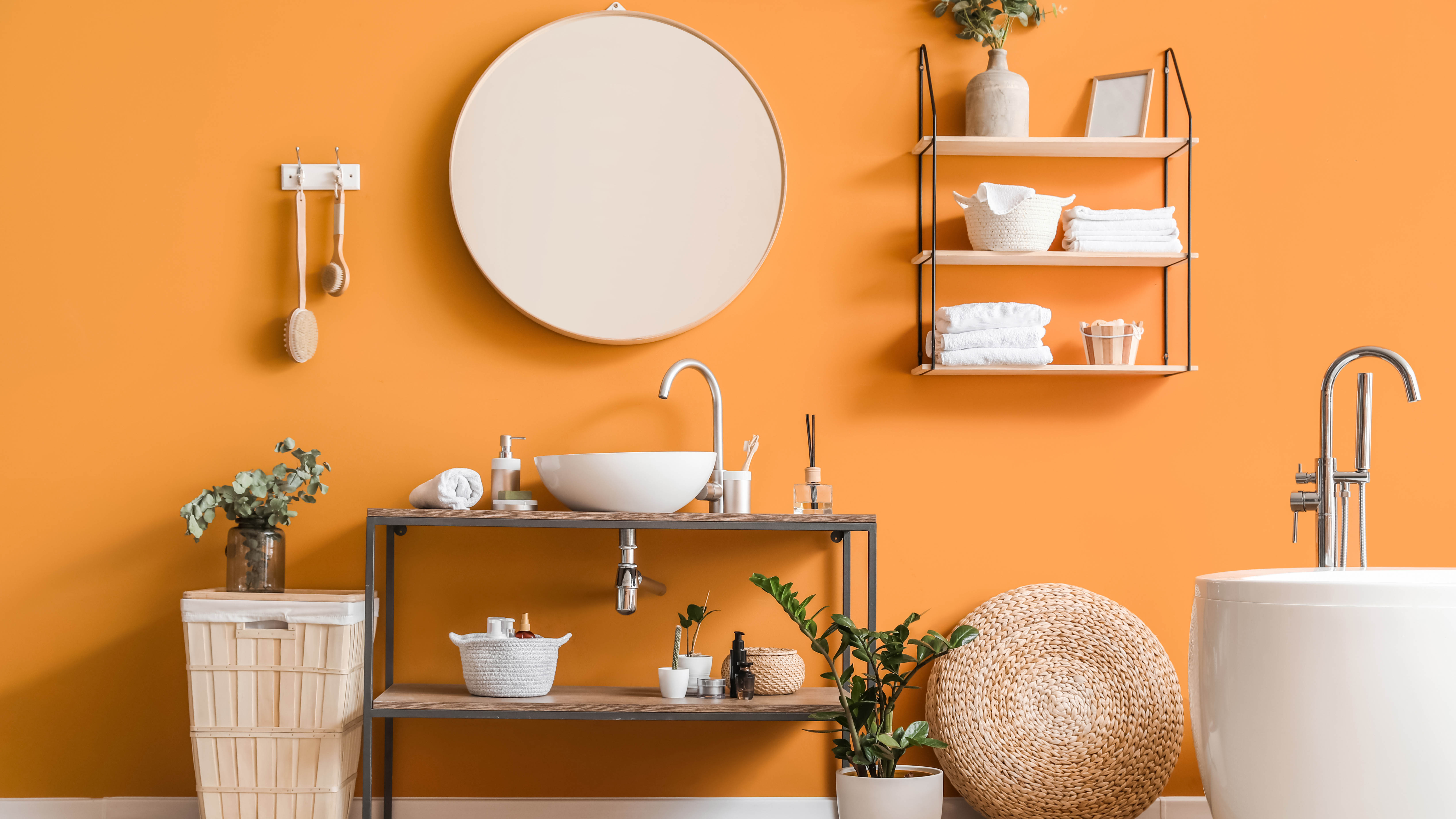
With the rise of augmented reality and digital design tools, high-saturation hues are being embraced in both real and virtual spaces. These colors are electric—think magenta, turquoise, neon chartreuse, and electric orange.
Why it works: These shades energize the eye and make bold statements. They’re especially impactful in digital content, pop-art-inspired interiors, and editorial fashion.
How to use it: Add punchy colors in accent details—neon pillows, LED wall art, or a vibrant gallery wall. For fashion, bold accessories like shoes or a structured bag in electric orange instantly pop against neutral outfits.
Ocean Tones: Blues That Flow
This season’s blue is not just any blue. It’s a spectrum inspired by the ocean—from seafoam to deep navy, and cerulean to teal. These hues evoke the natural serenity of the sea and its calming, endless motion.
Why it works: Blue is universally beloved and inherently soothing. These water-inspired tones foster tranquility while delivering depth.
How to use it: In interiors, layer multiple blue shades using textiles, paint, and ceramics. In fashion, denim-on-denim looks in varied washes are making a comeback. Add subtle shimmer or metallics for a nautical-meets-modern effect.
Radiant Sunset: From Amber to Dusty Rose
The golden hour isn’t just for Instagram anymore. Hues that replicate the beauty of the setting sun—burnt orange, coral blush, amber glow, and dusty rose—are finding their way into both homes and wardrobes.
Why it works: These shades feel romantic, dreamy, and warm. They emulate nostalgia while remaining contemporary.
How to use it: Paint a bedroom wall in soft coral and layer it with gold-accented furniture. Mix amber-toned glassware with minimalist dinnerware for an elevated tablescape. Wear dusty rose sweaters with camel trousers for an understated chic look.
Monochrome Magic: A Single Color, Multiple Depths
Designers are leaning into single-color spaces but with tonal layering. A room or outfit styled in one hue—just in varying saturations—feels composed, polished, and expansive.
Why it works: Tonal styling builds depth and complexity without visual clutter. It makes small spaces feel larger and fashion ensembles more refined.
How to use it: Choose a main color, such as sage, and use lighter tints and darker shades throughout your space. Try painting moldings and walls in subtly different tones. In fashion, layer a sky-blue dress with a navy jacket and periwinkle accessories.
Muted Metallics: A Softer Shine
This season’s metallics aren’t the brash, mirror-finished versions of past decades. Instead, they arrive in whispery tones—brushed gold, pewter, rose silver, and aged bronze. Their softness brings elegance and a touch of glamour without shouting.
Why it works: These metallics complement both warm and cool palettes. They catch the light in gentle ways, adding sophistication to every angle.
How to use it: Swap out chrome fixtures for brushed brass. Incorporate rose-silver vases or trays on dark surfaces. Wear accessories in muted metallics against monochrome or earth-tone outfits.
Unexpected Color Pairings
Rather than sticking to safe duos, designers are now experimenting with brave, unexpected color combinations. Sage green with mustard. Lavender with maroon. Powder blue with cocoa brown.
Why it works: These combinations surprise the eye and feel distinctly modern. They also reflect a growing desire for self-expression and individuality.
How to use it: Use contrasting throw pillows, layered bedding in clashing colors, or unexpected color-blocked outfits. Keep the textures simple to let the hues shine.
Soft Black & Off-White
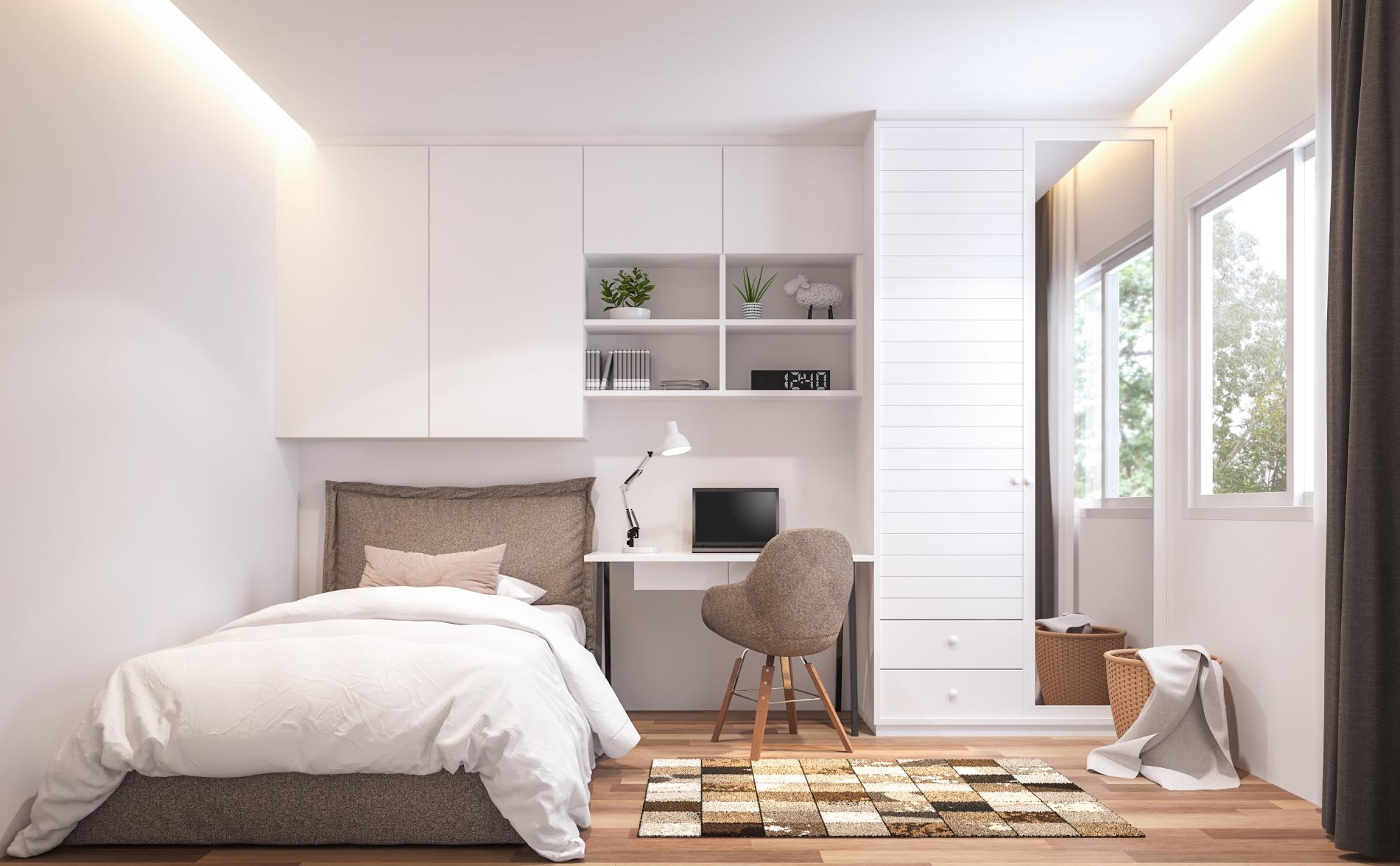
A contrast to high-gloss black and bright white, this season brings the rise of softened versions—matte black and creamy off-white. These colors anchor a palette while feeling more relaxed and modern.
Why it works: Softened neutrals offer more visual comfort and less starkness. They blend beautifully with almost any palette.
How to use it: Use matte black finishes on hardware or kitchen faucets. Opt for off-white bedding and combine it with ivory or stone-gray for added warmth. This pairing also works exceptionally well in Scandinavian-inspired designs.
Celestial Purples and Galactic Tones
Space-inspired hues are continuing their slow rise—lavender-gray, dusty mauve, midnight violet, and soft indigo all feel ethereal and futuristic. These colors capture the curiosity of the cosmos.
Why it works: They merge mystery with subtle femininity. These tones are both modern and dreamlike, ideal for moody environments.
How to use it: Create a stargazing corner with velvet violet drapes and plush mauve cushions. Wear indigo scarves or nail polish to make small, celestial statements.
Gender-Neutral Palettes
Gone are the days of “blue for boys, pink for girls.” Now, palettes are leaning into fluid, neutral territory—sage, sand, blush, charcoal, and eggshell dominate the scene as inclusive hues.
Why it works: These tones appeal universally and feel welcoming, inclusive, and balanced. They’re especially popular in nurseries, offices, and unisex clothing collections.
How to use it: Design a space using soft sage walls, beige linens, and natural wood tones. Choose fashion staples like oversized blush sweatshirts or cream joggers for effortless style.
Vintage-Inspired Revival
Retro palettes are making a major comeback—think avocado green, burnt mustard, dusty teal, and faded burgundy. These hues harken back to the 1970s and 80s but are now used in sleeker, more curated ways.
Why it works: These nostalgic hues tap into memory, comfort, and cultural reference. They feel familiar yet reimagined.
How to use it: Opt for a dusty teal accent wall paired with modern furniture silhouettes. Wear mustard knits with rust-colored wide-leg trousers for a retro-chic look.
Ethereal White-on-White
While not a color in the traditional sense, the white-on-white trend speaks volumes in its subtlety. Designers are layering different shades of white—cool, warm, creamy, chalky—for a rich, nuanced feel.
Why it works: White reflects light, opens up space, and provides a canvas for creativity. Layered whites create movement without overpowering a room.
How to use it: Mix bright white curtains with off-white furniture and warm ivory decor pieces. In fashion, layer a white turtleneck under a cream blazer with ivory jeans for a high-style monochrome look.
This season, color isn’t just about decoration—it’s about emotion, innovation, and identity. From the grounded comfort of earth tones to the exuberance of digital brights, this year’s seasonal color trend ideas reflect a broader cultural shift. People are searching for balance, inspiration, and meaning in their surroundings—and color is delivering it all.
By embracing these hues, spaces feel fresher, outfits feel more expressive, and life itself takes on a more vibrant energy. Whether you’re drawn to subtle pastels or wild neons, there’s a place for your palette in this chromatic moment. The only rule?
Stay curious. Stay colorful.