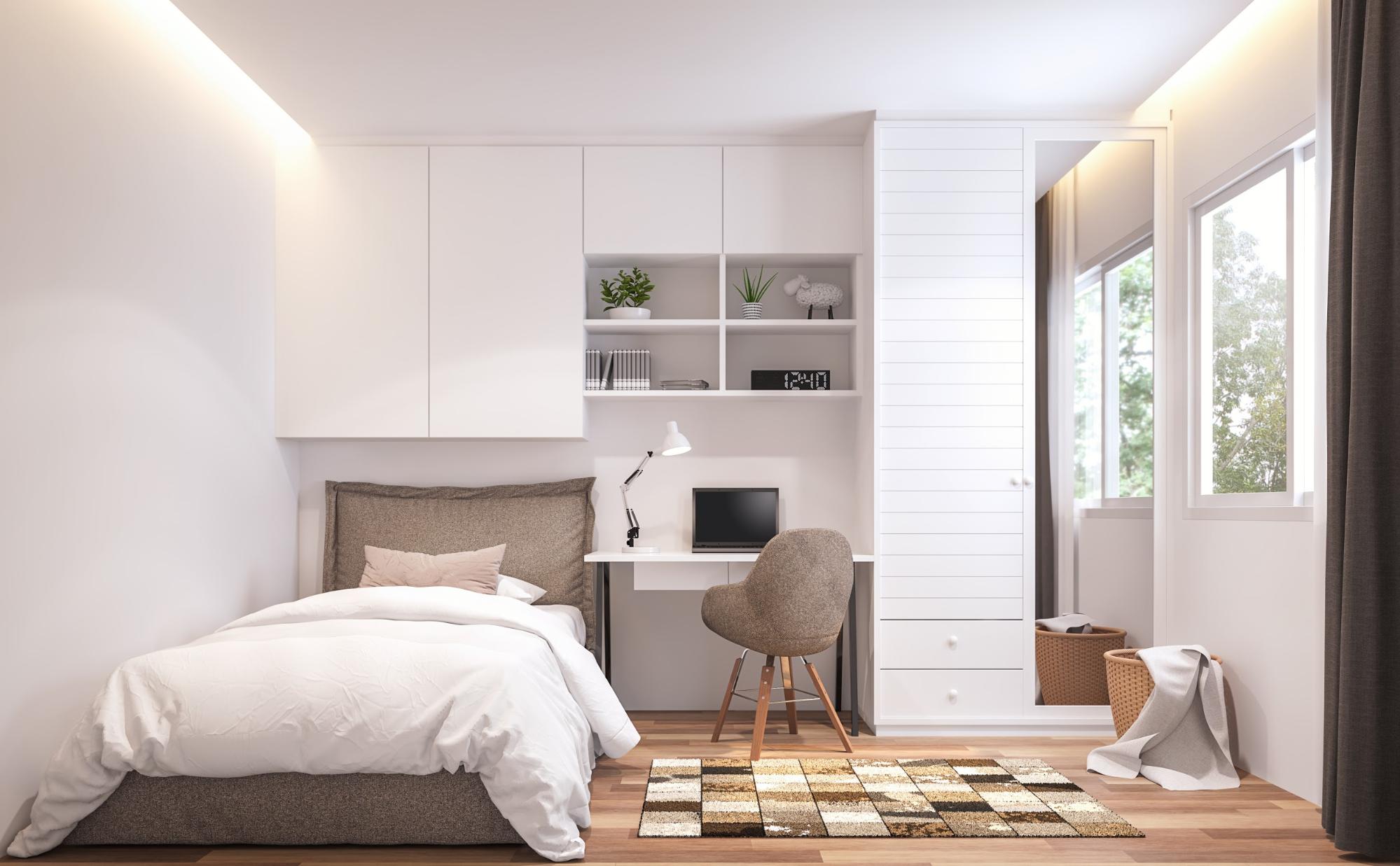
Color Trends to Inspire Creativity in every corner of our lives, color sparks emotion. It awakens ideas, stirs imagination, and shapes the way we experience the world. When it comes to designing spaces that promote innovation and creative thinking, the right palette can make all the difference. From bold contrasts to subtle harmonies, the latest creative inspiring color pairings guide us toward environments where ingenuity thrives.
This in-depth exploration delves into ten transformative color trends—complete with practical applications, pairing strategies, and professional insights—to help you curate spaces that not only look beautiful but also fuel your creative fire.

1. Vibrant Contrast: Tangerine and Teal
Essence
High-energy tangerine meets revitalizing teal. This duo crackles with vibrancy and draws the eye in every direction.
Why It Works
- Emotional Uplift: Tangerine sparks enthusiasm and optimism.
- Clarity of Thought: Teal soothes the mind while maintaining alertness.
- Visual Drama: The juxtaposition of warm and cool creates dynamic tension.
Applications
- Home Office: Paint one wall tangerine for an energetic backdrop; furnish with a teal desk or shelving.
- Studio Space: Use teal storage bins against tangerine cabinetry for both function and flair.
- Accent Pieces: Teal throw pillows on a tangerine sofa enliven living areas.
Styling Tips
Anchor the scheme with neutral flooring—light oak or polished concrete—to prevent overstimulation. Introduce metallic accents in brushed brass for cohesion.
2. Soft Innovation: Blush Pink and Olive Green
Essence
Quiet blush pink resonates with warmth; olive green provides grounded sophistication. Together, they create a nurturing palette that gently encourages experimentation.
Why It Works
- Psychological Safety: Blush reduces fear of judgment.
- Organic Creativity: Olive connects us to nature’s ingenuity.
- Subtle Sophistication: The pairing feels fresh yet refined.
Applications
- Creative Nook: Upholster a reading chair in blush pink; surround it with olive-green bookshelves.
- Collaborative Lounge: Blush walls with olive-green modular seating foster gentle collaboration.
- Desk Areas: Olive desktop surfaces accented with blush office accessories.
Styling Tips
Keep other elements white or light gray to enhance contrast. Incorporate woven textures—linen curtains, rattan baskets—for depth.
3. Electric Harmony: Neon Lime and Charcoal
Essence
Neon lime jolts the senses; charcoal grounds the space. This pairing balances kinetic energy with calm focus.
Why It Works
- Stimulates Idea Flow: Neon lime energizes brain activity.
- Enhances Concentration: Charcoal reduces visual noise.
- Modern Edge: The contrast feels cutting-edge.
Applications
- Innovation Lab: Neon lime feature wall behind charcoal desks inspires dynamic brainstorming.
- Tech Startup Office: Charcoal flooring with neon lime wayfinding decals energizes circulation paths.
- Art Studio: Neon lime storage units against charcoal-painted shelving.
Styling Tips
Use neon in small doses—desk lamps, wall decals, or planters. Maintain charcoal for major surfaces to avoid eye strain.
4. Serene Spark: Sky Blue and Marigold
Essence
Sky blue evokes open horizons; marigold infuses warmth and joy. This duo fosters calm creativity with a touch of playful exuberance.
Why It Works
- Open Mindset: Sky blue encourages expansive thinking.
- Joyful Motivation: Marigold ignites inspiration and positivity.
- Balanced Energy: The colors complement rather than compete.
Applications
- Brainstorming Zone: Sky-blue accent wall with marigold poufs for informal seating.
- Craft Corner: Marigold shelving units lined with sky-blue storage boxes.
- Breakout Space: Sky-blue high-top tables with marigold stools.
Styling Tips
Introduce potted greenery to bridge the two tones. Use natural wood furniture to soften the palette.
5. Earthy Innovation: Terracotta and Sage
Essence
Sun-baked terracotta enriches the spirit; muted sage green soothes the senses. Their union feels both elemental and forward-looking.
Why It Works
- Grounded Imagination: Terracotta connects to earth’s warmth.
- Calming Creativity: Sage green instills balance and focus.
- Timeless Appeal: Both hues evoke heritage while remaining contemporary.
Applications
- Home Library: Terracotta walls with sage-green built-in bookshelves.
- Garden Room: Sage-green walls accented by terracotta planters and pots.
- Design Studio: Terracotta desktop surfaces with sage swivel chairs.
Styling Tips
Pair with matte black metal accents for an industrial touch. Layer in linen and wool textiles to enhance comfort.
6. Jewel-Infused Focus: Emerald and Aubergine
Essence
Emerald green radiates vitality; deep aubergine offers introspective depth. This pairing is luxurious and intellectually stimulating.
Why It Works
- Creative Confidence: Emerald promotes bold thinking.
- Reflective Depth: Aubergine encourages contemplation.
- Sophisticated Atmosphere: Feels both opulent and studious.
Applications
- Executive Office: Emerald-painted cabinetry with aubergine leather chairs.
- Conference Room: Aubergine accent wall with emerald trim.
- Reading Alcove: Emerald velvet daybed and aubergine throw pillows.
Styling Tips
Use jewel-toned glass accessories to catch and refract light. Balance with cream or beige carpets.
7. Cool Contrast: Ice Blue and Burnt Sienna
Essence
Ice blue’s crisp clarity meets burnt sienna’s earthy embrace. This blend energizes without overwhelming.
Why It Works
- Renewed Clarity: Ice blue enhances mental acuity.
- Warm Motivation: Burnt sienna ignites ambition.
- Dynamic Balance: Cool and warm counterpoints keep the mind engaged.
Applications
- Studio Workshop: Ice-blue worktables with burnt-sienna tool cabinets.
- Idea Lab: Ice-blue walls adorned with burnt-sienna pegboards.
- Kitchen Workspace: Burnt-sienna countertop backed by ice-blue tile.
Styling Tips
Integrate stainless steel or silver fixtures to accentuate cool notes. Use reclaimed wood for warmth.
8. Pastel Palette Play: Mint, Peach, and Lavender
Essence
Soft mint, gentle peach, and whispering lavender unite for a pastel medley that inspires calm creativity.
Why It Works
- Comforting Softness: Pastels reduce stress and invite play.
- Multidimensional Harmony: Three nuanced hues create layered intrigue.
- Subdued Energy: Feels lively without high intensity.
Applications
- Children’s Creative Corner: Mint walls, peach furniture, lavender accents.
- Boutique Studio: Peach cabinetry, mint rugs, lavender art installations.
- Wellness Room: Lavender drapes, mint chaise lounges, peach décor pieces.
Styling Tips
Balance pastels with whitewashed wood and woven textures. Introduce muted gold hardware for elegance.
9. Neon Pastel Fusion: Highlighter Pink and Soft Mint
Essence
Highlighter pink injects pop energy; soft mint tames it with pastel calm. This combination feels audacious yet accessible.
Why It Works
- Visual Jolt: Neon pink grabs attention immediately.
- Soothing Counterpoint: Mint offers respite for the eyes.
- Bold-Subtle Dance: Energizes without fatigue.
Applications
- Pop-Up Event Booth: Neon-pink signage on mint walls.
- Collaborative Hub: Mint sofas with neon-pink accent chairs.
- Art Display Area: Soft-mint pedestals showcasing neon-pink sculptures.
Styling Tips
Limit neon to focal points. Use matte finishes for neon elements to soften glare.
10. Monochromatic Gradient: One Hue, Endless Variation
Essence
Choose a single color family and explore its full tonal spectrum—from the palest tint to the richest shade.
Why It Works
- Depth Without Complexity: Multiple tones provide intrigue without color overload.
- Seamless Flow: Gradation guides the eye smoothly across surfaces.
- Focused Creativity: Immerses users in a singular chromatic environment.
Applications
- Gradient Wall Mural: From light mint at ceiling to deep teal at baseboards.
- Furniture Sets: Chairs and tables in progressively darker hues.
- Textile Layering: Cushions, throws, and rugs in escalating tones.
Styling Tips
Anchor with neutrals—white trim, light wood floors—to maintain clarity. Use simple silhouettes to let the gradient shine.
Layering Textures for Creative Fuel
Color comes alive when paired with texture. To further invigorate creative inspiring color pairings, incorporate:
- Tactile Fabrics: Velvet, bouclé, and looped wool attract touch and focus.
- Natural Materials: Wood, rattan, and stone ground vibrant hues.
- Metals: Polished chrome, brushed brass, or copper catch light and add a futuristic edge.
- Glass & Acrylic: Transparent elements refract color, creating dynamic interplay.
Textures anchor color, invite interaction, and stimulate sensory engagement—all vital for nurturing creativity.
Lighting: Amplifying Your Palette
Lighting can make or break a color scheme:
- Natural Light: Showcases true undertones; essential for daylight tasks.
- Warm LED (2700K–3000K): Enhances warm hues; cozy for brainstorming over coffee.
- Cool LED (3500K–4000K): Sharpens cool tones; ideal for focused, detailed work.
- Adjustable Dimmers: Let you shift ambiance from energetic to reflective as needed.
Always test paint swatches and materials under multiple lighting conditions before committing.
Room-by-Room Strategy
Home Office
Primary walls in sage; desk in terracotta; accessories in blush and emerald. A neon mint desk lamp energizes.
Studio or Workshop
Polished concrete floor; feature wall in burnt sienna; work tables in ice blue; tool storage in charcoal. Neon coral accent pegboard adds vibrancy.
Living and Lounge Areas
Accent sofa in indigo; walls in apricot; side tables in chartreuse; throw pillows in slate gray and lemon. Layer woven rugs.
Creative Corner or Craft Nook
Blush walls; mint cabinetry; lavender pegboards; neon pink organizers. Open shelving displays colorful supplies.
Collaborative Spaces
Powder-blue round tables; marigold chairs; olive accent walls; artwork in emerald and aubergine. Portable storage in neon lime.
Maintaining Cohesion
To ensure your creative inspiring color pairings feel intentional:
- Repeat Key Hues: Echo each color at least three times.
- Anchor with Neutrals: White, gray, or wood tones prevent chaos.
- Balance Boldness: Pair a standout color with subdued variations.
- Group by Proximity: Use related shades close together and contrasting farther apart.
- Allow Breathing Space: White or neutral zones give the eye rest.
Final Reflection
In creative environments, color is catalyst. The right palette fosters curiosity, ignites conversation, and fuels the flow of ideas. By embracing these ten transformative trends—from vibrant contrasts to serene harmonies—you can construct interiors that both look remarkable and nurture your creative spirit. Mix, match, and revel in the discovery that color can be both your canvas and your muse.