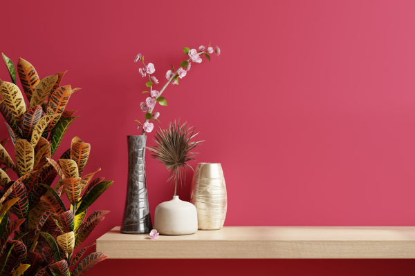
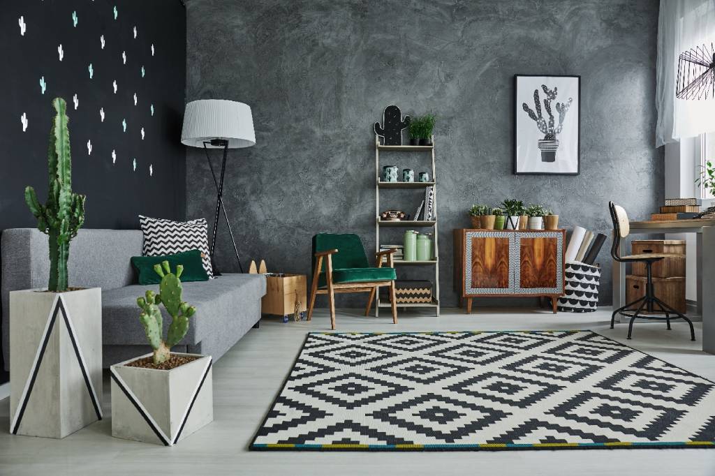
Modern Color Trends to Steal Today color breathes life into a space. It directs the eye, stirs emotion, and defines a mood. In the world of modern design, color trends are evolving to reflect a blend of bold confidence and calm sophistication. The freshest palettes borrow from nature, culture, technology, and emotion—each telling a story of presence and personality. Whether you’re renovating a space or simply refreshing a room, these modern trending color palettes offer inspiration that feels both stylish and soulful.
Gone are the days of cookie-cutter design. Today’s most sought-after hues are expressive, layered, and tailored to how we want to live right now—connected, grounded, inspired.
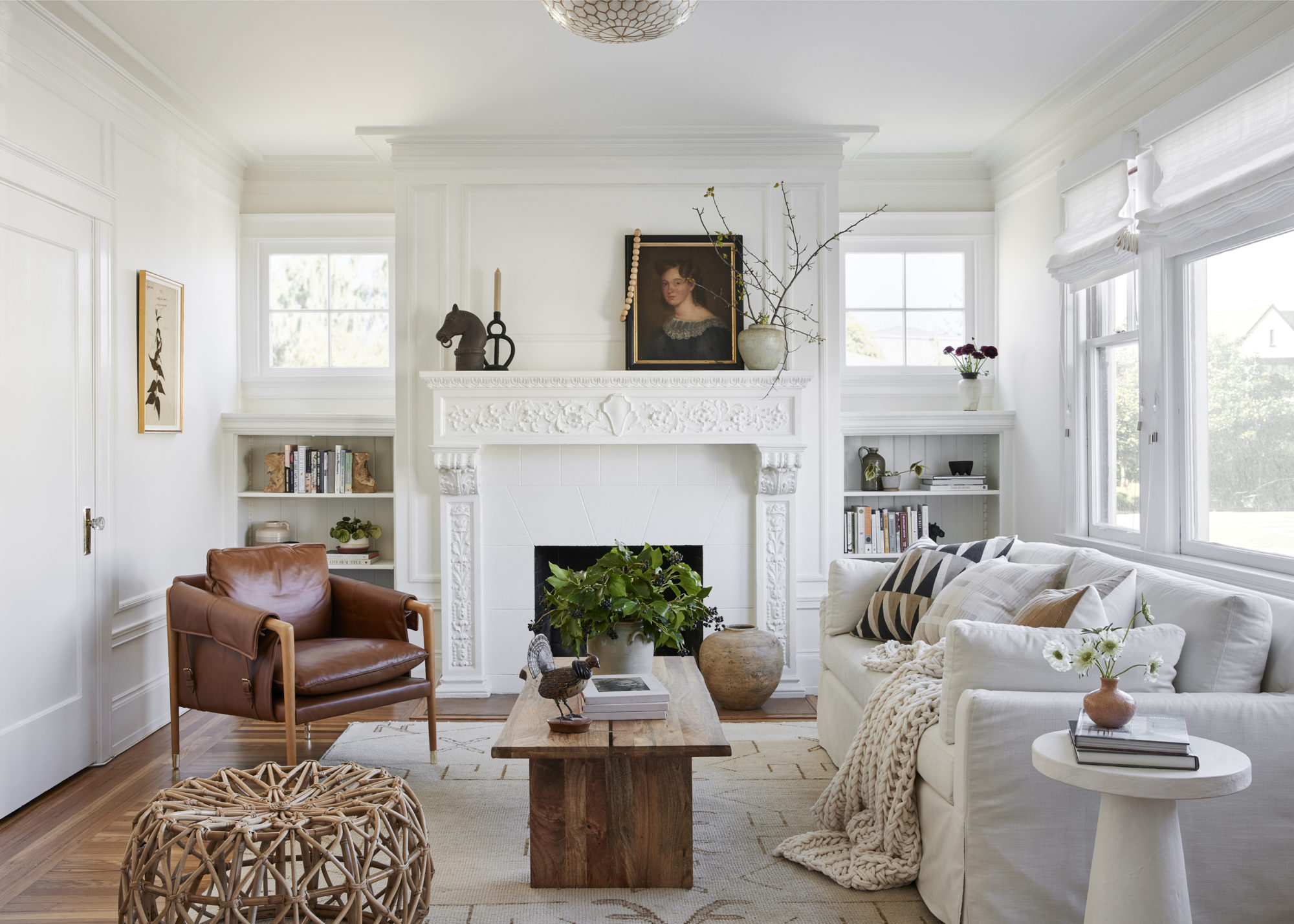
Why Modern Color Matters
Modern doesn’t mean cold or clinical anymore. It’s not about stark white walls or grayscale monotony. Instead, modern color embraces nuance. It’s fluid and intuitive, reflecting individuality and intention. It can be warm, moody, soft, or joyful—but always curated.
At its best, modern color tells a story. It invites creativity while maintaining cohesion. From subtle earth tones to electrifying neons, the goal is harmony—not uniformity. The rise of modern trending color palettes represents a shift toward spaces that feel alive, expressive, and truly lived-in.
Let’s explore the most captivating palettes that designers, stylists, and homeowners are loving right now.
1. Spiced Earth: Cinnamon, Ochre & Terracotta
Rooted in nature but full of modern warmth, this palette celebrates grounded luxury. Cinnamon tones offer richness, ochre brings light, and terracotta adds texture. Together, they create an ambiance that’s both rustic and refined.
Why it works:
- Evokes natural warmth and comfort
- Perfect for layering materials like leather, rattan, and wood
- Adapts beautifully across seasons
Best for:
- Living rooms, kitchens, sunlit dining areas
- Mediterranean and boho-chic design aesthetics
These hues are a cornerstone of modern trending color palettes that feel welcoming and lived-in.
2. Soft Tech: Digital Lavender, Glacier Blue & Mist Gray
A nod to the digital age, this palette blends serenity with innovation. Digital lavender has been crowned one of the most trend-forward colors, evoking calm and creativity. Glacier blue cools the edges, while mist gray keeps it grounded.
Why it works:
- Balances technology with softness
- Ideal for minimalist and Scandinavian spaces
- Creates a calming and productive environment
Best for:
- Home offices, tech-forward interiors, modern nurseries
- Branding for wellness and digital products
This is a palette that whispers clarity, and it’s one of the most emotionally intelligent among modern trending color palettes.
3. Desert Jewel: Sage, Dusty Rose & Burnt Copper
Earth tones take a glamorous turn in this richly toned palette. Sage keeps things subtle, dusty rose adds softness, and burnt copper introduces metallic flair.
Why it works:
- Sophisticated without being stiff
- Great for mixing matte and metallic finishes
- Works with natural light beautifully
Best for:
- Bedrooms, lounge areas, powder rooms
- Glam-meets-organic home styles
This palette is a dream for creating sanctuary spaces that still feel modern and expressive.
4. Deep Sea Drama: Midnight Blue, Aubergine & Storm Gray
Bold and moody, this trio embraces depth and intrigue. Midnight blue anchors the room, aubergine adds artistic flair, and storm gray smooths out the intensity.
Why it works:
- Perfect for drama without darkness
- Ideal for layering with luxe textures like velvet or leather
- Timeless with an edge
Best for:
- Dining rooms, media rooms, formal living spaces
- Statement powder rooms or art-driven interiors
Dark hues are staging a comeback, and this is one of the most romantic modern trending color palettes on the scene.
5. Urban Oasis: Olive Green, Soft Black & Champagne
This palette brings together the raw beauty of nature and the sleek lines of urban life. Olive adds freshness, soft black introduces modern drama, and champagne offers an airy elegance.
Why it works:
- Fresh take on industrial minimalism
- Creates contrast without feeling harsh
- Ideal for modern apartments or renovated lofts
Best for:
- Kitchens, entryways, and modern bathrooms
- Masculine-feminine shared spaces
Sleek and serene, this trio turns any space into a design-forward sanctuary.
6. Blushing Neutrals: Clay Pink, Ivory, & Toasted Almond
Neutral doesn’t mean boring anymore. This update on a classic beige palette adds warmth and romance without being overt. Clay pink adds charm, ivory opens up the space, and toasted almond brings body.
Why it works:
- Softens minimal interiors
- Excellent foundation for layering décor styles
- Feels comforting and inclusive
Best for:
- Bedrooms, nurseries, creative studios
- Clean but cozy living spaces
It’s one of the most accessible and versatile options within the current wave of modern trending color palettes.
7. Citrus Bloom: Apricot, Lemon Zest & Pale Coral
Bright, cheerful, and refreshingly optimistic. This palette reinvents sunny colors with sophistication. Apricot offers a mellow base, lemon zest provides energy, and pale coral adds softness.
Why it works:
- Joyful without being juvenile
- Adds light to dim rooms
- Ideal for playful but polished spaces
Best for:
- Kitchens, entryways, home cafés
- Children’s rooms and summer homes
These happy hues pack a punch—and reflect the trend toward more expressive, dopamine-boosting design.
8. Icy Warmth: Cool Mint, Snow White & Rust
Mint and white feel fresh and spa-like, while rust anchors the palette with grounded warmth. The result? A dynamic push-pull of cool and warm tones.
Why it works:
- Unpredictable but harmonious
- Breathes new life into classic white interiors
- Looks stunning with wood and copper accents
Best for:
- Bathrooms, kitchen nooks, modern farmhouses
- Trend-forward commercial spaces
This contrast-driven scheme reflects the bolder side of modern trending color palettes.
9. Monochrome Melt: Bone, Charcoal & Warm Taupe
Monochrome doesn’t always mean black and white. This modern iteration explores the power of layered neutrals. Bone adds brightness, charcoal delivers edge, and warm taupe creates cohesion.
Why it works:
- Subtle but strong
- Works in nearly any light
- Allows texture and form to shine
Best for:
- Open-plan living
- Showrooms, architecture-driven spaces
Perfect for design lovers who appreciate understatement with substance.
10. Eco Inspired: Pine Green, Sandstone & Sky Blue
This palette draws directly from nature’s canvas—forests, rivers, and desert skies. Pine green roots the palette, sandstone adds neutrality, and sky blue lifts it all up.
Why it works:
- Biophilic and eco-conscious
- Creates a grounded, calming energy
- Timeless with a modern lens
Best for:
- Living rooms, creative studios, eco-lodges
- Spaces that celebrate sustainability and organic design
Of all the modern trending color palettes, this one is most closely aligned with the movement toward wellness and mindful living.
Color Psychology: How Today’s Hues Affect Mood
Modern color trends aren’t just about aesthetics. They’re emotional tools. The right colors can reduce anxiety, boost focus, or lift a heavy mood.
- Blues: Calming, trustworthy, cerebral
- Greens: Restorative, organic, refreshing
- Pinks: Nurturing, soft, creative
- Yellows: Energizing, optimistic, attention-grabbing
- Neutrals: Grounding, timeless, versatile
- Dark tones: Introspective, dramatic, cozy
Today’s best color palettes don’t just look good—they feel good, too.
Lighting: The Game-Changer in Modern Color
How color reads depends deeply on the light that hits it. The most successful use of color begins with understanding your space’s lighting environment.
- North-facing rooms: Enhance with warm tones (mustard, rust, blush)
- South-facing rooms: Handle cooler tones beautifully (sage, mint, icy blue)
- East-facing rooms: Great for warm morning light—play with citrus hues
- West-facing rooms: Complement the golden hour glow with deep, dramatic hues
Natural light changes everything. What works in a showroom may feel entirely different in your living room. Always sample before you settle.
Styling Tips: How to Make Color Work for You
- Start small: A throw pillow, a piece of art, or a feature wall is a low-commitment way to test bold color.
- Think finish: A matte teal reads very differently from a glossy one. Texture matters.
- Don’t match—balance: Harmonize rather than coordinate. Let contrast create rhythm.
- Mix eras: Pair modern color with vintage furniture or classic architecture for unexpected beauty.
- Let function guide you: Use energizing palettes in kitchens or offices; calming tones in bedrooms and baths.
The goal of using modern trending color palettes is to support both aesthetics and everyday living.
Future Forecast: What’s Coming Next
Design never stands still, and color is always evolving. Keep an eye on these emerging directions:
- Hyper-personalization: Custom colors tailored to personal energy and lifestyle
- Neon naturals: Bright hues inspired by nature, but with a synthetic twist
- Mood tech: Smart lighting and paint that shifts according to mood or time
- Global palettes: Cultural color influences from Africa, Asia, and Latin America
As our homes become more reflective of our personalities, color will continue to be a tool for storytelling, self-expression, and even healing.
Final Thoughts
In the pursuit of modernity, color offers a playground where form meets feeling. From dusky lilacs to rich terracottas, from icy mint to golden ochre, today’s most compelling shades invite you to take risks while honoring comfort.
The beauty of modern trending color palettes is their versatility.
So whether you’re planning a full-scale design or simply seeking a spark of creativity, let color be your guide. Paint with purpose. Layer with intention. Design with joy.